If home is our first place, and work is our second place, then mobile screens have definitely become our third place. Smart phone use has increased from 21 percent in 2010 to more than 63 percent today, and with 83 percent of all Americans online regularly, that percentage of mobile users is bound to keep edging up.
The fact that so many people now view the world through a window the size of a business card has spelled an inevitable change in logo design. It used to be that minute favicons had to be kept extremely simple: Now, as a rule, logos must be as well, but that doesn’t mean boring. Designers continue to push back and evolve the meaning of “simple.”
That logos have to be scalable has always been understood. But our perception of “small” has changed, in some cases “tiny” is being rather generous. Dimension and detail are necessarily removed so that these logos read properly on mobile screens. Designs have become more and more flat. Surfaces are plain and defined by mono-weight lines.
Of course, there’s a limit to this flattening out and removal of information. Designers and audiences alike need an escape from all things digital. They need a chance to decompress and take a deep breath in a place that provides shelter from information’s frantic pace. Everyone needs to step outside and bask in sunlight, not screen light. And so the pendulum starts to swing back.
People seem to be more and more drawn back to what is real, whether that is perusing handmade hats on Pinterest, exploring other cultures or our own family histories, or reconnecting with stories from mythology or our childhoods. By bringing back what is human-made, we gain a sense of control over the digital tide that threatens to overtake us.
Designers have responded to the mobile screen’s harsh requisites in a variety of ways, many of which are detailed in this year’s Trend Report. Artisan crafting is ever more important as evidenced by the “Hand Type” solution in abundance this year. Colors are brighter and lighter. Typographic solutions, which can be absorbed immediately with no symbolic interpretation, are ever more important.
Designers also have found ingenious creative workarounds, such as introducing long shadows to very flat designs, suggesting that dimension is still there. Logo designs may be reduced to line work (see the “Geo Wires” trend below), but now every facet of the design is visible. These designs are simpler, but now somehow more complex. In other designs, like this year’s “Pompons,” solutions are less reliant on exact, specific shapes, instead communicating with energy and emotion.
As with all things, it’s about balance. When anything pushes people too far one way, the natural reaction is to push back. Perceptive designers will always be able learn from watching the pendulum as it swings between people’s wants and needs, and technology’s gifts and demands. As Proctor & Gamble’s global marketing and brand building officer Marc Pritchard said, “Creativity without insight is worthless.” Today, insight means learning how to move design forward by turning digital limitations into communication advantages.
We also saw plenty of:
- Mountains, both representing geographic entities as well as a metaphor for achieving great heights or reaching a summit of success.
- Acorns a plenty, as a return to nature and the promise of potential and greatness from an auspicious beginning. These demonstrated planning for the future and as a reminder, the best time to plant a tree was yesterday.
- Bees in every form, and a few hives as well. A versatile symbol of fertility, industry, dedication and teamwork. All the critical ingredients for a sticky reward delivered without a sting.
- Digital controllers, whether for a game or otherwise, seem to symbolize the ability to manage any challenge at the push of a button or flick of the wrist.
- Symbols are being adopted by consumers at an extraordinary pace, and many of these from digital devices or associations with that industry. Clouds, Wi-Fi waves, loading wheels and a rush of icons from our mobile devices are providing the analogies for the next generation of logos.
- Faceting cannot be stopped as it continues to evolve. Since it first hit the scene in 2010 it has sprouted more offshoots than a hydra at a knife fight.
- Flat, overly simple logos are giving realism a breather. Skeumorphic design is so yesterday. Unfortunately designers are breaking the surface tension by letting long shadows creep onto the faces of their work. So if we’re living in flat world, what’s casting the shadow?
The 2014 Trend Report
At the writing of this report there are more than 212,000 logo on the LogoLounge website, submitted from designers all over the world. The last year’s submissions, 24,500 in all, were examined for this report.
In studying these large collections, trends are noted. The intention of this report is to share with you what we see, not to make suggestions for what you should do. Often a trend we see may be an outgrowth of a direction identified in a previous report. Proof that the product of this industry is part of a healthy evolutionary cycle.
Perhaps the greatest value of these reports is to enable designers to map out the trajectory of specific styles, concepts, techniques and solutions. Once a chain of design evolution is identified, it is much simpler to forecast and design the next step in the sequence. We encourage you to visit www.LogoLounge.com where the last decade of reports can be viewed in their entirety. These resources and the trends identified here, combined with your unique interpretation and ingenuity, may fuel the beginning of a truly exceptional logo.
Special thanks to some of the world’s best identity designers for their generous suggestions that helped enhance this report, including Brian Miller, Brian Wiens, Adam Anderson, Stephan Smith, Ty Wilkins, Alen Pavlovic, Brett Stiles, Valera Namzov, Jeron Ames, Denis Ulyanov, Sherwin Schwartzrock, and others. A note of appreciation as well to the LogoLounge members whose work is displayed here.
Mono Crest
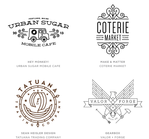
Let’s start this year’s report with the spawn of the most prolific trend we identified in last year’s report. The use of mono-weight line work and in this case as used in crests or other combination marks that utilize typography and illustration. Last year we identified “Line Craft” using the same single weight stroke throughout and this year the movement has invaded with a vengeance. We identified at least five strains of mono including the most ubiquitous “Mono Script,” “Mono Icons” and this year’s “Mono Crest.”
The non-scalable single line weight gained serious use as the go-to for icon designers, and the simplicity can also be seen where it carries forward into illustration work. These crests have a lightness that proves half of the idiom, “you can never be too rich or too thin.” Certainly there is a refinement here, but it allows designers to embrace the rich language they’ve used for years in crests without tonality or color. These are bit like stripping away the heavy flesh to expose a really striking bone structure.
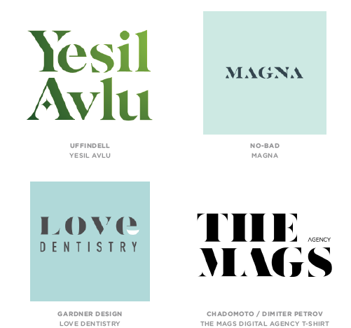
Letter Stacks
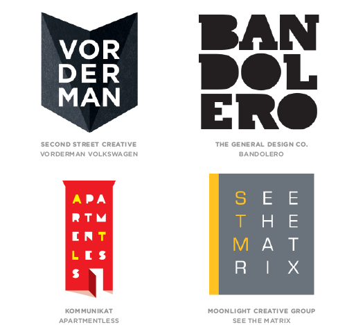
Lowly hyphens should abandon hope and designers should be admonished as they lose care for the need to break words between consonants. A primary concern here is whether mathematically the total number of letters gives us an even break. The solution for a stubborn name that’s too long to behave is to parse it into a stack of segments and box them up. Presto, you have a compact solution that suddenly stands out on a T-shirt’s logo ghetto.
Typographically, the font is less important but obviously these are seldom lower case. Upper case letters have a parity that allows designers to arrange them like building blocks. Some of this ilk is visually encased and others just arranged to create the illusion of a shape. Either way, this solution is not a true puzzle but it chides viewers enough to actively draw them into the discovery process. It is that modest participation that can initiate the brand bonding process for the consumer.
Hand Type
It should be no surprise that the use of “hand drawn” type has migrated from the printed page and illustration world to the small and powerful logo. So much so that designers are both revolted and enamored with the mechanization and inundation of these crude digital fonts and abundant template solutions. This last year’s explosion to near critical saturation had been building slowly but with recently blown floodgates, we have to question how much enchanting handcrafted messaging a consumer can take.
The promise is the same as the book Hand Job released in 2007, which offered designers and consumers alike a refreshing respite from the churn of digital type. But handcraft be damned as the majority of what appears to be original is no more than a digital font pretending not to be. However, there are exceptional examples of truly hand drawn solutions out there and they standout like a clarion voice. This trend has enough traction that it won’t die soon, but it must surely evolve, and soon.
Dazzle
Two centuries ago when Firman Didot crafted his modern serif font of the same name, it became the signature text to usher in the age of enlightenment in literature. Little could he suspect that the Achilles heel of Didot would become an attribute or a trend. When reproduced digitally at it’s smallest, the hairline strokes of the letterform often vanished, an anomaly referred to as “dazzle.” Magnify those misprinted letters and you have a typographic solution that is intriguing and legible in its incompleteness.
Designers take particular pride in removing 40 percent of the letterform, which at a distance and to aged eyes appears missing already. Gone is the need for a client to be concerned with how small you can make your wordmark before it starts to fall apart. This is closely related to similar solutions where thick and thin strokes alike are dissected from serif letterforms to create compact visuals ready for consumer interpretation.
Flat Facets
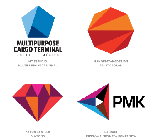
Another equally prolific line of trends over the last few years has been the facet. Watching this particular technique rocket and split into a variety of interpretations embraced by the design community has proven it has legs. This year’s report identified four emerging strains, including “Facet Fields,” “Crystals,” “Type Facets” and “Flat Facets,” which we’ll expound on here.
Facets first came about with an attempt to create three-dimensional objects from a series of intersecting planes. With shifting gradients or transparency, these marks certainly tried to define volume for the viewer. This trend steps back and allows the very same planes to become dimensionally flat. No attempt to fool the eye here. The greatest value of these marks come from telling the story of recognizing worth in a worthless stone then, making it perceptible by finely honing the surfaces until it takes on the qualities of a priceless gem.
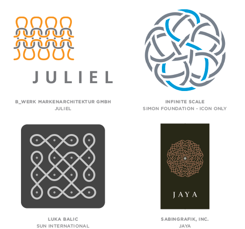
Geo Wires
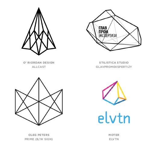
Looking more like a gem cutters instruction manual, this is where facets and mono line trends first intersect by mapping out the cleavage of a rare substance. Often crafted in black and white, these logos take their volume and form from scribing the edges of an invisible host. Canting the shape to create depth, the viewer instinctively knows these lines incase an unknown substance of extreme value.
By using a wireframe solution these marks convey a level of precision, whether geometrically symmetrical or resembling an oddly shaped element of deeper symbolism. No curvilinear segments required here as every surface is defined by the straightest of edges. Scientific associations abound with an immediate connection for clients in math, architecture, chemistry and digital endeavors.
Trans Menagerie
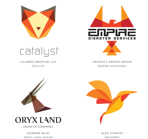
Flat yes. Transparent yes. Animals yes. In one of the oddest clusters of kindred thinking, the desire to craft beast logos from very flat transparent layers has arrived. Appearing from seemingly diverse geographic sectors, these marks are created from a handful of geometric shapes and are executed with base simplicity. Though I’m absolutely positive I could rearrange these parts to make an inanimate subject, designers have a real fixation on animals here.
The clarity of the overlays represents a transparency of process to be expected in dealings with the client. This is a key factor whenever see through layers are used as building blocks. Although there is some modest use of gradation, the majority of these rely entirely on flat overlapping color. This outgrowth of 2012’s “Tessellation” trend brings transparent pattern to the eventual construction of a specific subject.
Waves
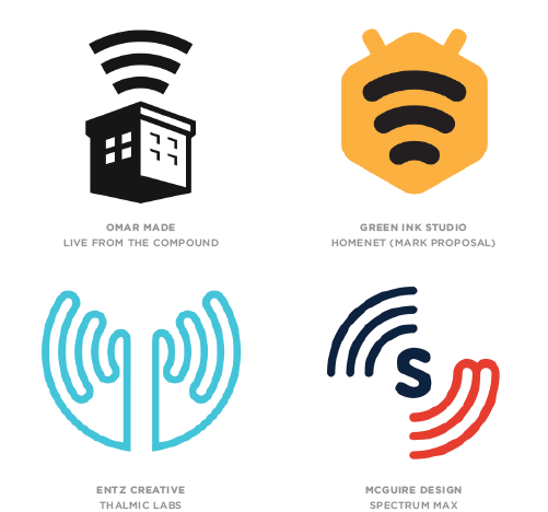
We can hardly use the name of a registered product for a trend, thus Waves instead of Wi-Fi®. The protected term has become such a common descriptor that it is starting to suffer trademark erosion and could soon end up like Aspirin, Zipper and Thermos. But here is the rub. Show the three curved, concentrically diminishing lines and everyone in the room will tell you that it stands for Wi-Fi®. In fact, the Wi-Fi Alliance logo has no such lines.
Consumers know that when they see these waves, it means the possibility of civilization in the air. It means that they can power up and, cross your fingers, have a wireless connection. It doesn’t hurt that this is a generic icon on most devices for joining a network. Anticipate this icon will not stay confined to digital devices. This symbol is on its way to standing for simply making connections, even if they’re analog.
Hexagons
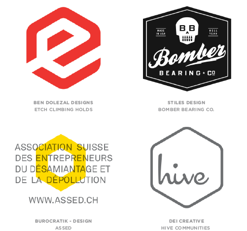
Bees knew this was coming long before we did. They have long known the hexagon was the universal building block of shapes. Aim the corner of a perfect cube at your eyes and what do you see? Another hexagon. A regular six-sided polygon with equal edges is perfect for tiling without a gap to be had. So why did it take designers until the last year to bury themselves under an avalanche of these?
For all these reasons and more, designers have universally gravitated to hexagons but each with their own take on the shape. The four examples we have selected for this trend could not be more different. The typical crest created in a shield or circle or square is now firmly ensconced in the shape du jour. Interestingly, the shape seldom rolls over to a flat base as the potential of seeing the outline of a cube is most evident when sitting on point.
Geography
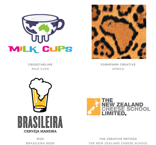
Generally the topography, rivers, coastlines and parallels of the world give us a pretty irregular looking batch of continents, as well as national and regional boundaries. Unless you live in Colorado, where your state is often mistaken for the H&R Block logo. Short of a boot shaped like Italy, finding a way to subtly ease a country’s profile into a mark could be a real test for any designer. Of late, there are many that appear up to this challenge.
Literally placing a silhouette of your homeland into a logo is not new. Finding a way to incorporate it to achieve an “aha!” moment when discovered seems to be on the rise. Nationalism in general seems to be a favorable recent motif with an abundance of state colors and symbolism. Not every attempt is successful, but when a designer turns Brazil into a frothy head of beer or buries Africa in the spots of a leopard, the magic is impeccable.
Pompons
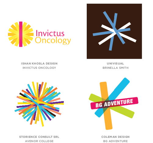
No simple balls of fluff, these marks are a series of line segments with a central pivot point. Aside from a common intersection, there are few other rules. Some have a random nature to the grouping and others are highly organized and seem to radiate with great regularity. Others show transparent segments, while still others are as opaque as night. Color can be very limited, or it could just as well give the rainbow a run for the Chroma award.
There is a common theme of strength in numbers with each individual element connected in the center with a mutual bond. Examples of this trend are found with flat 2D solutions, as well as attempts to create an illusion of 3D. A measure of radiance is undeniable in each, though the more precise the disbursement the more likely they are to resemble a stellar body. Still others readily accept a kinship to an asterisk, conveying a note of surprise or something special is happening here.
Knit
The essence of weaving is the ability to take fine threads of modest strength and arrange them in an overlapping sequence to form a surface of substantial strength. We have reported variants on woven logo solutions for a number of reports, but this year the genetics of the idea jumped the fence. These designers understood the value of the story of a woven solution but they have taken a different path to a similar result.
These marks still have the strength of the warp and the weft, but someone called out “knit one, purl two.” The story here is that textiles come about in many ways. Most of these solutions appear to be the result of knitting, crocheting, darning or some other method of assembly that requires an interlocking stitch. This micro-view of the process demonstrates unobserved intricacies to the consumer. Intricacies that might turn an institution of delicate strands into fabric of an impervious nature.
States
Homage to simplicity could not be more evident. Keep it one color and no gradients please. A simple yet symbolic shape. Could be a silhouette but keep it flat. Make sure the text is short and to the point. Knock it out of the shape and preferably scaled down. I refer to these as “states” because they often remind me of a simple geometric bordered parcel with the name of the entity subtly placed atop.
These solutions are about as Spartan as a mark can get and they speak to an unadulterated proposition. The shape may hint at the industry or business type, but it’s never a literal answer. Compared to glossy, transparent, overworked identities, these have a strong voice by virtue of their zigging while much of the design world is still zagging. If there is a challenge it is scaling; once the text is minimally legible, the shape on some of these could appear large and horsey.
Links
Proof that hotdogs can be made out of anything and that anything can be made out of hotdogs. Welcome a variety of solutions that live and die by using a series of straight and quarter-round transparent links. In 2012, the Pentagram team of Michael Bierut and Joe Marianek crafted the colorful and engaging identity for Mohawk. Though not the first use of this technique, it would be fair to ascribe credit to this project as a seminal influence for this trend.
Credit designers that have examined these building blocks and created their own spin on how to reassemble with a degree of originality. Transparent linkage shows how multiple components work together for a flexible and greater good. The connecting overlap serves as a joint in the marks. Consumers can almost imagine a real life version of these logos with functional pivot points. Friendly and approachable with no sharp points, as if it were a toy from the public’s childhood. It’s an instant bond.
Motion Lines
Everything designers know about demonstrating action they learned from Stan Lee. The most dynamic super hero was just stationary flesh until a few streaks were added for motion. Logo motion has gone old school with the influence of icons for apps and user interface. The simplest graphic language is still the best shortcut. If something turns on, it radiates lines. If something rings, just add vibration lines.
Identity designers have had no larger influencing factor than the plethora of icons, most of which were created for digital media. Many of these icon systems were built with a common mono-line as a signature to identify other icons from the same set. It’s not surprising to find designers of these sets are also creators of logos. Seeing this influence migrate to both areas of their work is only natural.
About the Author
Bill Gardner is the principal of Gardner Design and creator of LogoLounge.com, a unique website where, in real time, members can post their logo design work; study the work of others; search the database by keyword, designer’s name, client type, and other attributes; learn from articles written expressly for logo designers; and much more. Bill can be contacted atbill@logolounge.com.
Mr. Gardner is also the author of the best-selling LogoLounge 1-8 book series, the recently released Logo Creed, a text on logo design, and now is an online author for Lynda.com in LogoLounge: Shapes and Symbols in Logo Design.
Taken from Logo Lounge
 Why Not Everybody Should Design


 Google has had a bottom-up rebrand, and it’s provoked plenty of opinion