An important part of being a professional web designer is knowing what and doesn’t work. There are bad design habits for websites that a lot of builders don’t take notice of. Everything you design on a client’s website should be there for a specific reason, and should follow the most current design practices. Unfortunately, sometimes we all get stuck in a rut, and add certain website elements out of just habit, unaware that there might be a better, more freshen approach.
We are half way through 2016, and it’s time to take a look at some of the most common offenders of web designs. Some are now out-dated, while others are actually toxic to the success of a website. We will examine why each should be forgotten, and what you can do instead to make sure you’re designing with the most current trends at your disposal.
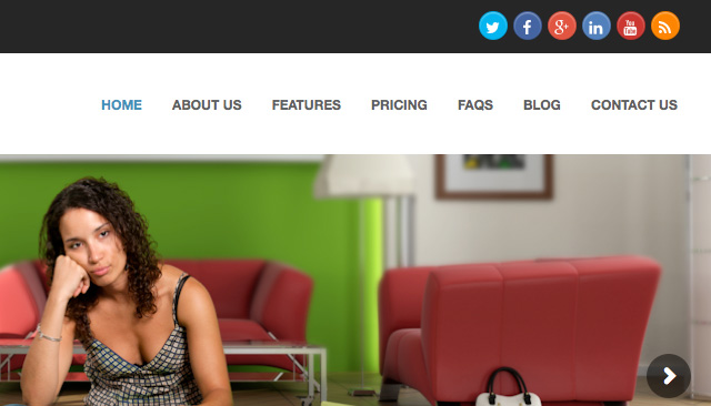
Social Media Icons at the top of the Header
Every time your client has a visitor to their website, it’s a small win. So why would you want to give them a brightly coloured exit sign?
Usually in most cases, the point of a social media campaign is to drive visitors from social network sites to your client’s website, not the other way around. Even if a visitor follows the link with the specific purpose of following your client, the chances are that they will get distracted somewhere along the line, and not come back.
A Solution:
Your best approach is to start using social media plugins (WordPress) rather than a simple link icon. These will allow your visitors to like your Facebook or Twitter page, or add you on other social channels without bouncing them off the page. It means the users stay on the page, keeping your client’s visitors where you want them.
Try taking the emphasis off by moving them down the page, to either the footer or a sidebar. Also, I recommend to style them in perhaps a less eye catching way. It should only be visible for users who are looking for them, if you make them too colourful, it may entice the visitors to leave.
Tacky Stock Photos
We all know that full-width images are a popular and tired trend in web design, and they have actually been shown to increase conversions. Unfortunately, photos that are clearly of the stock variety can have the opposite effect. People can be turned off by anything they deem to think is not real, which causes distrust, thus taking conversion rates down.
A Solution:
You have some choices, but will be largely determined by your client’s budget.
The first choice would be to hire a photographer. Customers respond very well to authenticity, so if your client’s actual photos are professionally taken, it will go a long way building trust. Photography can range in any price, so it can usually be achievable. These days, even a smartphone can take decent photo, if you put a little effort into it.
Another option, stick with stock photography, but choose it much more carefully. We have actually designed many websites using stock photos, but the trick is find the right image that don’t look cheap, and suits your clients business.
Only recently is there stock photo businesses that specialise in “authentic” looking photos. The kind that look like you would find scrolling through your Instagram feed.
Email Links
If part of the website you’re designing includes some type of staff bios, the question of email links will always come up. It’s an easy way of letting people get in touch easily with staff members, but it comes at a cost.
When you click an email link, it will trigger your computer’s native email client, which you may or may not use. Then, I must right-click the email address to save it, and paste it into my gmail.
Another issue is email links are usually crawled by robots, making your client’s website a sitting target for email spam.
A Solution:
Most website have an email form on their site, (contact page,) just use this technique everywhere on the site that requires an email address. In the case of individual staff contacts, design one template you can use for each staff member, each with their own mini-contact form that will send to their email address. There are advantages to this approach:
- Form emails are easily tracked
- Emails sent through forms can be filtered through apps such as Google’s mail app
- You can set up specific fields for emailers to complete
If you must include an email address on the website, just make sure they are not linked if you’d like to sidestep email spam. Your clients will appreciate that thinking.
Client-focused Copy
One of the best marketing tools you can bring to any website is professionally copy. In most cases clients use their websites as a brag-page, shouting to the world what makes them so damn amazing. The truth is, their customers could not care less.
Visitors need to be enticed in order to make a conversion. And what entices a user? Benefits. Specifically, how will this product or service benefit me.
By taking up valuable real estate space to brag about your client, you really aren’t looking at what matters. Take a look at the following example:
Visitors don’t really care as much about the fact that they have been innovating since 1949.
A Solution:
Whether the websites copy is coming from you, or directly from your client, it has to address the benefits for the customer. A benefit is not a feature, and it’s not a brag. It should address an objection for a customer, and specifically say how they as a business can solve it.
So instead of “Packaging Quality, Service, and Innovation Since 1949,” you might try “Are You Tired of Paying for More Than You Need? High Quality Offset Packaging With No Minimum Orders.”
This addresses a specific point, and solves the problem easily.
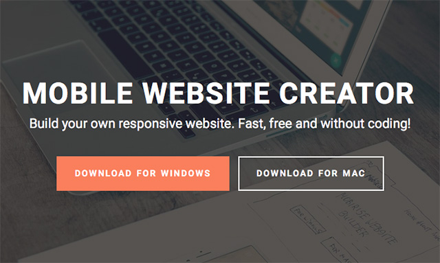
Ghost Buttons that are a Call to Action
Ghost buttons are form over function. While they are not old-school it takes the visual weight out of a button, by surrounding the text with a simple rectangular stroke, it makes for a nice looking design element, but it comes with a price: it decreases click-throughs.
The trouble with ghost buttons is that they don’t always read as buttons. Good user experience states that buttons should be clickable obviously, and ghost buttons sometimes don’t hit the mark.
A Solution:
Simply stick with the basic. Your buttons (especially your main CALL TO ACTION) should be styled to look like a typical button. Here is some tips to design the perfect CALL TO ACTION button:
- Shape – Rounded rectangles work better. Web buttons have always been associated with rectangles, and the rounded corners draw the eye inwards toward the copy.
- Copy – Use action words wherever possible that highlight what the customer is getting, not what they are giving up. One example is “Get” is a more saleable word than the word “Buy.”
- Color – The colour you use for the button should contrast with the background. Don’t go for subtle; You want your CALL TO ACTION to pop out at your customers.
While you should aim to avoid ghost buttons for your CALL TO ACTION, it can often a way to style your secondary line, especially when it is in close proximity to your primary line.
In Summary
Every now you need to take a step back to see what features and techniques are adding to the success of your websites, as well as which ones are only getting in the way. We learn more about user behaviour, so we should always be evolving our methods in order to deliver the best possible result for our clients.

