Just ask. Get answers.

[contact-form-7 404 "Not Found"]
  • Our Work
  • Logo Gallery
  • Services
  • Video Production
  • You’re in Good Hands
  • About us
  • Contact Us
Let`s Create

All posts tagged: Logo

Welcome to our blogs. Have a read through and let us know what you think.

Why you should rebrand

Why you should rebrand?

Why you should rebrand is a question I get asked often, and they answer is if there’s one thing that running a branding agency has made me appreciate, it’s the ever-changing nature of the marketplace.

August 1, 2018 admin Brand Identity, Branding, Branding Adelaide No comments yet

What Kind of Logo Do You Get When Using Fiverr?

Fiverr is doing to the graphic design industry what Uber is saying UberX isn’t as professional or safe, the design industry are claiming that the user is getting a raw deal as the product they buy is demonstrably inferior or stolen.

May 31, 2018 admin Logo design No comments yet

Mistakes To Avoid with Logo Design

One of the best ways to distinguish a business is by having a unique and memorable logo; but designing a unique and memorable logo is not as easy as it seems. Here are some common logo design mistakes that amateur logo designers do.

Typography chaos

Typography in logo design can either make or break a design, so it’s important you know your typography. A logo should be kept as simple as possible while still portraying the intended message, and to achieve this a designer must consider all typographic aspects of the logo design. It is a skill that is learned, not done on the spare of the moment.

Don’t use too many fonts. Don’t use crazy fonts, I believe a simple and timeless font always works. Pay close attention to kerning, spacing, and sizing and most importantly, ensure you’ve chosen the right font(s) for the project.

Easy Speedy

EasySpeedy Logo: See how this logo uses just one font but with different styling. The italic convey speed while the bold conveys ease.

Bad font choice

When it comes to creating a logo, choosing the right font can make or break a logo. The fonts chosen can often take just as long as the creation of the logo icon itself, and it should not be done quickly.

You need to spend time researching all the different font choices that could be used for the logo, narrow them down, and then see how each one works with the logo. Keep in mind how the logo’s font could be used across the rest of the brand in conjunction with other fonts.

Emotive Logo

Emotive Analytics: Every font has it’s own personality, so you need to choose the right “font personality” for your logo. The font chosen in this logo is much more serious.


Not too complex

Memorable logos are more successful as they allow for easier recognition; but for a logo to be memorable it must have something unique about it. Simplicity just doesn’t make a logo more memorable, but it also helps the logo to be adaptable, this means it can work over more mediums. For example logos need to work on something the size of a stamp and on something as large as a billboard. So don’t make the logo too complex, keep it simple.


Don’t rely on effects

If a logo requires a special effect to make it a stand out, then it’s not a strong logo. Start off by working in black and white first, and then add the special effects. This will allow you to focus on the shape and concept, rather than a special effect. Don’t use drop shadows or embossing to luster up your logos — a good logo will stand on its own.

Opus Logo

Opus Grex: So yes this logo does have gradients and colour, but if we took away these effects it still is strong, and simple.

Vector images

A logo has to be designed in a vector graphics program like Adobe Illustrator, to make sure that the final logo can be scaled to any size, this helps the logo to be applied easily to any media. A vector graphic is made up of precise points, these ensure visual consistency across all mediums and sizes. A rastered image (is made out of pixels, like what you would find in Adobe Photoshop) can’t be scaled to any size, this means at larger sizes, the logo would be not usable. Make sure you use a vector graphics program when creating logos.


Don’t use visual clichés

Light bulbs for ‘ideas’, speech bubbles for ‘discussion’, etc. These ideas have been done over and over again, they are often the first thing to pop into someone’s head when brainstorming, and for the same reason should be the first ideas to be not used. How is your logo going to be unique when so many other logos have the same idea? Just stay clear of these visual clichés, come up with an original idea logo.


Copying or stealing

In a world where we can easily rip something off the internet is just all too easy, and it’s an all-too-common practice these days to steal or copy another design. A designer sees an idea that they likes, does a quick change, it could be a colour change, and then calls the idea their own. This is unethical and downright silly but you’re also going to get caught sooner or later. And do not use clip art either — isn’t the point of a logo to be unique and original?

Don’t get too much client influence

Yes, the client is paying you as a professional to come up with a design, which means you need to direct the client to the best possible solution. The best way to do this is to offer your experience, so not let them direct the project. If a client asks for a change that you feel will not work, explain why and offer a better alternative. If they refuse, then send your own design changes, as well as their suggestions. They often realise that their suggestions may not have been the best idea, but you as a logo designer should also realise that you also, are not always right, so try and give the client’s suggestions a look — you never know, sometimes they are right.


Don’t provide too many ideas

Even though you as a designer may have a lot of concepts you have worked on, you need to use your expertise and narrow it down. If you provide 8 concepts to a client, you run the risk that they may choose what you consider is the ‘worst’ out of the lot. A good rule of thumb is to only send three concepts that you personally feel would work the best for their business.


Provide the correct files

Delivering the final files to your client is one way to make sure that your client doesn’t comes back asking for more changes. It also allows the logo to be displayed correctly in all formats, which cane be supported by a logo style guide.

You should provide the client four high-quality files — spot-colour file, a CMYK, a black file, and a reversed (white) one. These generally are in EPS, JPEG and PNG formats.

In Summary

The above logo design tips should help you become a greater logo designer, but it’s important to let you know that although lists such as these are a good starting point, they should not hold back your creativity — having said all the above rules are made to be broken & there is no ‘right’ way when it comes to design.


March 23, 2017 admin Logo design, Typography Comments Off on Mistakes To Avoid with Logo Design

The process behind designing a professional logo

Designing a professional logo

What is frustrating about being a designer is most clients have no idea the process involved in designing a professional logo. When clients ask for a quote and I tell them, they usually respond saying ‘Oh, that’s too much money’.  They have no idea how long it takes, the amount of hours invested into creating and delivering a logo that is unique and will stand the test of the time.

This post explains our design process in getting to a professional logo design. It takes careful planning, hard work and an understanding of the client’s requirements and wishes, but ultimately you are there to give them what they need, not what they want.

The Logo Design Process is as per below:

  1. The Brief
  2. Initial Research 
  3. Visual Research
  4. Concept Conceptualising
  5. Reflection
  6. Positioning
  7. Present
  8. Celebrate

1. The Brief

Logo Design Brief

The initial growth of information from the client is the most important step, it should be a face to face interview or if that can’t be done then a questionnaire. This is where you must establish the design brief. It’s critical to really understand your client very thoroughly before you get started. Logo Design is not just guessing.

2. Initial Research

Logo Design Research

After establishing the design brief, getting to understand your client’s businesses is the next important step. Research includes general reading on the industry, analysis of current and future industry trends, sometimes the businesses history, its competitors. If you can convince your client to invest the extra budget some external research can be carried out.

3. Visual Research

Visual Research

This is where we seek and find other logo’s similar in the clients industry to get some ideas and inspiration. In short terms we find logos of similar business’ and critique them, and collate a collection of ideas. This is where we look for inspiration.

We look more for techniques to ask ourselves why a certain logo looks like it does, what makes a really good business logo: or for why do we like this logo and dislike the other. All designers should do this to get a better understanding of the industry and competition.

4. Concept Conceptualising

Sketching & Conceptualising

Developing the logo design concepts is where creativity comes in, this is where a designer must create the logo by using the design brief and the research conducted as per mentioned above. Some designers use a sketchbook to scribble down their ideas whilst some use the computer as their sketchbook, it all comes down to personal choice, however we believe using the computer first is not the best first step.

5. Reflection

Reflection

Taking a break is important because. It is easy to get stuck in a creative cul-de-sac (learn how to be creative) and get tired of a project which is why designers take breaks. By walking away and having a rest means your creative ideas mature and develop in the back of your head. When you go back to your logo, you have insight and a clear head. It also is a a good time to get feedback from your team.

6. Present

Presentation

It’s time to present our work to the client. We usually only show the client three logo design concepts because if we present too many it actually makes it more difficult for them to choose. We pick the best out of the bunch, we pick what we feel meets the briefs requirements.

8. Celebrate

Celebrate

When the job is finally approved we like to celebrate by drinking 🙂 Being in the creative field can sometimes be daunting, just like a writer get’s ‘writer’s block’, so does a designer. Not all the logo’s we design are quick and easy, it takes time and planning. It is after all a business face to a name.

Moral of the Story

When given a brief, every designer interprets it in their own way, and if the assignment is given to 50 different designers, it would return 50 different logos, few of them would look like each other. We must remember, the ultimate judge of the logo design may only be the satisfied and paying client.

The moral to this story is to work hard, but not be too hard on your first concepts as the process itself, is the key to ultimate success.


February 1, 2017 admin Logo design Comments Off on The process behind designing a professional logo

Flat Logo Design

Flat Logo Design: The Latest Design Trend

The Latest Trend in Logo Design

Like all creative things, there are always trends that come and go. Some trends turn out to be quick, while others have a longer and more impact. One trend that has been raising eyebrows in a good way is flat logo design.

What is flat design? According to Wikipedia, it’s a design aesthetic that is minimalism and does not have that 3D effect. For example, you it does not have any drop shadows, gradients or textures in flat design because all stylistic choices give the impression of depth. There’s a website entirely devoted to showcasing flat design in all its wisdom.


Big Brands Switching to Flat Design

Apple is the perfect example of a massive tech company that was well ahead of the flat design trend that’s taking the logo world by storm right now. Its current logo, which meets all of the requirements for a flat design has been around since 1999. However, Apple has until recently embraced skeuomorphism, which explains why so many Apple buttons and icons in the company’s products and website were in 3D.

After iOS 7, it became clear that the Apple shifted more committedly to flat design than ever before. It did this at the right time, when this design aesthetic was just taking off. It has to be noted that Apple’s shift to a flat design is more slow instead of quickly. For example, the icons and buttons of iOS 7 simply look flatter than any other Apple user interface of the past; technically, they’re still not 100% flat…but it’s a work in progress!

iOS 7 Apple flat logo design example

Why Is Flat Design So Popular?

One reason a trend begins to gain popularity and pop up in increasing places is because of it’s coverage. Flat design has been covered in many outlets over the past few years. As more consumers get exposed to this design philosophy, it resonates with them.

But that doesn’t account for all of flat design’s “takeover” effect. Take Microsoft for example, In 2006 it played around with flat design with its now-obsolete Zune player; in 2010, it applied flat design to its Windows Phone 7. The availability of these products to their customer helped to make flat design take presidence in the collective consciousness of its customers.

The increased exposure to flat design also found it’s way to more brands adopting flat design for their own logos.

Look at Facebook and what it’s done with it’s= buttons and icons. Facebook just switched to flat design for the logo graphics of its various pages. Whereas pages for developers, privacy, security, universities and mobile once sported a noticeable, 3D look, they now proudly show a flat design aesthetic.

Google also jumped onboard the flat design. For example, this screenshot of Google Now, the company’s “intelligent personal assistant,” clearly shows a flat design aesthetic.

Google Flat Logo

Advantages of Flat Logo Design 

One reason flat logo design has expanded in influence is because of the number of design advantages it has. These advantages are diverse and offer stylistic, but also very practical advantages. Let’s look at every flat design advantage in detail:

Vibrant Colours Make an Impression – One of the trademarks of any flat logo design is bold and striking colours. This is not just a stylistic choice; it’s driven by desire. Since flat design removes elements like drop shadows and gradients to present a 3D effect, graphic designers have to use another way to indicate where one border or line ends and where another begins. By increasing contrast by way of colours, flat design is able to achieve this.

Clean Look – Because of its emphasis on minimalism, flat design creates a clean look. An clean look is useful in logo design because it communicates what your brand’s about so much more effectively and quickly rather than a complicated logo. In the end, this helps your customers connect much more easily with your business.

Better on Mobile – Flat design is a lot more mobile-friendly than any other design approach. This is something of a contradiction because buttons and icons in 3D were very popular in the early days of mobile phones. But, as time has passed and developers have understood more about designing, it was discovered that flat design scaled a lot more easily on a mobile.


Final Conclusion

Flat design has already made a big impact, and it’s here to stay for at least a while. What originally began as a quiet move by Microsoft has now expanded to where more tech companies are jumping aboard the flat logo design bandwagon. It’s interesting to note that a lot of old economy business have already been using a flat design in their logos for some time.

If you think that your brand can benefit from this, then you should think hard about getting a DesignLab to design a logo for your business that uses this flat aesthetic. After all, it’s trendy to advertise this design on your logo. We know that trends don’t last forever, but it’s safe to say that flat design still has a long life ahead.

The Psychology of Colours in a Logo

It’s helpful to understand how colours of a logo can affect your brand perception, whether you create a 3D logo or a flat logo design. This is a video for anyone interested int designing a better corporate logo with a high-impact and lasting effect based on good logo design principles.

Check out the chart below on how a good and well though-out logo can help your business:


Greatlogo-01

January 3, 2017 admin Logo design Comments Off on Flat Logo Design

Logo Rebrands 2016 

Logo rebrands are a necessary step to take in the world of business; this could be because your current logo is confusing to customers, or it doesn’t sell your brand message correctly or it’s simply out-dated.

But, this type of redesign can be a minefield and your loyal customers may lose the emotional connection that’s cultivated over the years. It’s safe to say as a society, we don’t like change.

A Logo Can Have an Emotional Attachment

Sometimes it can seem no matter the size of the brand, it seems it send out a negative message to your market; this is because we align ourselves with the brands we engage with. We tend to take on their identity, and when the design changes, we are concerned the brand is going to change with the new logo. In short, the stronger emotional bond we have to a brand, the more negative our reactions are when they change their design.

Brand’s risk losing their audience with a new design, and though many seek advice from logo design agencies, the water’s a muddy and a rebrand is a treacherous place to be.

What big brands had had their logo redesigned for 2016, and how did we react?

Instagram

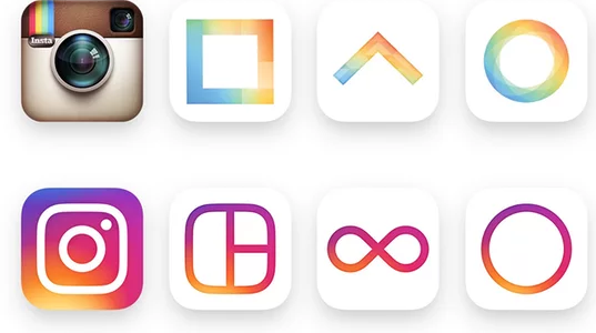
Instagram is currently of the world’s most popular social media channels. In May 2016, a new look and feel was launched. The original retro camera has been replaced with a background of oranges, yellows, pinks and purple with a white keyline of a camera. The design was described by own a Guardian writer as:

“As if the camera was murdered, and chalk was drawn around its body. Murdered at sundown.”

Head of design for Instagram Ian Spalter explained the design as a response to Instagram user evolving from a place to simply share filtered photos to a community platform that is vibrant and diverse.

Instagram Logo Rebrand 2016

Not only did the logo change, but it’s sister apps have undergone a similar makeover; Boomerang, Hyperlapese and Layout have all been given the vibrant look the brand want to evoke.

The infamous Saul Bass once stated “Logos are a graphic extension of the internal realties of a company”. Instagram are using their new logo to speak to their users, without the need for written communication, whether we like it or not.

Netflix

Netflix redesign 2016

Netflix has become the world’s leading internet television company. It nearly avoided a PR backlash in June 2016 thanks to their announcement regarding their “not new logo” and proclaimed the new icon was simply to accompany the current logo.

This new ribbon effect “N” against a black background icon mirrors the current logo and though the ribbon effect is very pleasing, though some feedback is it serves no purpose. And when compared to the negative comments Instagram’s new logo received, Netflix has every right to be feeling good.

Past Rebranding Failures

Gap

Gap Logo Redesign

This rebranding failure haunts us time and again. Remember in 2010 when Gap unveiled their brand new logo. It brought a global attention, for all the wrong reasons. The brand that held a firm identity by its logo for over 20 years had suddenly changed overnight, and no one was happy. One of the reasons the logo failed so badly was thanks to the use of the font. This typeface is so overused, so therefore it failed to create any unique visual appael for the audience to hold onto. After just 1 week, Gap reverted back to their old logo, with a rough estimate of around $100million lost in the rebranding process.

London Olympics 2012

London Olympics Logo 2012

Not every logo design failure is because of a rebrand; some are just terrible designs. For example the 2012 Olympics proved that, and thanks to the rise in social media, failures are now less contained than before. The logo’s intention was by being bold, spirited and some say jarring, it would echo London as a diverse, modern and vibrant city, though the internet had different ideas and the design was alluded to an X-rated image that soon reached viral status.

Logo Design

When a company wants to rebrand who have a massive budget in the multi millions are still failing at logo design, it can put off other smaller companies doing the same thing. It’s important to let your customers know if a change is coming, just incase you shock or disappoint them. Ask this, does your’e redesign need to happen?  Head of design Ian Spalter from Instagram drives this message with his blog post regarding their logo change:

“Brands, logos, and products develop deep connections and associations with people, so you don’t just want to change them for the sake of novelty”.

In summary, if a redesign seems more just self-indulgent, pause and step away, or you risk alienating your customers, but if it’s necessary, then do it properly and hire a professional design / branding agency!

November 9, 2016 admin Logo design Comments Off on Logo Rebrands 2016 

Do You need Pantone colours anymore?

Pantone (PMS) swatchesBack when I was in design college (that’s a long time now), it used to be that every logo had specific colours that were chosen from the Pantone Matching System (PMS). These Pantone, or PMS colours were noted by number which could be 185 red or 545 blue. As a graphic designer, that was one part of the design job: to choose and assign a PMS colour for the brand identity.

But the question is in today’s world, do we still need pantone colours? Now with digital printing it’s easier and cost effective to avoid the traditional offset printing.

Pantone colours were used in offset printing jobs when you print a one-colour or two-colour job. This used to be common for letterheads or business cards . If something prints in 4 colour process (CMYK) whether with your traditional offset printer, or with a digital printer, PMS colours are not used and will be converted in your file. Read this link if you want a clearer understanding of the differences between CMYK and PMS colours.

These days it’s not always necessary for a logo to be designed with PMS colours.

More and more now, clients find it more financially economical to get their artwork digitally printed (4 colour process) rather than offset printed, even if it’s just one or two colours.

This now means, we do not have to select a PMS colour. But no one’s asking should we?

TO ENSURE CONSISTENCY

Consistency of your brand such as your logo is important in helping your’e customers make a visual connection with your brand across all types of media.

Pantone colours are a good way for defining the visual elements of your logo and identity. But this can also be achieved by having your graphic designers indicate your corporate colours using other colour systems such as CMYK, RGB and web colours.

So, it is not critical that there is a specific PMS colour, but there should be specific formulas for the colours that are used in online and print.

TO MINIMISE COLOR CONVERSIONS

When a logo is approved, we provide a library to our clients. A common mistake clients do is use the files in a way that converts the colours back and forth between the different colour systems.

One example is our clients will place a RGB jpeg file in a Word document, but then send it to be digitally printed, which should be a CMYK print. This means that the client’s corporate colours may have started as a CMYK file, then become converted to RGB instead, and then converted again to CMYK.

Every tool that makes this change from one colour to another uses formulas to make this conversion. As a file gets changed over and over the true colour that was specially and carefully picked by the graphic designer can change from where it originally started.

AN EXAMPLE

The example of New England Clean Energy was designed and PMS 300 selected for their corporate blue. It’s important for them to have this logo as a one colour because they use it on many different applications such as signs, print and shirts.

New England Clean logo

But, we their brand identity has been extended beyond just the logo with the use a graphical supporting waves, these are yellow wavy lines that are featured on their web site. Those were initially introduced in a printed brochure. Therefore a CMYK value was selected for the yellow: (0C 0M 100Y 0K). A PMS colour was never assigned because the waves would always be used in CMYK or RGB.

New England Breeze brochure

Every great brand identity should include elements of the corporate identity that go beyond just the logo. New England Clean Energy this included the sky with clouds and waves. But, they don’t need a PMS colour. The CMYK colour was used on printed material, and also the RGB used on the website.

IN SUMMARY

So, do you need to use Pantone colours? No, you don’t, but you should still define the corporate colours in all the different colour systems, just incase the client needs to use any of these systems.


August 18, 2016 admin Blogs, Branding Adelaide Comments Off on Do You need Pantone colours anymore?

Branding Small Businesses

Branding small businesses can be challenging, why? because most brands are associated with larger companies such as Apple, Nike, Coke, Mercedes Benz, just to name a few. But what is branding?

Branding is ‘the marketing practice of creating a name, symbol or design that identifies and differentiates a product from other products.’ It’s what consumers think of your product / image / company.

Branding is how you want your audience and everyone else to view your company. Branding is what your audience can expect from your services or products.

But how do you create a brand?

Step 1. Define your brand

Before you create your brand you must first define it. Work to define the following to focus your brand:

  • Company mission statement.
  • Characteristics of your company.
  • What are our company goals?
  • Characteristics you would like your company to have.
  • Who is our target audience?
  • Mercedes

Step 2. Create a identity through logos and colour

COLOR:

Colour schemes may not seem like a urgent important decision for your brand; but let me assure you that it is. The human mind is extremely responsive to visual stimuli. However, colours play a major contributor in this response, which you may or may not have known.

Each colour can affect your brand differently, there are underlying messages behind each one. The tone and shade of your colours will affect your brand.

Meanings associated with differing colours:

  • Red: Passion, Power
  • Blue: Loyal, Clean, Trust, Peace
  • Pink: Love, Tranquil, Feminine
  • Orange: Energy, Warmth, Excitement, Health
  • Green: Soothing, Money, Nature
  • Purple: Creativity, Royalty, Magic
  • White: Simplicity, Purity, Cleanliness,
  • Black: Power, Sophistication
  • Brown: Outdoors, Masculine, Rural

Starbucks Brand Colours

YOUR LOGO

You need to take your time when creating your logo, with a professional graphic design agency. Your businesses logo is a crucial piece in creating an effective brand in the market place. Think of your logo as your businesses face. Your logo is what your customers will learn to associate with your business and its services or products.

When creating your logo, think for the long term. A good question to ask yourself is ‘what logo would I like to see my business still have in many years to come?’

How you are going to use your logo? On websites, billboards, stationary, vehicles etc? You want to create a logo that is adaptable to each and every possible way.

Step 3. Create a slogan

Just Do It Slogan

What is a slogan? A slogan is a unique phrase that links your name to your brand.

Slogans are tricky to come up with and more work that one might think. But, don’t get so focused on creating the perfect slogan that you just can’t think or enjoy the process!

Instead, focus on what your product or service is that your brand represents, focus instead on the benefits of your services or products. This is what your slogan should ‘say’ to your audience.

Examples of famous slogans:

  • Nike: “Just do it.”
  • Coke:“The Real Thing”
  • LG: “Life’s Good”
  • Apple: “Think Different”
  • Lego: “Play on”
  • Disneyland: “The happiest place on earth.”

Step 4. Integrate your ‘Brand’

Converse Shoes Brand

Your brand is now ready to be implemented into every aspect of your business. Small businesses have a leg up in this area, because with fewer employees comes the opportunity of being more personal with your customers.

You need proper training with your staff that ensures that everyone is on the same page with your brand. Why is this so important? I will explain using an example of a cleaning services business. If the business is trying to portray their brand as being ‘clean’ and ‘professional’, then the employee who is wearing a dirty uniform will confuse your customers.  This is where proper training of your employees will considerably help with any of these issues.

Step 5. Be Authentic and Consistent 

Last and importantly, make sure every communication you send out in regards to your business is consistent and in line with the brand you have created. A confusing brand will deter rather than attract your customers. This is usually done by asking your graphic design agency to create a style guide.

Conclusion

Branding is essential in creating a successful small business. Follow these steps to create a brand that develops the essence of your business and (hopefully) reap the rewards that come along with it. Stick with it. It pays off.

June 15, 2016 admin Branding Comments Off on Branding Small Businesses

Develop an effective brand

Branding is being embraced by small businesses as a means to distinguish themselves from their competition. It takes time to develop an effective brand, both in the creation and the implementation stage. A brand is not created overnight; it is planned, maintained, groomed. Done effectively, the process is well worth your energy.

To explain what a brand is simple, it’s the public image of a business or product. It is a promise. It is reputation. When delivered consistently, a brand shapes consumers’ perceptions and their expectations. A successful brand celebrates personality, values and embodies the spirit of the subject it represents.

The objective of a branding strategy is to develop a clear, compelling and consistent message that is easily conveyed. A good brand contains messages that can speak to a large audience, including it’s current customers, and potential people. This has to be delivered in a short, simple way.

Creating a Logo

Apple-Retro-Logo

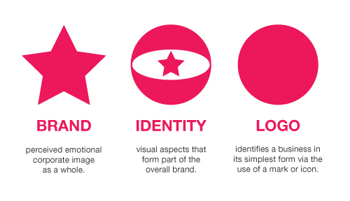
A crucial part of developing a branding is the creation of a good logo, but remember your logo is not your brand. This visual element symbolises the brand, plays a large role in establishing the emotional connection with the product. Integrating the logo into all corporate elements, including PR, information packets, brochures, advertising, videos, newsletters, websites and social media, is a important part of building the brand identity. Consistency in design, look is vital in building credibility.

A important rule for logo design is that it must be able to speak on it’s own. Effective logos should not have to be explained. Take a look at some of the world’s most successful brands: the Nike swoosh, the golden arches of McDonalds, the interlocking rings of the Olympics, the colorful peacock of NBC and the bite out of Apple. Brands & a strong visual identity helps this happen.

Investigating a Brand Identity

Branding Identity Logo Design Explained

It is easy to hire a graphic design agency and writer to assist in the creation of your brand. Significant time, money and energy will be lost if a well thought out plan isn’t planned first. The first place to start is with a SWOT analysis. When evaluating your Strengths, Weaknesses, Opportunities and Threats to your company, it is important to be honest.

A thorough review of your business should include what it will accomplish, how the products and services will be delivered, why it even exists and what it makes it different from your competitors. Also consider the target audience, what their concerns are, and how the business can help them. Be careful not to quickly reject an idea as ridiculous during this brainstorming phase.

When the list is at a point where it can be narrowed down to the three best ideas, a focus group should be put together to gauge their perceptions, reactions, misconceptions, feelings and opinions. A another focus group of staff and members, as well as current customers, should also be gathered.

Building a Branding Strategy

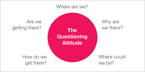
Questioning Attitude

Negative feedback about products and services should be considered when developing the branding strategy. Make a list of the current public perceptions, then take a critical look at how those beliefs can be repositioned.

At the very least, the focus groups opinions should drive the final branding position statement. Around one to two paragraphs, this statement must embody who the company is and what it delivers differently. From these sentences, sound bites that can be incorporated any time someone speaks or writes about the business.

Once this is done, visual and textual elements can begin the development stage. These should reflect the personality and values of your brand, but also match the interest of your target audience. For example, if a skateboard company wants to attract a young and hip audience, the messages, fonts and artwork should be playful and outdoorsy. In complete contrast, a retirement house needs to build a more subdued brand in order to portray an image of trust and peace.

Utilising a Slogan

M&Ms-Melt-Hand

A slogan should be developed to define the business to its audience. When a customer hear a slogan, they should immediately think of its associated company. For example, when someone says, “Just do it,” the first thought is Nike. Other large corporations have been extremely successful with these tactics, including M&M’s “It melts in your mouth, not in your hands”.

The objective is to keep the slogan simple and easy to remember. Being clever is only considered if it doesn’t confuse the message. It also has to be short since the slogan is typically incorporated into the logo design, as well as all collateral marketing pieces.

As the brand is implemented, it is important that everyone affiliated with the business is able to convey the brand messages. Each person who represents the company is a brand ambassador, from the CEO, to the sales manager, to the receptionist, to the staff.


May 23, 2016 admin Brand Identity, Branding, Branding Adelaide Comments Off on Develop an effective brand

Why a professional logo design doesn't cost $99

Professional Logo design today is totally under rated. People do not understand how important a good logo is and how valuable it is to their business. We are going to outline some very important points explaining to you exactly why logo design should not cost $99, and why your logo is not something you should ever take lightly.

We will do this by comparing “cheap logo design” to “professional logo design” and we will outline the reasons why professional logo designers don’t charge low fees and why you should invest in a professional logo design.

What Is A Logo?

To really understand what a logo must achieve, we first must know what a logo is. A logo’s design is for immediate brand recognition, it inspires trust, admiration and loyalty. A logo is one aspect of a businesses brand, or economic entity, its colours, shapes and fonts usually are different from others in a similar market. Logos are also used to identify business.

It makes us so frustrated as to why some people have no logo, or why they would even bother with a getting a cheap logo designed if a logo is meant to do all of these things.

Spec Work

No Respect

Before we get into comparing cheap vs professional logo design I want to talk to you a bit about SPEC work. “Spec” has become the short form for any work done on a speculative basis.

For example. If you design this for me, I will pay you if I like it. – This is clealry not right.

To explain, let’s create a scene in another industry where SPEC work does NOT exist.

“I went for a dental check-up the other day. After the dentist finished, he suggested I need some work to prevent further tooth decay. I told him to go ahead, and if the dental work to my satisfaction, I’d be more than happy to pay. He responded that he wouldn’t be able to do that, because he normally provides a service when a fee is agreed upon up-front. I said I’d let him know after I checked in with other local dentists.”

This sort of thing happens in the design industry every day and is ruining the design industry. A designer should not have to invest time and resources with no guarantee of payment much like a dentist or any other professional.

Check out these comics below about Spec Work, they are very amusing.

  • Freelance Freedom 1
  • Freelance Freedom Comic 2
  • Freelance Freedom Comic 3

Cheap Logo Design

What quality can you expect for a logo in between the $5 – $200 price bracket. Have a look at the following link $35 logo design contest that was held on Digital Point Forums.

The “brief” for the logo design was

“MAKE A LOGO FOR THE SITE ‘SPELA PIANO’. THE MEANING OF THAT IS PLAY PIANO. THIS IS A SITE WHERE OUR MEMBERS CAN LEARN TO PLAY PIANO ONLINE.”

Below you can see the concepts from the contestants, which one do you think won?

$2.50

You will notice that nearly all of the logos above use free standard issue fonts and don’t assign to the rules of what makes a good logo. Ie. memorable, effective, describable and scalable.

Ask yourself the following questions to the contest logos above:

  • How many of the logos can you describe or remember?
  • Do you think these logos are effective without colour?
  • Are they scalable enough?
  • Do they gain immediate recognition of what they are?
  • Do they convey the company’s character or personality?
  • Do they relate to your clients by conveying a feeling of credibility?
  • Do they have association with quality?

Professional Logo Design

Professional Logo Design

Now compare these professional logo designs and answer the same questions as above….

Can you any difference?

Why are they so different? Because professional logo designers have a process that involves research and conceptualising and this is why they do not charge $99.

The design process of a professional logo designer usually consists of:

  1. A Design Brief: This is a questionnaire and interview with the client to create a design brief.
  2. Research: Conduct research focused on the market itself, on its history, and its competitors.
  3. Conceptualising: Develop logo concept(s) around the brief and the research.
  4. Reflection: Taking breaks throughout their design process. This lets ideas mature and get them renewed enthusiasm and get feedback.
  5. Presentation: Choose whether to present only a select few logos to the client.

Do you believe doing all of that costs $99?

On that note, did you know that the software used to make the logo is around $2,000 in itself,  let alone the computer or the costs associated with essentials… i.e. paper, ink and an internet.

More Reasons

Here are some more responses from other designers on reasons why logo design does not cost $99.

  1. A logo is the first impression your customers get of your business.
  2. A logo needs longevity, it should stand the test of time.
  3. A logo needs to be original (not a copy from somewhere else).
  4. A logo should look professional.
  5. A logo should reflect the business.
  6. A logo is the starting point of your corporate image.

Now look back at those $99 logo designs to see they follow the above points.

How much does a logo cost?

This is the most frequently asked question, and as we say to all our clients it is the hardest one to answer without more details of the project.

The cost of a professional logo design is a question that cannot be easily answered as every company has different needs, the best way to approach this question is to draw up a customised quote for each individual. This is how we approach it at DesignLab.

A number of facts have to be taken into consideration when designing a logo, i.e. how many logo concepts, how many changes are required, how much research is needed, the size of the business, does the business need corporate stationery (such as business card or letterhead design).

The best way to find out how much a logo design will cost is to get a quote from the design agency.

Is Time To Invest?

Isn’t it about time you invested in a professional logo design?

You can can get a free quote by calling Spiros on 0431 926 575 or email us at info@designlab.net.au


April 4, 2016 admin Graphic Design Adelaide, Logo design Comments Off on Why a professional logo design doesn't cost $99

Posts navigation

1 2 3 Next
Recent Posts
  • Content Relevance for SEO
  • Can you have too many backlinks?
  • Benefits of heat maps
  • The benefits of SEO in link building
  • Why are we addicted to social media?
Categories
  • Animated Video
  • Blogs
  • Brand Identity
  • Branding
  • Branding Adelaide
  • Business
  • Digital Design
  • Events
  • Future
  • General
  • Google
  • Google Plus
  • Graphic design
  • Graphic Design Adelaide
  • Identity
  • Illustration
  • IT
  • Logo design
  • News
  • Online security
  • Photography
  • Podcasts
  • Print Advertising
  • Science
  • SEO
  • Signage
  • Social Media
  • Tips & Tricks
  • Typography
  • Uncategorized
  • UX
  • Video
  • Video Production
  • Web
  • Web design
  • WordPress
Who are we

We work with every one of our clients to develop and grow new and inspiring brands and refresh existing ones. Creating unique and individual visual identity. We hope that fresh approach to each client’s needs is demonstrated here in this showcase of our graphic design work.

CONTACT US

Suite 4a/134a The Parade
Norwood SA 5067
Australia

Phone: [+61] 0431 926 575
E-Mail: info@designlab.net.au
Web: designlab.net.au

ADDITIONAL LINKS

About Us
You’re In Good Hands
Services
Branding Adelaide
Graphic Design Adelaide
Our Blogs

Copyright. All rights reserved.