Logo Design Trends 2016
Logo design is constantly changing as businesses can now engage consumers in a number of digital ways. The frequency of engagement is increasing at a rapid rate, while the quality of engagement has become more inclusive, more personal.
The rules (so to speak) that worked before no longer count in today’s modern technological world. In fact, what has held true for the last couple of years is no longer the same. The art/ science of logo design is changing as fast as the “opportunity to engage consumers” grows. This “opportunity,” is changing as fast as technology develops everyday.
Fortunately, there are many designers who dedicate themselves to studying changes, establishing trends in logo design. An example is Bill Gardner of the LogoLounge (read the interview here), he remains one of the most credible sources. His observant eye and attention to detail, as well as his innate “radar” to detect design approaches fast becoming “trends”, is what sets him apart.
So what will logo design be like in 2016, or in the near future? Here are some logo design trends that are predictions.
Logo Design Trends 2016 Prediction : Flat
Flat logo designs will continue to dominate, and not because they look clean, but they register well in any browsing device, especially due to SVGs. They load a lot faster also. Patterns, textures, shadows, gradients will give way to simpler lines and colours. These register better in print or online, in black, grey or colour, and on any browsing device. Businesses will simplify their design elements making them easily identifiable.
Logo Design Trends 2016 Prediction : Handmade
Handmade logos speak of personality. They convey intimacy and personality. This trend has been slowly gaining ground for a while now. A small sketch of an arrow, or scribbled letters prominently combined with some other elements have been evident in a growing number of businesses logos. Some look like “hybrids.” They’re the ones that don’t look “truly” handmade but they don’t feel digital either. Such designs suggest the idea of being handmade and they register the same charm, though not on the same level.
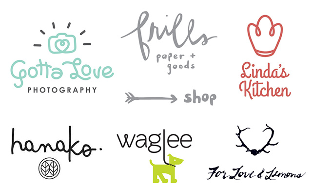
Handmade elements and font sets, or a suggestion of such, will be more evident in logo design as the year progresses. Bespoke font sets will be a valuable design asset.
It is important to emphasize that typography is no longer just the style of text you add to the design to spell out something. It is, and will always be, a great contributor to communicating the brand’s personality.
Logo Design Trends 2016 Prediction : Kinetic Logos
Kinetic logos that change but remain the same will find greater appeal. Perhaps because this particular style offers freshness, or it could be because the decision of what is attractive becomes even more appealing, while the need to connect to as many people as possible becomes the main focus.
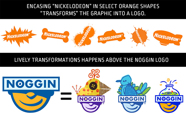
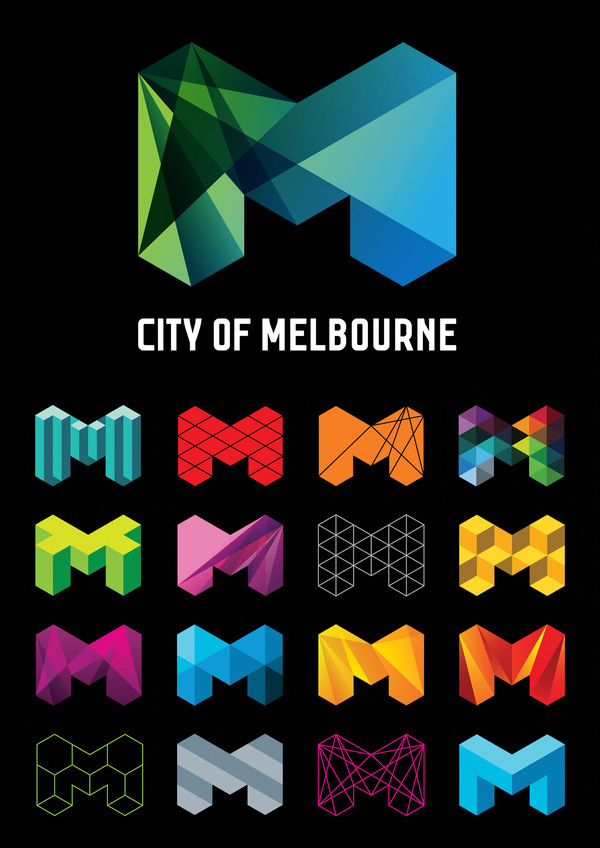
These types of logos have the ability to make the consumer unconsciously aware of the diversification the company and brand is pursuing in real-time. The danger lies when the “kinetic” change does not rhyme with the core values the company has effectively communicated and has established for itself.
For example think of the regular changes in the Google Doodle, you get the idea of how this growing trend both excites the consumer and answers the need to present something fresh on a regular basis.
Logo Design Trends 2016 Prediction : Negative Space
Negative space will ALWAYS continue to amaze me. A design is something you see first, but then it speaks to you, and then you understand what it is saying. That is what makes design work. If it is able to convey more than this, and the consumer is able to pick up on a deeper message, it becomes something special. This is why negative space will continue to make many designers explore its strengths.

The ability to communicate more to the consumer without adding extra elements is always a challenge to any designer. To the public, it’s like a welcome visual “egg hunt.”
Logo Design Trends 2016 Prediction : Letterstacking
Letterstacking is continuing to hold ground. This trend has been around for a while and it’s not losing popularity. We think it because it draws in the consumer and challenges them to make sense out of it.
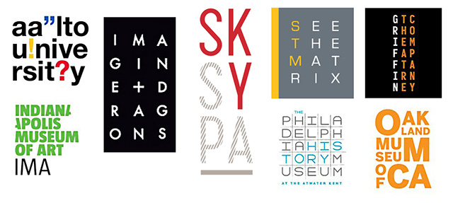
Our tendency to break down things and discover how we can rearrange them better is not the reason for this continuing trend. We think it may be because it offers a creative solution for logo designers to be able to communicate long “text” in visual bytes. It offers them a creative way to break down long messages. Whatever the reason may be, the style seems to work and has gained a foothold in logo design.
Logo Design Trends 2016 Prediction : Mono Lines
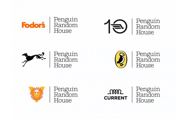
Thin Lines/Mono will present itself as “the new fresh, clean look”. This is the use of a line, unchanging in thickness, to design and compose the entire logo in something akin to “wire”. At first glance, this logo design style seems to run against the idea of simplification because of the intricacy of the execution.

It will result in an appreciation of the ability to present something cleaner and clearer, with a hint of craft (handmade). This makes it more in line with the above mentioned forecasts rather than against them.
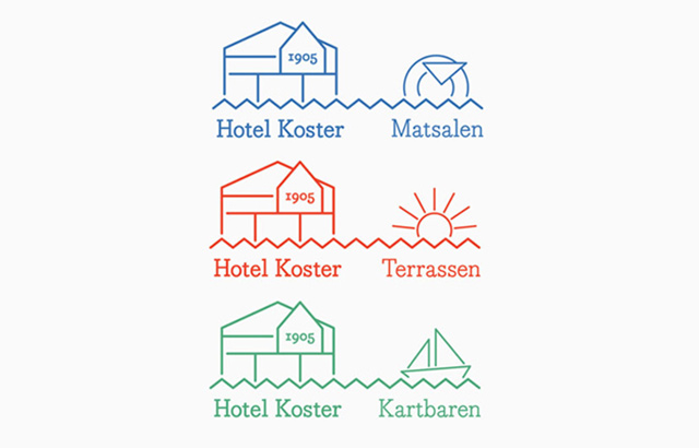
The clean thin lines do strike you with an “honesty” so to speak, that is quite refreshing. It presents a welcome from seeing so many gradients and colours in the last years. The use of thin lines, or lines with a consistent thickness in mono scripts, mono icons and mono crests, is a beautiful progression of just how strong this design trend has been growing over the few years.
In Conclusion
Trends are forever changing, so what it is now, does not necessarily mean it will be the same for years to come. One thing we all know, are trends come around full circle after many years. All the above design trends we mention are not new ones, they have been around for years, but are now popular this year. One thing which is always constant in logo design….simplicity. All the above trends have this in them, which for designers is a blessing.