Why-are-we-addicted-to-social-media

Why are we addicted to social media?

Social media is so engraved in our daily lives these days that we are ourselves are becoming a brand. We need to understand the psychology of social media and use that knowledge to bring our customers closer, give them more of what they want, and create better relationships. 

Is-SEO-Framework-the-new-Yoast?

Is SEO Framework the new Yoast?

There are a ton of WordPress Search Engine Optimisation (SEO) plugins on the market, but only a few of them have really made an impact. There are plenty of other excellent plugins to choose from, one that’s been making a lot of noise is The SEO Framework.

facebook-ads

Creating Effective Facebook Ads

Many startup and small businesses have had an attempt at creating effective Facebook Ads,  as part of their marketing strategy, but most of these businesses have no idea how to effectively use Facebook Ads (all you are doing is helping boost Facebook’s stock price).

What is Brand Monitoring?

Brand monitoring is an important yet often overlooked aspect of online marketing. For a company to remain competitive, their business must analyse and refine it’s brand to ensure it’s delivering on the promises of what it stands for.

Advantages Working with a Small Boutique Creative Agency

For a long time now big brands have worked with big creative agencies to work on their marketing, but lately what these big brands have found is they have top-heavy processes, people and systems. But lately there is a move towards a small boutique creative agency that can work more closely achieving your goals – at a fraction of the price.

Why SEO and Searching is important

When someone starts a search, they are starting a journey. Digital Marketers love to talk about something named “the consumer journey”, which is a fancy word of referencing a user’s direction from inception of their task to the end – and these journeys start with a simple search.

Why video testimonials boost your SEO

Some will tell you that the key to success is hard work, but if you don’t have anyone vouching for the hard work you put in then you’ll find yourself going round and round when it comes to proving your values to prospective customers.

Hello world!

Welcome to our blogs. Have a read through and let us know what you think.

A quick guide in becoming a UX designer

UX-Designer

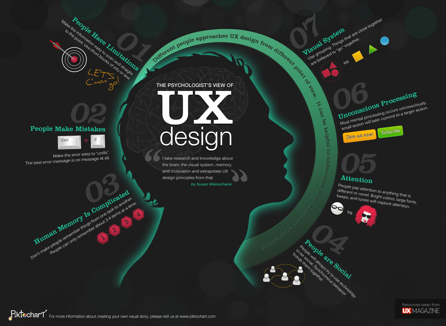
It seems more and more these days in a competitive market the importance of a UX designer is becoming more important and essential if any business wants to succeed.

The role of a UX designer is to be the voice of the user. The goal of UX designer is to make the experience of using the product or a service as easy as possible.

To achieve this UX designers must put themselves in the shoes of the customer, analyse the process they go through, and then come up with solutions to make the process easier by testing them with the end user.

Here is a a Four step process

UX design really is a simple process:

  1. Research  —  2. Analyse — 3. Design — 4. Test

Each step can be expanded on or each step can be bypassed depending on what the project is.

Step 1. Research

Start with the business

First, you need to understand what the business needs are, tip: Business needs rarely ever align with their user needs, and that’s good because our role is to fix that.

Start by asking key stakeholders what they want to achieve, and what metrics they are trying to target.

Hold a workshop and gather all the information you can.

Talk to the real users

First find out who the users are then divide them into groups.

Organise interviews with some people from each of the groups. Take notes and possibly bring along the designer who will be working on the project  so they get first hand experience of the users needs. Make it count, everything you say and do from now on will be based on this research.

Step 2. Analyse

This is where you take all your interviews and convert it into something you can use. Usually you would make personas or journey maps, but any kind of output can be used depending on what you need.

Personas

Take all your interviews and mark out the trends.

Take each question and mark it on a slider, happy on one end, and  frustrated users on the other.

You will see some trends on the sliders, the same users will possibly be clumped together. You can then create personas for all the users in that trend and write a story based on real stories.

Personas can be visual, you can use infographics to summarise their behaviour, wants and motivations.

A UX designer may often use personas to make lists of things they need, we call these jobs to be completed’. The job to be complete is what we need to simplify to help the user achieve their goal.

Journey maps

Map out the whole journey the user will take, from before they even get to your site to when they leave the site and possibly someday return.

Take the user interviews and map them onto a timeline, use genuine quotes to show if they are happy or frustrated with the experience.

A bad experience can be named ‘pain points’. Your role is to fix those pain points.

For each pain point you come up with a small brief for what you need to do, we can call these ‘how might we’ and write down what we need to do in order to improve the experience for the user.

A journey map can be printed on and placed on a wall, and are useful for the entire group to see what areas the experience need improving.

Step 3. Design

Pull out some pens and paper, and start sketching experiences that would exceed the users needs. This is the most fun part of a UX design and ideas are best shared between people.

The quality of the sketches don’t matter. You need to do some sort of mapping, like a sitemap, storyboards, user flows etc. the idea is to show other people on the teams the experience users will have in a way they will understand.

Spend time talking through your work with anyone joining the project as it can be very hard to understand any outputs from a UX designer, keep it simple or else no one will use any of the research you gathered.

Step 4. Test

Last step, make a prototype of your answers.

Designer or develop the prototype to be as close to the real thing.

Test the prototype with users, this is called ‘user testing’. Use your personas to help you test if your new experience is better and what still needs fixing.

If you can, use the same users from the user research you did and conduct your testing, this will give you good feedback on your new solution.

Then make it real, and test it again when it’s live.

In Summary

The reason a UX designer can have so much say in a business and get paid really well is because they are responsible for connecting the users needs with the business needs.

UX design is still relatively new, there is no right or wrong way of doing things.

Keep sharp, most of what a UX designer does is pick the right processes for the right job.

Why Sliders Are Not Good for your website

Sliders are not good for your website. At the time of this writing which is middle of 2016, sliders are the most widely used element on website home pages. There are hundreds of slider plugins for WordPress, which are being downloaded by the millions.

How Widespread Are Sliders?

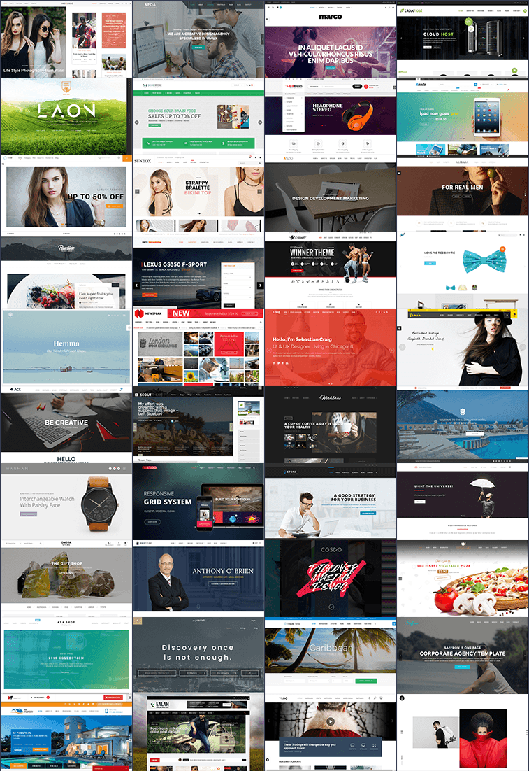
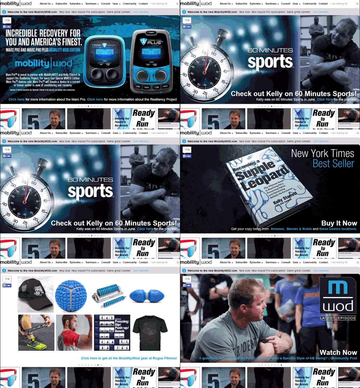
It seems that sliders are EVERYWHERE these days. If you’re in the market for a new website, carousels are unavoidable. Here’s a simple illustration of what I mean:

sliders

This is a gallery of the above the fold space on a number of randomly selected websites.

Out of these examples, only 3 do not have a slider on the homepage.

While it is possible to find a website that doesn’t feature a huge slider at the top, it is certainly a lot easier to find sites with a veritable carousel abundance.


Sliders: The Proof is in the Pudding

Whatever you think about how sliders look if the slider doesn’t help move your visitors towards your conversion goal.

There’s a a lot of stats that prove sliders having a negative impact on conversion rates. Here are some highlights:

Here’s what some experts in the fields of conversion optimisation have to say about carousels:

“Almost all the testing I’ve managed has proven content delivered via carousels to be missed by users. We’ve witnessed the banner blindness concept in full effect.” – Adam Fellows

“It gets ignored. It’s distracting. It’s confusing. It squeezes out relevant content. It slows down your site. It causes global warming.” – James-Royal Lawson

“Rotating banners are absolutely evil and should be removed immediately.” – Tim Ash

Actions Really Do Speak Louder Than Words

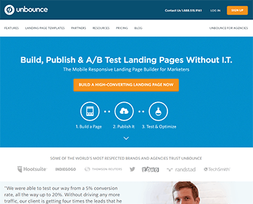
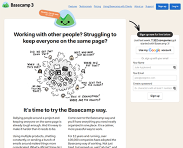
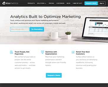
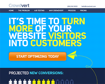
It is very interesting to see who does and doesn’t use sliders. Look at websites run by businesses who are known for a lot of testing and optimisation. For example:

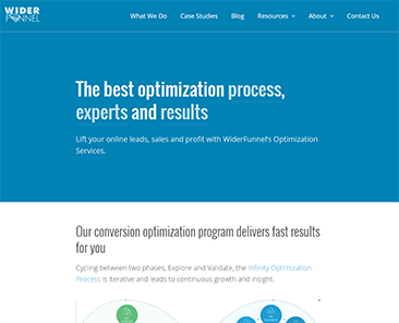
Crowdvert

All these websites are run by people who live and breath testing and conversion optimisation – and none of them have a single slider.

Do Sliders Really Suck?

If you still don’t believe us then dig deeper into this topic, we encourage you to read some of the posts I have linked. They include studies and ideas about what makes sliders such a bad UI element.

One of the biggest issues I have with sliders is easily demonstrated below like this one:

Look at the example and read each slide. The text that appears try to understand what’s being offered for each slide. As soon as you do this, you’ll notice a major problem.

With any one of these slides, a couple of things apply: you’re either interested in what’s on the slide or you aren’t.

If you are interested, then the content is gone and replaced by some other slide before you can read it.

If you aren’t interested, then you’ll probably scroll down before the second slide even appears. When was the last time you stared at a website for 10 seconds, even though it contained nothing that caught your attention?

The main culprit that makes sliders and carousels suck is the auto forwarding or automatic rotation.

Hero to the Rescue?

So if the auto-forwarding that make a carousel so bad, the solution simply is to make a slider not move?

It’s better, but still not ideal. An example of this is a currently very widespread web design element: the “hero image”.

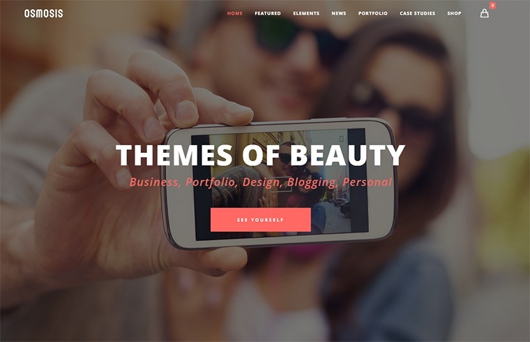
Here’s an example of a couple:

This kind of layout is dubbed a “watermark homepage”. Its defining feature is a large image with some text (and maybe a button).

Though visually striking, is it it effective?. There are two major flaws I see with most of these types of layouts:

  1. The image is generic. Because of the layout, the image almost has to be generic. The problem is that unless the image really adds meaning to the page, it’s just a waste of real estate and bandwith. And if the image is highly relevant and specific, then it probably shouldn’t be in the background.
  2. The image takes up all of the available above-the-fold space. This pushes all your important content too far down the page and it also means that some of your visitors won’t realise that they can actually scroll down to find out more.

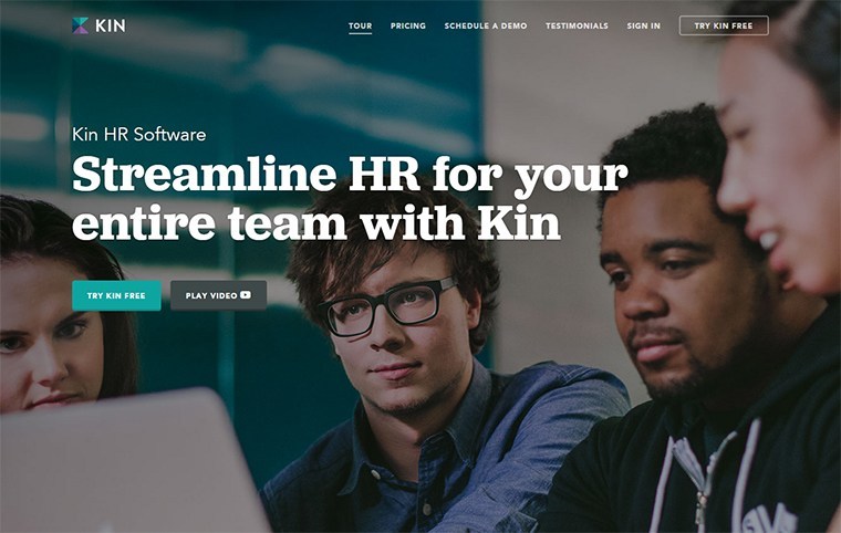
But here are some good examples:

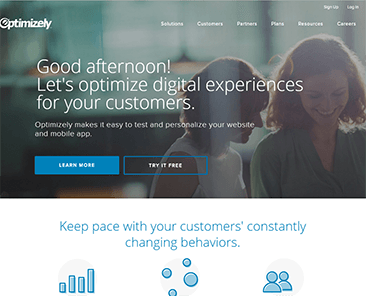
The image tells a story that is relevant to the product, there’s enough text above the fold to compel further reading and it’s obvious that more content is below the fold.

Hero images can be effective if you avoid those generic ones, give the users a clear signal to scroll and don’t use short bad headlines.

What’s the Alternative to a Slider?

If rotating sliders are so bad, and the hero layout fails too, then what is the best solution to a large slider?

Well, there is no one-size-fits-all solution and that’s why doing your own research is vital.

Here are three types of layouts you can use as inspiration for your website.

1) The Big Headline

To convey the value to your offer, text is more powerful than images. Text loads faster also and gets recognised and read faster by your visitors.

This means, the first and most important thing you need on any page on your website is an un-missable headline.

The headline should communicate your unique selling proposition, and it should arouse curiosity that can only be satisfied by reading further.

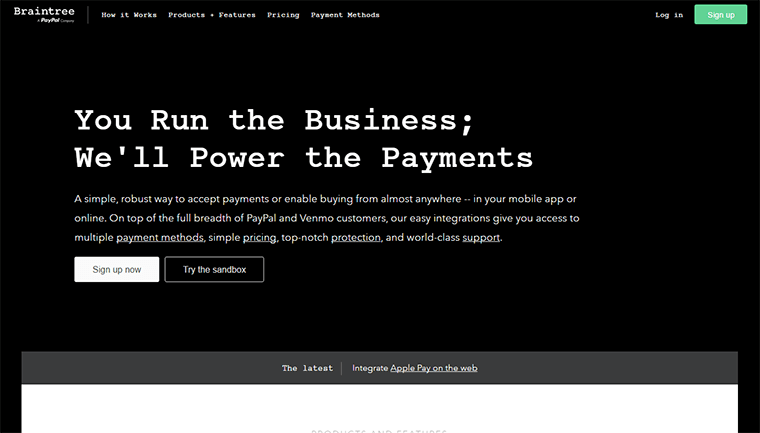
The example below from Braintree Payments shows that a big headline is sometimes the only thing you need.

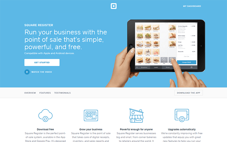
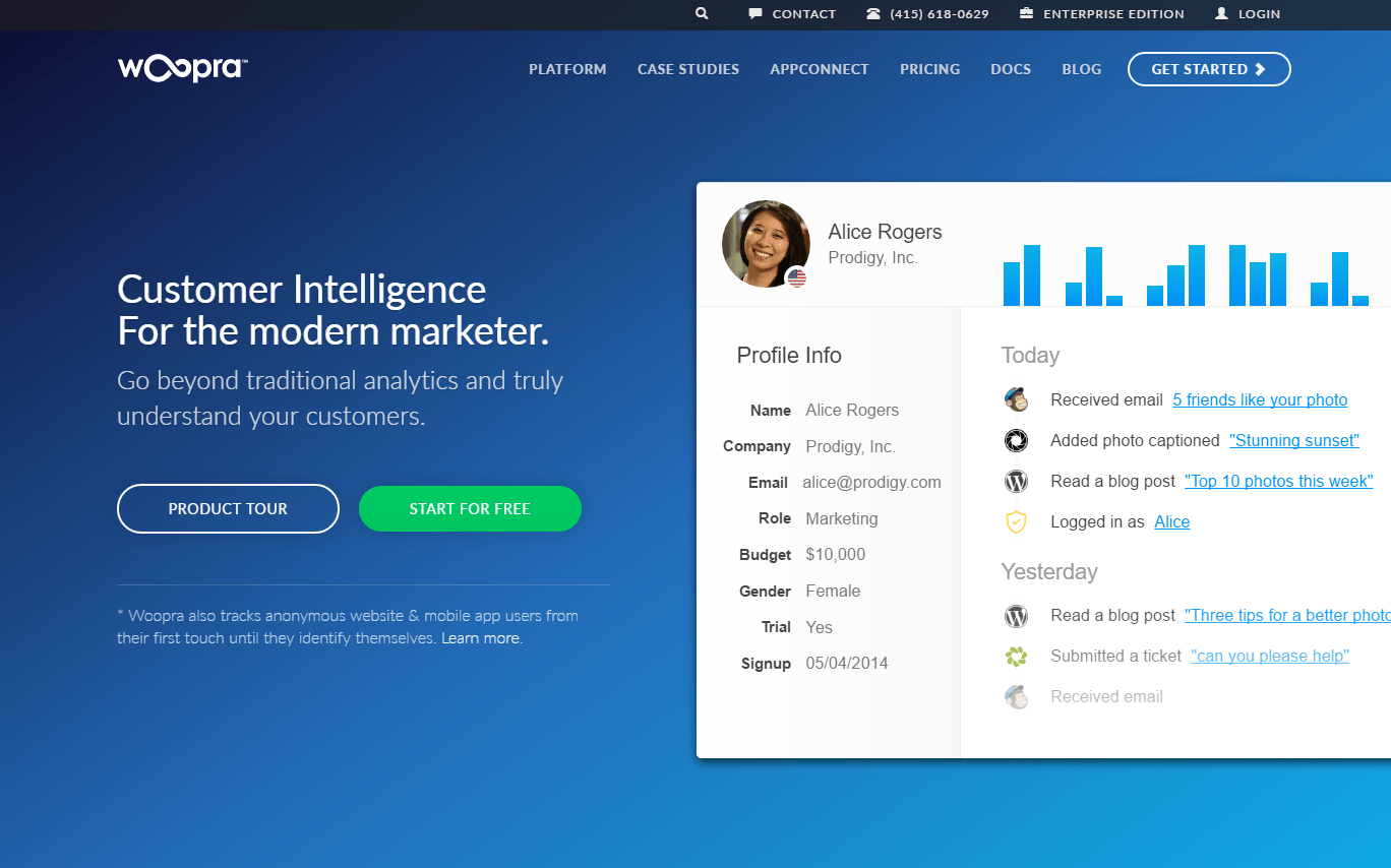
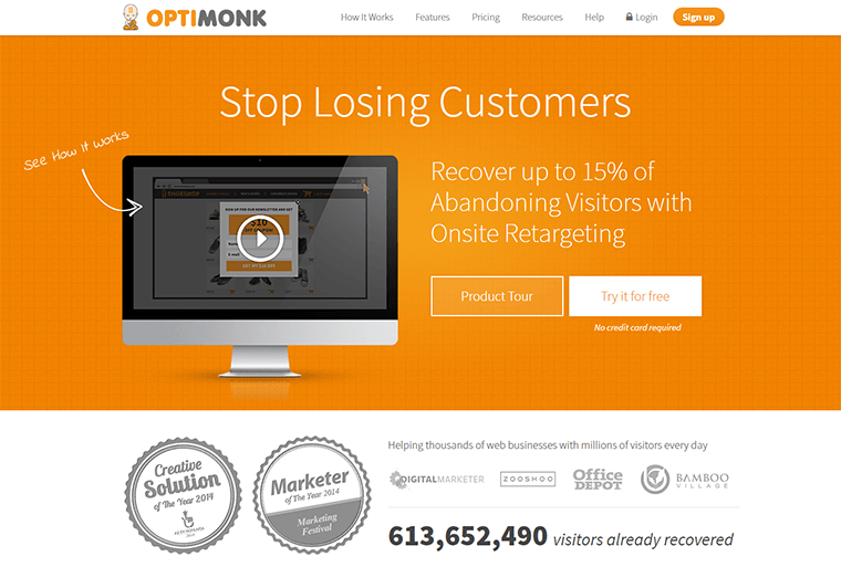
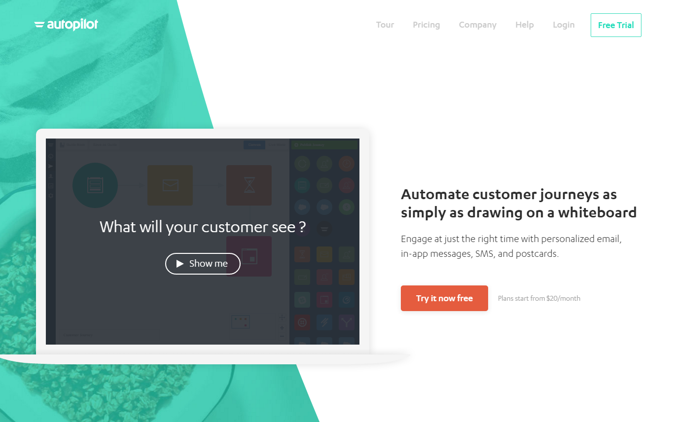
2) Side-by-Side

This layout consists of two columns. One column is for a image that represents your product, the other contains a headline and usually text and a button.

This layout is a great example to communicate what your business is about, it does not use up too much space. The great thing about this layout is that it puts a lot of focus on the image without letting it overwhelm the text portion.

Examples of Side-by-Side:

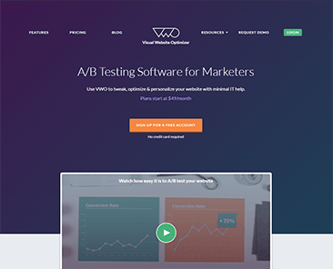
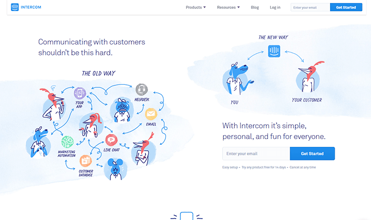
The homepage shows a large screenshot that shows off their software, next to call to action headline.

3) Click Play!

Video is an effective way to grab your customers attention straight away. A video should not replace your main headline or your call to action, but it can be the star on the page.

You can communicate a lot more with video rather than just an image.

Examples of Video Homepages:

4) Figure of what works Best for Your Message

Let’s stop, and take a step back and talk about sliders.

What’s the purpose of your’e page?

It needs to communicate the right message to the right audience.

If your page fails to do this, you’ll lose the majority of visitors quickly.

The bottom line is that you should do whatever is best for your audience.

Talk to us at DesignLab to see how we can help your website work better for your customers!