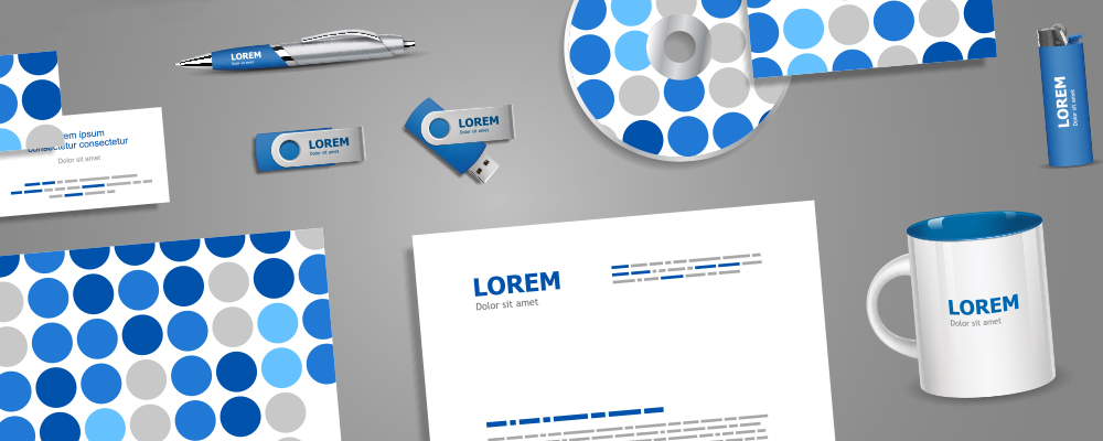
Over the last couple of weeks we have talked about the importance of business stationery, and how business cards are such an essential part of selling your brand. Today I want to discuss the importance of letterhead design.
Why your letterhead is important
Your Company logo
Your business has a logo for a reason. This logo will define and identify your brand, and will help your customers to recognise you. So by putting your business logo on your stationery you expose your brand and what it stands for, in turn giving you a far greater brand awareness in your industry and among your customers.
It backs up your brand
Every business wants its customers to know that it offers the best service or the most affordable products, then your letterhead therefore needs to reinforce your brand message.
If your brand is all about providing a professional, bespoke service (for example) then you should make sure that your letterhead reflects this, whether that’s with a clean design, or by colours and fonts. Once you’ve chosen the particular identifiers, make sure to stick to them across all of your business’ communication for consistency.
It shows legality and authority
Not only does your business letterhead present who you are, which helps to identify your brand; but it should also be used for all official documentation. It reinforces your brand’s authority and gives the remainder of the letter credibility.
What makes a good letterhead design?
Clean and simple
Your letterhead should be easy to read, so it’s important for it to be a clean and simple design. Your letterhead should consist of your logo and any contact details.
Contact details
It’s important that your customers can contact you by looking at your letterhead. This means ensure your contact details are relevant and up to date.
Two font rule
Now this is in the eye of the beholder, but we feel you shouldn’t use any more than two fonts in your letterhead design. Try to choose a font which reflects your logo. You may decide to use a specific typeface for all of your marketing communication.
Company colours
You should make sure that your letterhead contains any corporate colours from you logo. A business which sells items specifically related to food for example will likely opt for green and red, rather than purple, it’s simple logic.
Good examples of successful letterheads
Below is a look at some examples of what we think is successful letterhead designs. Just remember as long as you include the right information, and keep any design consistent with your brand’s identity, you can’t go wrong.
Simply in the shape of a comb, this works great for a barber shop.
Choosing a corporate colour must have been a bit of a no brainer with a name like Redbrick.
If you want to chat to DesignLab about how we can help with your business stationery in Adelaide, call Spiros 0n 0431 926 575.


