Why Sliders Are Not Good for your website
Sliders are not good for your website. At the time of this writing which is middle of 2016, sliders are the most widely used element on website home pages. There are hundreds of slider plugins for WordPress, which are being downloaded by the millions.
How Widespread Are Sliders?
It seems that sliders are EVERYWHERE these days. If you’re in the market for a new website, carousels are unavoidable. Here’s a simple illustration of what I mean:
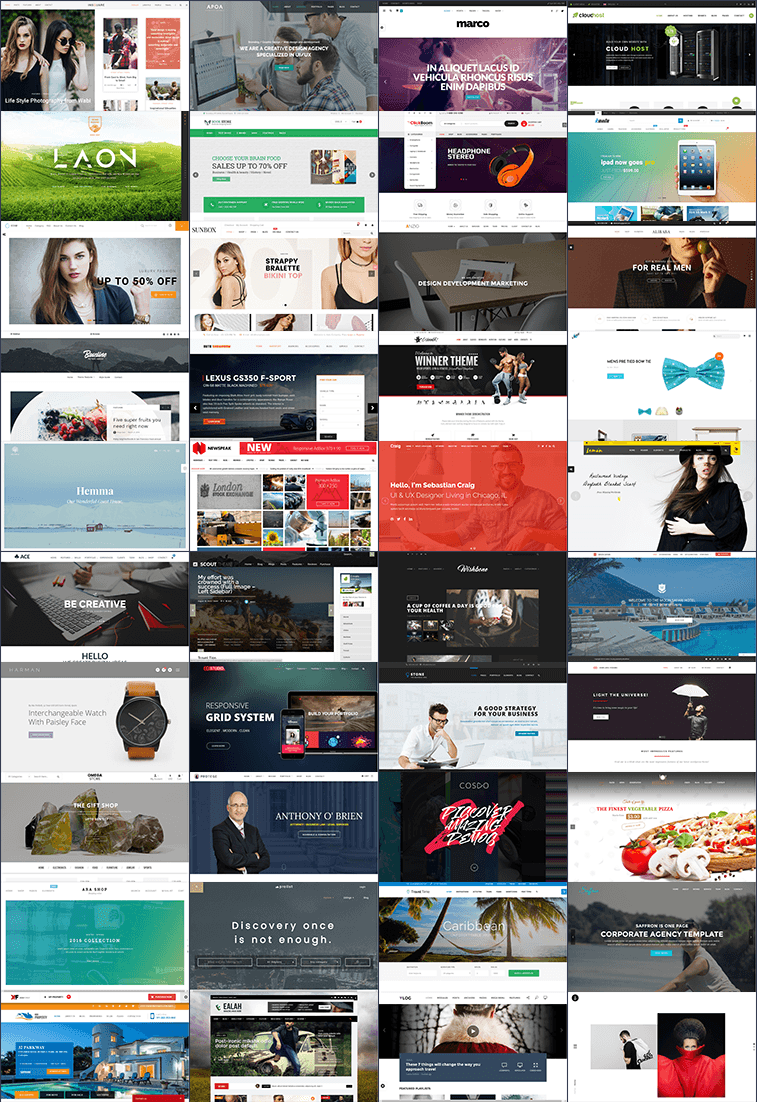
This is a gallery of the above the fold space on a number of randomly selected websites.
Out of these examples, only 3 do not have a slider on the homepage.
While it is possible to find a website that doesn’t feature a huge slider at the top, it is certainly a lot easier to find sites with a veritable carousel abundance.
Sliders: The Proof is in the Pudding
Whatever you think about how sliders look if the slider doesn’t help move your visitors towards your conversion goal.
There’s a a lot of stats that prove sliders having a negative impact on conversion rates. Here are some highlights:
- Jakob Nielsen said that sliders are either ignored entirely or, if they aren’t, are perceived as annoying by users.
- Erik Runyon tested a slider on ND.edu and saw abysmally low click-through-rates.
- SearchEngineLand states the awful click-rates, and also goes into details on reasons why sliders negatively impact your site’s SEO.
Here’s what some experts in the fields of conversion optimisation have to say about carousels:
“It gets ignored. It’s distracting. It’s confusing. It squeezes out relevant content. It slows down your site. It causes global warming.” – James-Royal Lawson
“Rotating banners are absolutely evil and should be removed immediately.” – Tim Ash
Actions Really Do Speak Louder Than Words
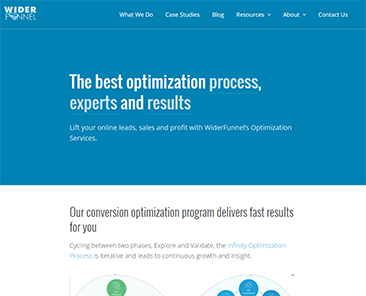
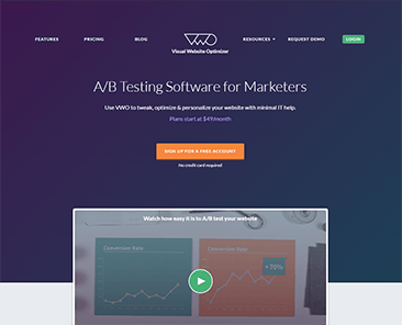
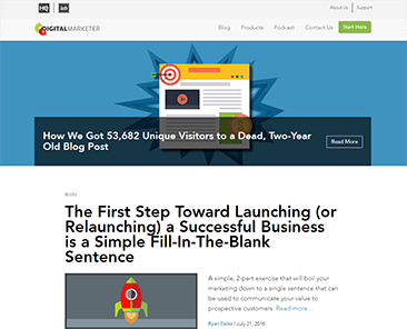
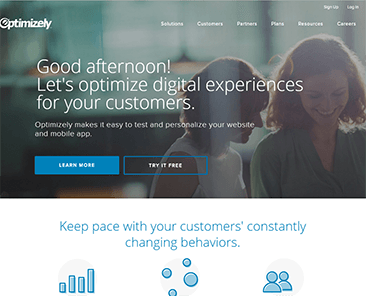
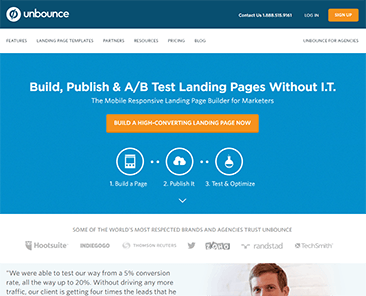
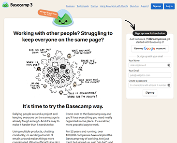
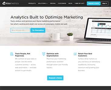
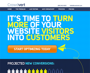
It is very interesting to see who does and doesn’t use sliders. Look at websites run by businesses who are known for a lot of testing and optimisation. For example:
All these websites are run by people who live and breath testing and conversion optimisation – and none of them have a single slider.
Do Sliders Really Suck?
If you still don’t believe us then dig deeper into this topic, we encourage you to read some of the posts I have linked. They include studies and ideas about what makes sliders such a bad UI element.
One of the biggest issues I have with sliders is easily demonstrated below like this one:
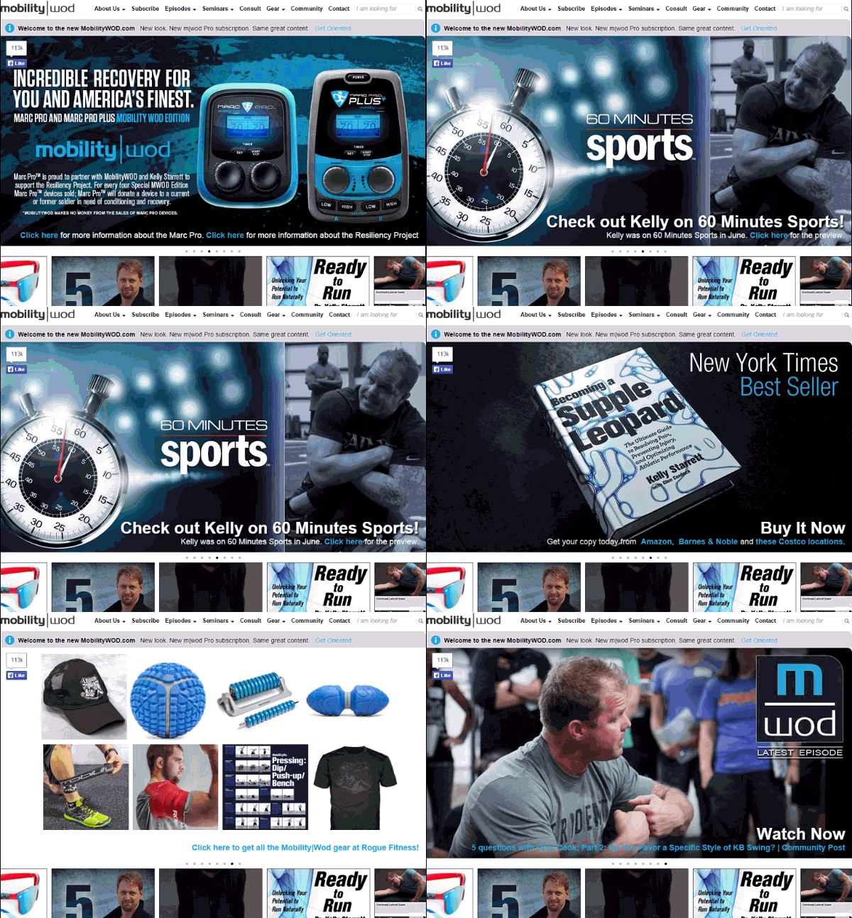
Look at the example and read each slide. The text that appears try to understand what’s being offered for each slide. As soon as you do this, you’ll notice a major problem.
With any one of these slides, a couple of things apply: you’re either interested in what’s on the slide or you aren’t.
If you are interested, then the content is gone and replaced by some other slide before you can read it.
If you aren’t interested, then you’ll probably scroll down before the second slide even appears. When was the last time you stared at a website for 10 seconds, even though it contained nothing that caught your attention?
The main culprit that makes sliders and carousels suck is the auto forwarding or automatic rotation.
Hero to the Rescue?
So if the auto-forwarding that make a carousel so bad, the solution simply is to make a slider not move?
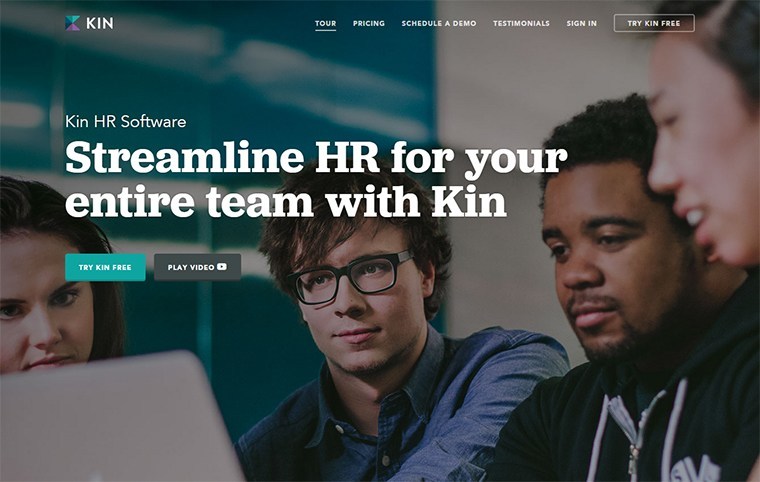
It’s better, but still not ideal. An example of this is a currently very widespread web design element: the “hero image”.
Here’s an example of a couple:
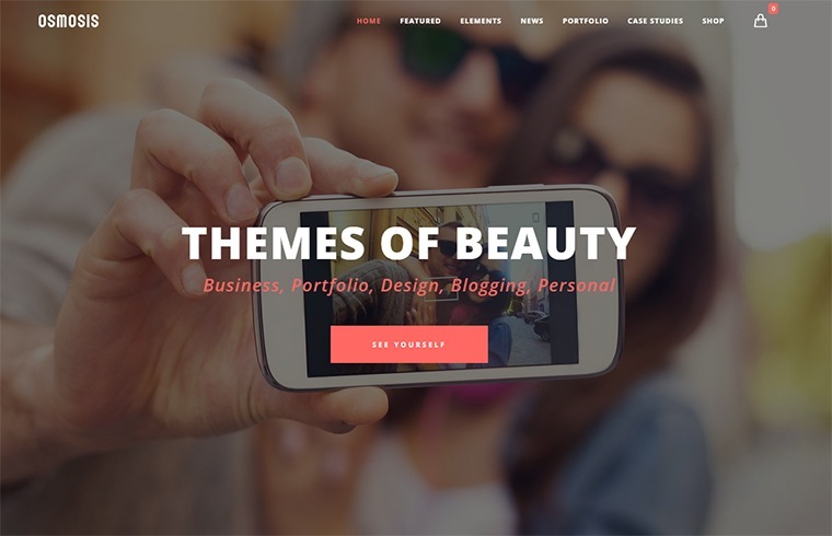
This kind of layout is dubbed a “watermark homepage”. Its defining feature is a large image with some text (and maybe a button).
Though visually striking, is it it effective?. There are two major flaws I see with most of these types of layouts:
- The image is generic. Because of the layout, the image almost has to be generic. The problem is that unless the image really adds meaning to the page, it’s just a waste of real estate and bandwith. And if the image is highly relevant and specific, then it probably shouldn’t be in the background.
- The image takes up all of the available above-the-fold space. This pushes all your important content too far down the page and it also means that some of your visitors won’t realise that they can actually scroll down to find out more.
But here are some good examples:
The image tells a story that is relevant to the product, there’s enough text above the fold to compel further reading and it’s obvious that more content is below the fold.
Hero images can be effective if you avoid those generic ones, give the users a clear signal to scroll and don’t use short bad headlines.
What’s the Alternative to a Slider?
If rotating sliders are so bad, and the hero layout fails too, then what is the best solution to a large slider?
Well, there is no one-size-fits-all solution and that’s why doing your own research is vital.
Here are three types of layouts you can use as inspiration for your website.
1) The Big Headline
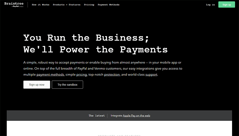
To convey the value to your offer, text is more powerful than images. Text loads faster also and gets recognised and read faster by your visitors.
This means, the first and most important thing you need on any page on your website is an un-missable headline.
The headline should communicate your unique selling proposition, and it should arouse curiosity that can only be satisfied by reading further.
The example below from Braintree Payments shows that a big headline is sometimes the only thing you need.
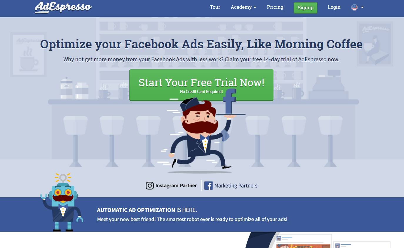
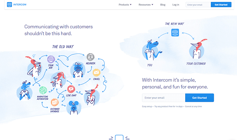
2) Side-by-Side
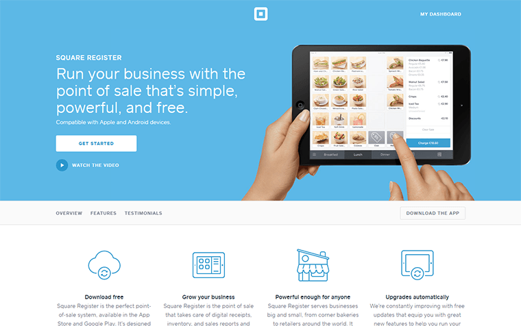
This layout consists of two columns. One column is for a image that represents your product, the other contains a headline and usually text and a button.
This layout is a great example to communicate what your business is about, it does not use up too much space. The great thing about this layout is that it puts a lot of focus on the image without letting it overwhelm the text portion.
Examples of Side-by-Side:
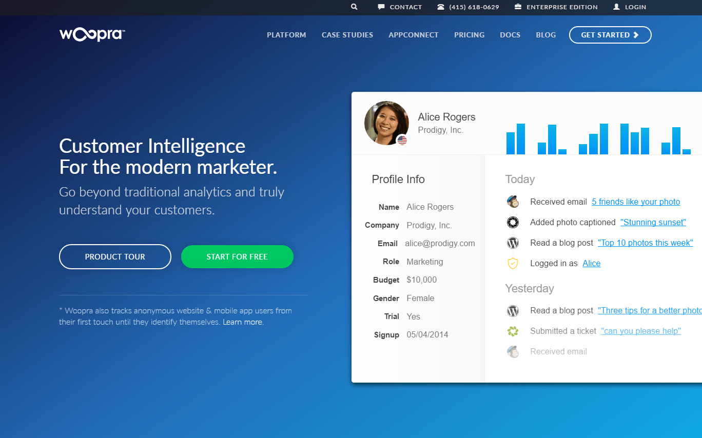
The homepage shows a large screenshot that shows off their software, next to call to action headline.
3) Click Play!
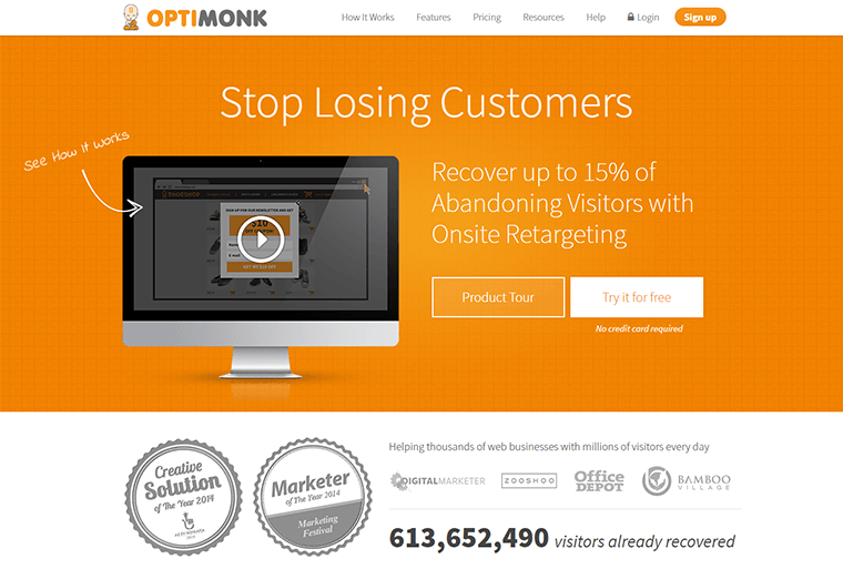
Video is an effective way to grab your customers attention straight away. A video should not replace your main headline or your call to action, but it can be the star on the page.
You can communicate a lot more with video rather than just an image.
Examples of Video Homepages:

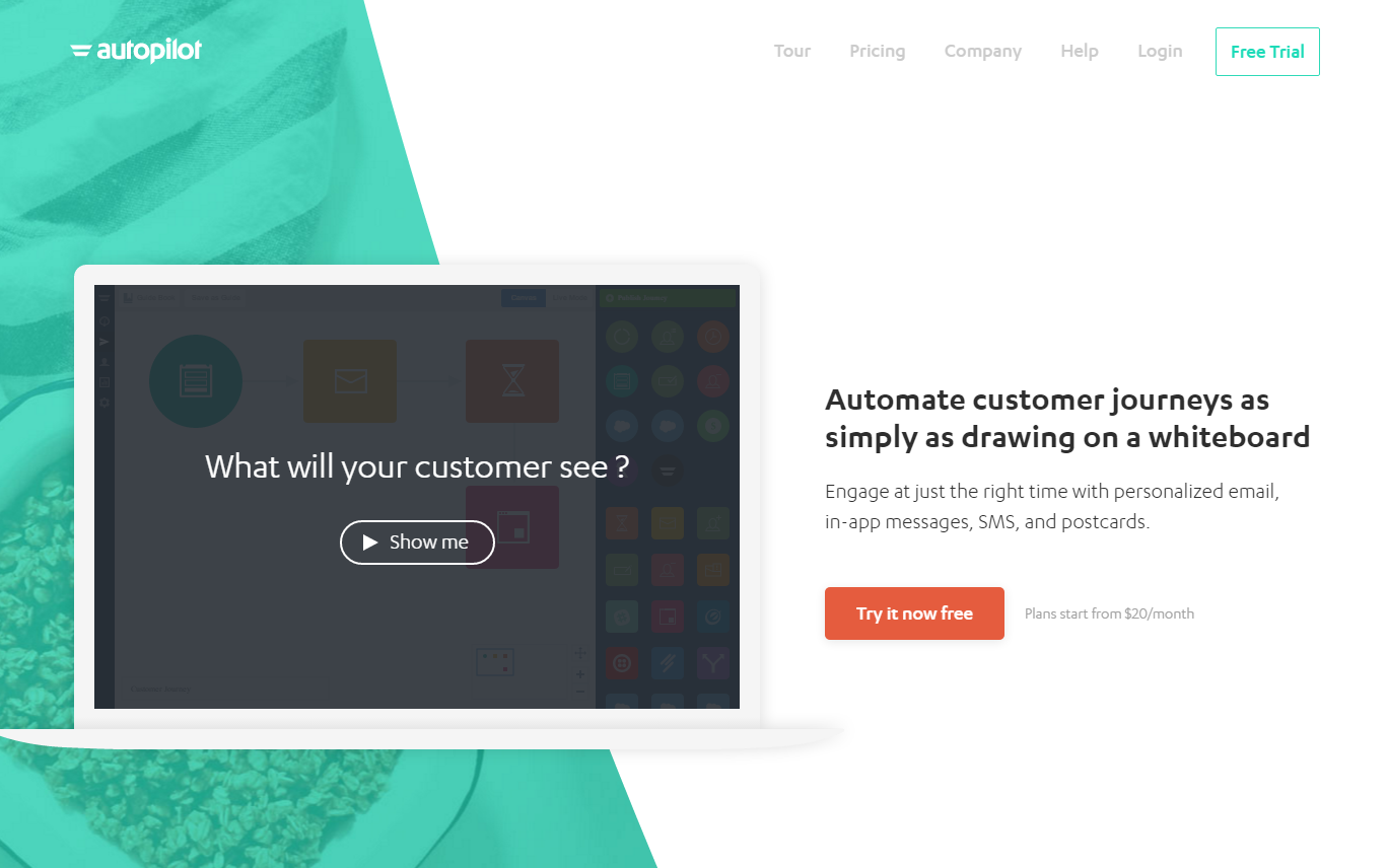
4) Figure of what works Best for Your Message
Let’s stop, and take a step back and talk about sliders.
What’s the purpose of your’e page?
It needs to communicate the right message to the right audience.
If your page fails to do this, you’ll lose the majority of visitors quickly.
The bottom line is that you should do whatever is best for your audience.
Talk to us at DesignLab to see how we can help your website work better for your customers!
