Why you should rebrand is a question I get asked often, and they answer is if there’s one thing that running a branding agency has made me appreciate, it’s the ever-changing nature of the marketplace.
Logo rebrands are a necessary step to take in the world of business; this could be because your current logo is confusing to customers, or it doesn’t sell your brand message correctly or it’s simply out-dated.
But, this type of redesign can be a minefield and your loyal customers may lose the emotional connection that’s cultivated over the years. It’s safe to say as a society, we don’t like change.
A Logo Can Have an Emotional Attachment
Sometimes it can seem no matter the size of the brand, it seems it send out a negative message to your market; this is because we align ourselves with the brands we engage with. We tend to take on their identity, and when the design changes, we are concerned the brand is going to change with the new logo. In short, the stronger emotional bond we have to a brand, the more negative our reactions are when they change their design.
Brand’s risk losing their audience with a new design, and though many seek advice from logo design agencies, the water’s a muddy and a rebrand is a treacherous place to be.
What big brands had had their logo redesigned for 2016, and how did we react?
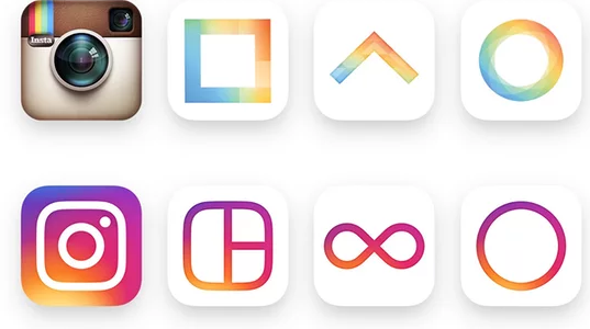
Instagram is currently of the world’s most popular social media channels. In May 2016, a new look and feel was launched. The original retro camera has been replaced with a background of oranges, yellows, pinks and purple with a white keyline of a camera. The design was described by own a Guardian writer as:
Head of design for Instagram Ian Spalter explained the design as a response to Instagram user evolving from a place to simply share filtered photos to a community platform that is vibrant and diverse.

Not only did the logo change, but it’s sister apps have undergone a similar makeover; Boomerang, Hyperlapese and Layout have all been given the vibrant look the brand want to evoke.
The infamous Saul Bass once stated “Logos are a graphic extension of the internal realties of a company”. Instagram are using their new logo to speak to their users, without the need for written communication, whether we like it or not.
Netflix

Netflix has become the world’s leading internet television company. It nearly avoided a PR backlash in June 2016 thanks to their announcement regarding their “not new logo” and proclaimed the new icon was simply to accompany the current logo.
This new ribbon effect “N” against a black background icon mirrors the current logo and though the ribbon effect is very pleasing, though some feedback is it serves no purpose. And when compared to the negative comments Instagram’s new logo received, Netflix has every right to be feeling good.
Past Rebranding Failures
Gap

This rebranding failure haunts us time and again. Remember in 2010 when Gap unveiled their brand new logo. It brought a global attention, for all the wrong reasons. The brand that held a firm identity by its logo for over 20 years had suddenly changed overnight, and no one was happy. One of the reasons the logo failed so badly was thanks to the use of the font. This typeface is so overused, so therefore it failed to create any unique visual appael for the audience to hold onto. After just 1 week, Gap reverted back to their old logo, with a rough estimate of around $100million lost in the rebranding process.
London Olympics 2012

Not every logo design failure is because of a rebrand; some are just terrible designs. For example the 2012 Olympics proved that, and thanks to the rise in social media, failures are now less contained than before. The logo’s intention was by being bold, spirited and some say jarring, it would echo London as a diverse, modern and vibrant city, though the internet had different ideas and the design was alluded to an X-rated image that soon reached viral status.
Logo Design
When a company wants to rebrand who have a massive budget in the multi millions are still failing at logo design, it can put off other smaller companies doing the same thing. It’s important to let your customers know if a change is coming, just incase you shock or disappoint them. Ask this, does your’e redesign need to happen? Head of design Ian Spalter from Instagram drives this message with his blog post regarding their logo change:
In summary, if a redesign seems more just self-indulgent, pause and step away, or you risk alienating your customers, but if it’s necessary, then do it properly and hire a professional design / branding agency!
