Happiness in a glass – Branding

Nook Nosh is a small bar located just out of the CBD on Unley Road, Unley. Here they serve great boutique wine, craft beers, a range of classic spirits, and tasty grazing foods, with a strong focus on local South Australian producers.

This “lovingly created” bar has a warm and inviting setting and is designed to be a welcoming place to share love for sips and nibbles. The owners, Chris and Lisa promise an easy, feel good experience, in which to share good times, and some of the good things in life, with great friends and friends-to-be.

We were lucky enough to be asked to create their branding.

Find Your Everything has put together a neat little video on Adelaide’s cosy little bar.

Address: 111 Unley Road, Unley, 5061
Phone: 0405 005 447
Website: http://www.nooknosh.com.au/
Email: sips@nooknosh.com.au
FAcebook: https://www.facebook.com/nooknosh


SA Caravan & Camping Show

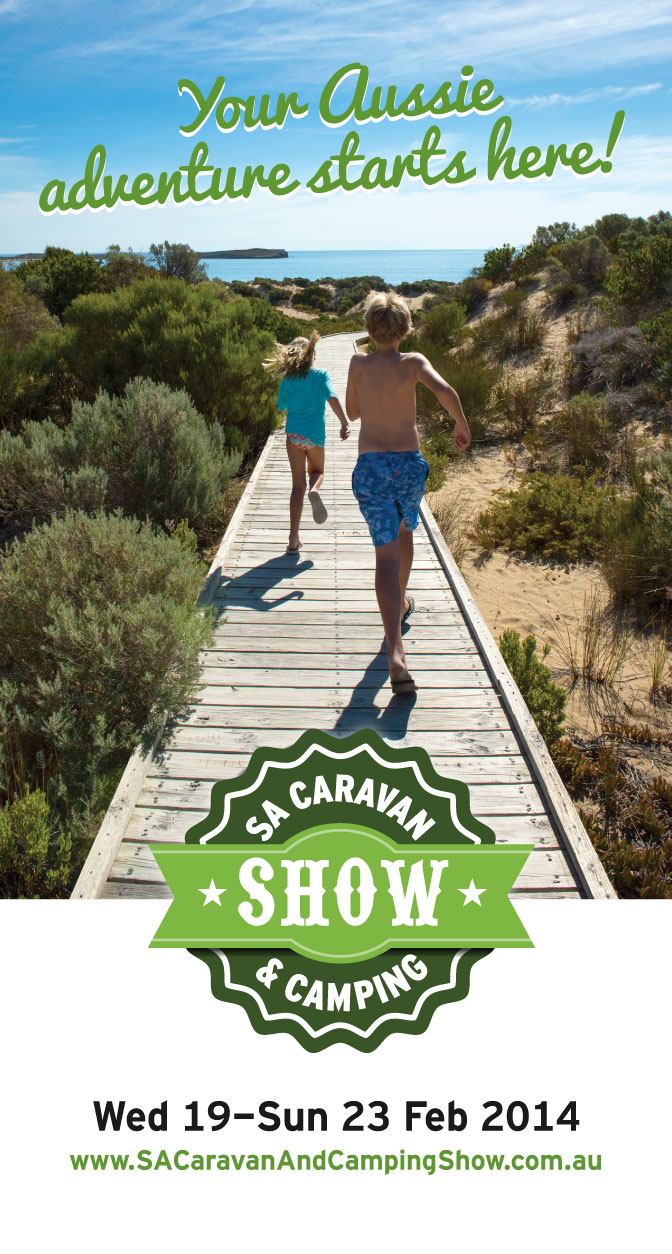
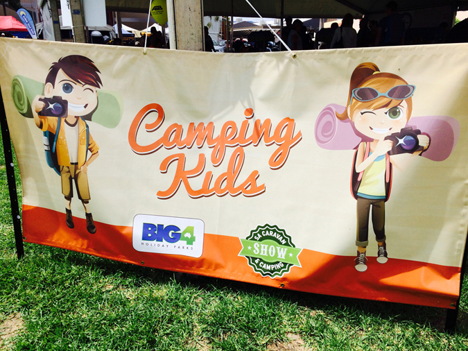
This year’s SA Caravan & Camping Show was a massive success, with a record crowds, a new Camping Kids Zone, Jayco Main Stage featuring The Drumming Monkeys topped off by perfect sunny Adelaide weather, what was there not to love!

We took a different direction with this years branding. We wanted the poster to create a sense of the typical Aussie holiday camping with family and friends.  We used a photo which was a brother and sister running on a jetty about to jump into the beach, and with tagline named ‘Your Aussie adventure starts here!’

SA-Caravan-Show-2014Poster    Photo 22-02-2014 12 43 28 pm Photo 22-02-2014 12 37 51 pm Photo 22-02-2014 12 13 21 pm Photo 22-02-2014 1 24 57 pm Photo 22-02-2014 1 04 58 pm

Category: Graphic Design Adelaide


Graphic and web design trends for 2014

With 2014 well on its way we thought it was a great time to look at this year’s graphic and web design trends to help you work towards achieving your competitive edge.

iStock Photo by Getty Images asked creatives around the globe to weigh in on what’s hot and what’s not for 2014. The resounding response was that simplicity is king, even as we’re introduced to more and more complex devices, platforms and channels than ever before. From flat design to reigned-in parallax scrolling to 5-second social media videos, think of simple design as the yin to technology’s yang.

10 Graphic and web design trends for 2014

1. Simplicity

Simplicity will undoubtedly be the most powerful tool for expressing the highest level of sophistication.

2. Flat Design

Hopefully we see better ‘flatness’ than we did this year. Many screen and app designs have applied flat shapes and solid colours with such fervor that they created layout, rhythm and usability issues. The many screens and wearable tech gizmos will require us to design clever and connected experiences.

3. Improving Parallax Scrolling

Over the past few years parallax scrolling has become a very popular tool enlivening the delivery of content on the web. More and more we will see this used in a restrained way — with more of a ‘light touch.’

4. 5-7 Second Storytelling

The biggest social media trend will be 5-7 second storytelling — clickable videos, Vine, and animated Gifs all use small pieces of moving media to tell a story quickly.

5. Logos With Depth

The increasing simplification in logo (re-) design is overused. In many cases this leads to a loss of brand sovereignty.

6. Real Models

I believe there is a trend in portraying reality more. We know models are meant to help to sell products…but the imagery of normal, real people also sells and can enhance public affinity with the brand.

 7. Digital Innovation

The Brazilian advertising industry is becoming more and more mature, focusing on what is really relevant to consumers, not just on what wins awards. Advertising needs to change to adapt to a market that has already changed.

8. 3D Printing

New forms, designs and patterns by 3D printer will be gain more popularity in 2014.

9. Creative Inspiration

We need to invest in knowledge about ourselves, about the world we live in, about the role of creativity on this planet. This knowledge will help us transform reality into something closer to what we dream of.

10. Trend Lists

I don’t believe in design trends being overused. The issue is around timing; if you’re using an aesthetic, design or idea that people are sick of, you’re not doing your job. However, I think creatives get jaded with new design styles way before the general population, so I’d say feel free to overuse more. People like consistency.

To download the full infographic visit iStock.


Yahoo? It’s not about the logo.

“We spent the majority of Saturday and Sunday designing the logo from start to finish.”
— MARISSA MAYER, CEO

Design for design’s sake?

It doesn’t half generate some media attention.

Yahoo rolls out its new logo, on CNN (I got a quick mention, too)
Yahoo reveals its new logo, on The Verge
This is Yahoo’s brand new logo, on Business Insider
Yahoo finally unveils its new logo, on Mashable
Yahoo’s new logo is a bore, and that’s the whole point, on Gizmodo
Yahoo unveils new logo, on Huffington Post
Yahoo picks a new GeoCities logo, on TechCrunch
CEO Mayer geeks out on Yahoo’s new logo, on USA Today

But as Dan points out, “‘Everyone is talking about our brand!’ is not the same as ‘Everyone loves our product!’”

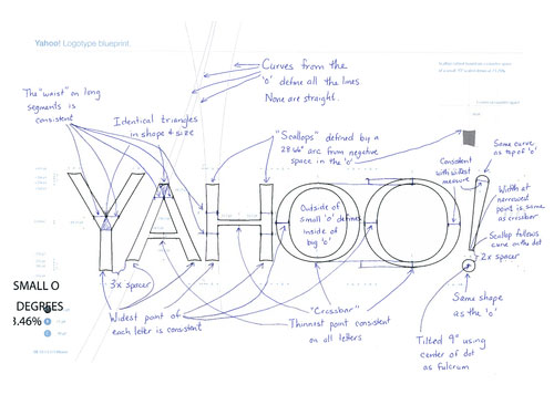
Yahoo logo sketch

Yahoo logo

Here’s what CEO Marissa Mayer had to say when talking about Adobe Illustrator.

“I’m not a pro, but I know enough to be dangerous.”

Look out.

Adelaide Festival 2014 Launch Night

Last night saw the launch of Adelaide Festival 2014, and we were there enjoying ourselves after a tiring couple of months getting the booking guide plus all the signage ready for the night.

The theme of the poster is inspired by the 560 million year old fossils discovered in South Australia’s Flinders Ranges that represent earliest known complex organisms.

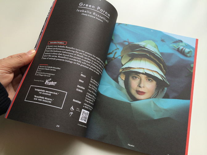
It was a huge success as Artistic Director David Sefton unleashed his eclectic program for 2014. Shows to watch out for are Roman Tragedies, Zorn in Oz, Green Porno featuring Isabelle Rossellini plus many more.

Click here to view the website to make a booking.

See you there in Feb 2014!

Adelaide-Festival-2014-Graphic-Design-Adelaide_blogAdelaide Festival 2014 poster

Adelaide-Festival-2014-Graphic-Design-Adelaide_blog-2Sneak peak inside

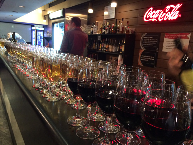
Adelaide-Festival-2014-Graphic-Design-Adelaide_blog-3Drink anyone?

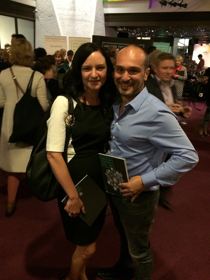
Adelaide-Festival-2014-Graphic-Design-Adelaide_blog-4Proudly showing off the booking guide.

Adelaide-Festival-2014-Graphic-Design-Adelaide_blog-5 Festival CEO Karen Bryant and Premier Jay Weatherill unveil 2014’s posters.

Category: Graphic Design

Thoughts about similar-looking logos

A recent blog post, Your Logo is Not Hardcore, got Bucharest-based designerAndrei Tache thinking. He shared a few of his comments in this guest piece.

Nike VCXC logo
Nike VCXC branding by Jon Contino

Context

We’re able to see those X-based logos together because the Internet connects everything, making it look like the world is one big box, but to each of us, life still takes its course in a limited area. Maybe all of those logos do their job for a small area and stand-out just as they are. Regardless, it’s no longer possible to have perfectly distinct logos for every business. You can hardly have that within a specific domain, much less cross-domain as it’s depicted in the case of Your Logo is Not Hardcore. Just because there are so many similar-looking logos doesn’t mean they’re not distinct.

Template

Although this particular design direction looks like a fashionable decision to make, I’d argue that the form is quite generic. Maybe just as generic as a square or a circle. The X looks like the new square, and it feels rather natural for designers to make more use of a new geometric form. Even looking at the examples in this collection, you know that it’s a route that leaves room for innovation. Its versatility creates its own place in graphic design, representative of our period.

Fashion

Fashion is a taboo subject for designers but maybe it should be looked at more closely. Fashion is about mass adoption of a certain mentality or a certain way of doing things. This means that fashion is a statement about the times in which we live — a statement that will be of value in 30 or 50 years from now. Just as we like motifs from other recent periods, this might grow into a classic of our time.

The downsides come through two means: one is that if you adopt ways that are fashionable today, you are already behind the flock. You’d be better off shaping the next best thing, but not everyone’s an innovator, and that’s fine. The second problem one might encounter is using fashionable shapes without having an understanding about what they mean. This can result in poor design that lacks coherence and intellectual content. But because the X stands for so many things, it’s difficult to mishandle.

Immortality

We design symbols to last, but nothing lasts forever, really. I’m not saying we shouldn’t try, I’m saying that thinking about something with a life cycle seems more natural and might offer a different perspective within the process.

Old ways

The form of these X-based logos can conjure thoughts of heraldry. So maybe it’s just an old habit with contemporary ways. But there’s one small glitch to this…

New ways

Similar-looking designs don’t work for us because we glance over them so quickly that we only grasp the main features. Crests come from a time where this just wasn’t the case. But maybe, just maybe we should consider slowing down a bit. It’s clear to us that logos won’t get more distinctive, so perhaps it’s us. Perhaps we should slow down and go into more detail, enjoy nicely crafted things, despite their vague resemblance to tons of other stuff. This calls for peace, thoughtful analysis, and a slower pace.

But it goes to show that maybe hardcore is not what a good logo should strive for.

You can view some of Andrei’s work on his website: Fabrica de Design.

Related, from the archives: When logos look alike.

Star Wars logo evolution

Alex Jay published an in-depth examination of the evolution of the Star Wars logo. See the full post on his blog Tenth Letter of the Alphabet.

Star Wars letterhead
Star Wars letterhead, with lettering by Joe Johnston

Star Wars logo Suzy Rice
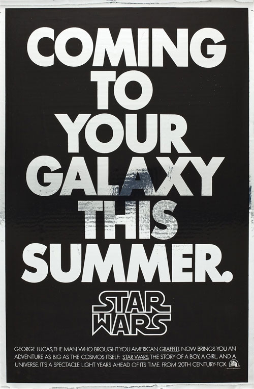
Mylar poster with Suzy Rice’s logo, 1977

“I’d been reading a book the night before the meeting with George Lucas, a book about German type design and the historical origins of some of the popular typefaces used today — how they developed into what we see and use in the present.”
— SUZY RICE

Star Wars trilogy logos
The New York Times, March 24, 1985

Full archive: Anatomy of a logo: Star Wars.

Via Kottke.

Our Christmas Show

Every 2nd year we like to treat all our clients to a Chrissy drink to thank them for their support throughout the year. Last year we took our clients to Grace The Establishment at Norwood.


_JN_2815

_JN_2816 _JN_2818 _JN_2819 _JN_2820 _JN_2821 _JN_2822 _JN_2823 _JN_2824 _JN_2826 _JN_2827 _JN_2831 _JN_2829 _JN_2832 _JN_2830

Graphic Design Adelaide

Graphic Design Adelaide

Graphic Design is an interdisciplinary, problem-solving activity which combines visual sensitivity with skill and knowledge in areas of communications, technology and business.

Graphic design practitioners specialise in the structuring and organising of visual information to aid communication and orientation. The graphic design process is a problem solving process, one that requires substantial creativity, innovation and technical expertise.

An understanding of a client’s product or service and goals, their competitors and the target audience is translated into a visual solution created from the manipulation, combination and utilisation of shape, colour, imagery, typography and space.

Read more about Graphic Design

DesignLab delivers a graphic design Adelaide service to clients mainly located in Adelaide South Australia. We aim to add value to our client products and services by creating interesting, engaging and effective visual communication outcomes.

Our work is more than just producing marketing and communications material. We work very closely with our clients.

Have a look at our work and read the feedback from our clients in their testimonials below. They’re ultimately the best judges of whether our design work is effective.

Please feel free to email me with your opinion, comments or questions related to this article.

Spiros Giannos
Design Director

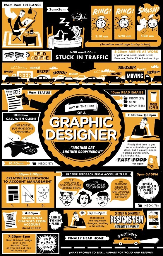
Here is a neat little infographic about a day a Graphic Designer lives.

graphic-design-adelaide-infographic

Ten logo design tips from the field

I love New York logo

I’ve learned from quite a few mistakes during my time as a designer, and to save you from doing likewise, here are 10 logo design tips I picked up.

1. A logo doesn’t need to say what a company does


Restaurant logos don’t need to show food, dentist logos don’t need to show teeth, furniture store logos don’t need to show furniture. Just because it’s relevant, doesn’t mean you can’t do better.

The Mercedes logo isn’t a car. The Virgin Atlantic logo isn’t an aeroplane. The Apple logo isn’t a computer. Etc. Etc.

2. Not every logo needs a symbol


Sometimes a client just needs a professional wordmark to identify their business. Don’t be afraid to ask what they think.

3. Two-way process


Remember, things might not always pan out as you hope. Your client might request something you disagree with. If that happens, try giving them what they want, then show them what you believe is an improvement, and why. They’re less likely to be so resistant if they already see how their thoughts pan out.

4. Picasso started somewhere


You don’t need to be an artist to realise the benefits of logo sketching. Ideas can flow much faster between a pen and paper than they can a mouse and monitor.

5. Under-promise, over-deliver
If you’re unsure how long a task will take to complete, estimate longer. Design projects are like construction work — you piece lots of little elements together to form a greater whole, and setbacks can crop up at any time.

6. Leave trends to the fashion industry


Trends come and go, and when you’re talking about changing a pair of jeans, or buying a new dress, that’s fine, but where your brand identity is concerned, longevity is key.

Don’t follow the pack.

Stand out.

7. Work in black first
By leaving colour to the end of the process, you focus on the idea. No amount of gradient or colour will rescue a poorly designed mark.

8. Keep it appropriate


Designing for a lawyer? Ditch the fun approach. Designing for a kid’s TV show? Nothing too serious. I could go on, but you get the picture.

9. A simple logo aids recognition


Keeping the design simple allows for flexibility in size. Ideally, your design should work at a minimum of around one inch without loss of detail. Look at the logos of large corporations like Mitsubishi, Samsung, FedEx, BBC etc. Their logos look simple and are easier to recognise because of it.

10. One thing to remember


That’s it. Leave your client with just one thing to remember about the design. All strong logos have one single feature to help them stand out.

Not two, three, or four.

One.