Web Design Trends In 2015

Web Design Trends In 2015

Copied from http://www.elegantthemes.com/blog/resources/web-design-trends-to-look-out-for-in-2015

Web Design Trends To Look Out For In 2015

Now that 2014 is nearly behind us, we can now begin to look at the web design trends for 2015, in particular trends have and will impact the WordPress Community–from existing WordPress themes and plugins to the new opportunities these trends will provide.

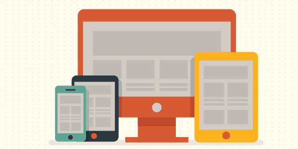
1. Responsive Layout
design-trends-2015-responsive

Do you have a really good reason for not using responsive design? Over the last few years responsive design has solidified itself as the new standard for web design in general and WordPress themes in particular. Sure, there are still arguments over implementation, but no one is saying, “let’s get rid of responsive design” and in fact more and more sites are opting to go in that direction. That was certainly the case in 2014 and I wouldn’t look for it to go anywhere in 2015. This one has ceased to be a trend and can now be considered the new norm.

2. Ghost Buttons
design-trends-2015-ghost-buttons

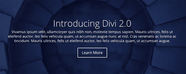
Ghost buttons are a prominent design feature in Divi. They’re minimal, stylish, and with the subtle hover animation they’re a delight to use. Look for this trend to continue into 2015; especially considering how well they pair with the large background images and videos we’ll talk about in no. 4.

3. Bigger Emphasis on Typography
design-trends-2015-typography

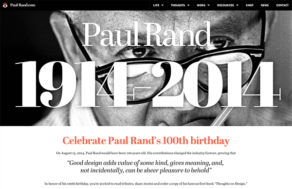
Image via Paul Rand

Usually web type-kits that allow for beautiful fonts and typefaces to be used on websites have been expensive. Meaning that sites leaning heavily on typographic design tended to require larger budgets–leaving the small guys (and most WordPress users) out of the fun. That however, is changing. Type kits are becoming more affordable (or free in the case of Google Fonts) and that means there is more freedom for designers working with a smaller budget to bring their typography skills to the web design table. Additionally, this allows WordPress theme designers to include more typographic flexibility in their themes, making stylish type-centric design attainable for anyone with a well designed WordPress theme.

4. Large Background Images & Videos
design-trends-2015-large-images-videos

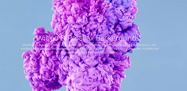
Another staple of Divi which has been and will continue to be a big hit are the large, beautiful background images and videos. One of the simplest ways to make your site stand out is by having great content displayed prominently. This trend is a wonderful way to accomplish that and when folded into a larger design style/philosophy it doesn’t feel gimmicky but powerful and elegant.

5. Scrolling Over Clicking

design-trends-2015-long-scrolling

As the mobile web continues to grow and web design continues to skew in the direction of a more effective and enjoyable mobile experience, scrolling will continue to dominate clicking. It’s more intuitive, easier to do, cuts down on load times and allows for more dynamic interaction to take place between the user and the website.

6. Card Design Will Get Better
design-trends-2015-card-design

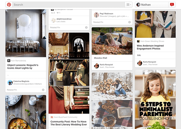
Image via Pinterest

“Card” design, while not new, has proven to be a great tool for designers working on responsive websites. Cards are a great way to keep things modular, rearrange columns without things getting sloppy or disorganised, to browse a lot of general data, but also to prompt users to drill down and see more. In short, cards are clean and simple with a lot of versatility. Exactly what the web needs. So expect to see more of it in the remainder of 2014 and throughout 2015.

7. Flat Design is Growing Up
design-trends-2015-material-design

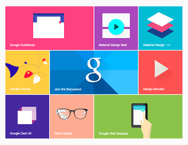
Image via Google Design

Flat design has achieved a lot of momentum over the last year or two and it appears to have staying power into 2015. However, it might be possible that as a concept, flat design is growing up. Perhaps into material design.  So, what is material design?

Material design is something Google unveiled this year as their new direction for mobile (and design in general). “Material,” to quote their brief, “is the metaphor. A material metaphor is the unifying theory of rationalised space and a system of motion. Our material is grounded in tactile reality, inspired by our study of paper and ink, yet open to imagination and magic.”

Outside of marketing speak (and including the observation that they’ve settled on something that might otherwise be called “almost flat design”) we can see that what the designers at Google mean when they say Material Design is a mostly flat design that uses very subtle gradients, layering, and animation to retain a sense of the tangible world (physical space and objects) while still achieving all the advantages of flat design. Some may disagree but personally, I think this is where flat design as a whole is headed and I look forward to seeing more companies and individuals adopt it in the remainder of 2014 and beyond.

8. Microinteractions
design-trends-2015-microinteractions

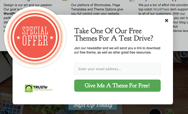
Microinteractions are a good trend to talk about after material design. What are microinteractions? They are contained experiences or moments within a product (or perhaps a module on a website) that revolve around a single use case. One example of this is the email signup box that pops up on this website. It sort of wiggles back and forth on the screen, giving a playful personality to an otherwise static graphic.  This microinteraction promotes an increase in user engagement; which in this particular case means more email signups. I’d look for this theory to further permeate web design in the coming years. I’d love to see more WordPress theme and plugin developers begin to think in this vein. In particular, I’d like to see plugins that don’t just add new features to a WordPress website but add new experiences.

9. Interactive Visual Storytelling
design-trends-2015-storytelling

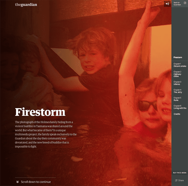
Image via The Guardian

What do you get when you put all of that together? a better platform for telling compelling stories and narratives. Now of course I do not mean that every web page has to tell a fairy tale, yarn or other bit of fiction. That’s not what I mean when I say story or narrative. What I mean is that your brand is made up of a series of concepts or values (elegance, creativity, simplicity, etc.) and everything from your page layout to your font choice to your web copy and microinteractive page elements are narrative tools with which you can tell stories that embody those concepts and values by showing them in action. A perfect example of this is the Tesla website, which I talk about below.

10. Personalised UX
design-trends-2015-pesonal-ux

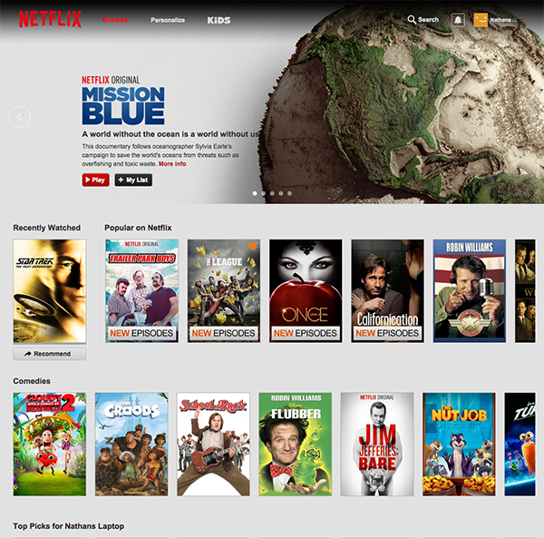
Image via Netflix

The idea of using cookies to help you display more relevant content to repeat visitors is nothing new. However, just as certain spammy practices (such as the popup) have made a classier return with better design and best practices in place, so too can the technique of using cookies to display certain content to repeat visitors be used for more than spam and shameless upselling. Netflix uses it to remember what you’ve recently watched. So does YouTube. Would it be so odd for a large editorial site to create a “recently read” sidebar widget for quick access to articles you may have enjoyed and/or commented on? Or perhaps hiding recently viewed content in order to highlight new posts/pages? I don’t think so and I think we’ll see more tasteful uses of this technique in the months to come. I’d also love to see that happening more in the WordPress community via plugins.

A Few Examples

Sometimes reading about all these design concepts can make it hard to imagine them working together seamlessly “in the wild”. To help remedy that I’ve put together a short list of three examples that collectively embody all of the web design trends I’ve mentioned in this post.

1. Apple

design-trends-2015-example-apple

You don’t have to be an Apple fan boy to appreciate good web design. Something that Apple has always accomplished with their trademark simplicity, and yet, continue to manage to squeeze in a remarkable number of current and future design trends. If you’re looking to learn but not mimic them, I think the thing to keep in mind is not that you have to create a site exactly like theirs but rather copy their insistency on subtlety to avoid making a trend come off as gimmick.

Visit Site

2. Tesla

design-trends-2015-example-tesla

One of my favorite websites right now, not just because I also love their products, is Tesla’s website. They combine all of my favorite trends into one fluid experience. I especially love their Go Electric page which uses large images, long scrolling, embedded infographics and interactive storytelling to explain their top five FAQ’s. It’s a brilliant bit of design chock full of delightful microinteractions that turns a traditionally boring part of most websites into a jaw-dropping showcase.

Visit Site

3. Divi

design-trends-2015-example-divi

Finally, we have an example that is not to be drooled over and dreamed of as hopelessly out of reach, but something that we can get our hands on and work with. Divi is without a doubt the best WordPress theme for the average user with limited (or zero) coding ability to achieve all of the trends covered in this article on their very own WordPress website. It’s possibly one of the most empowering WordPress themes I’ve ever come across. The drag-and-drop page builder takes advantage of interactive modules to help you create beautiful and effective pages of any length. And of course, thanks to its responsive design, that look and work beautifully on any device.

View  Theme

In Conclusion

The trends of 2014 look as if they will carry on into 2015, with a few of them maturing. In this case I’m speaking particularly about material design and microinteractions. The latter of which is the reason I didn’t include parallax in this post, as I would consider it a type of microinteraction that may or may not fade out in the next year but whose underlying concept will undoubtedly remain and mature.

As for what all this means for the WordPress community, I would think that we will see more themes follow the lead of Divi in creating more seamless ways for non-coding users to take advantage of these design trends. I also believe that as certain microinteractions become more popular in situations that have traditionally required custom development, the community will provide turn-key solutions via plugins; like they have with various popup form plugins.

I think the future of these trends will be decided by how far we push them in the months to come. Where will we find limitations that require refinement or perhaps going in a new direction altogether? I know I’m looking forward to watching it all unfold.


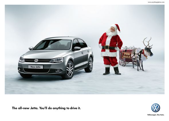
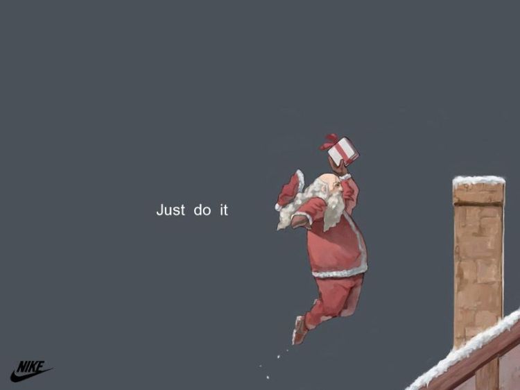
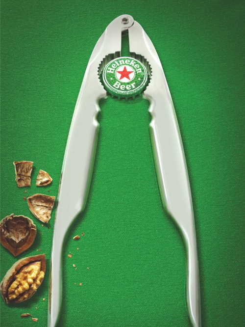
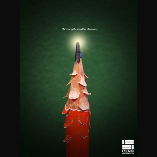
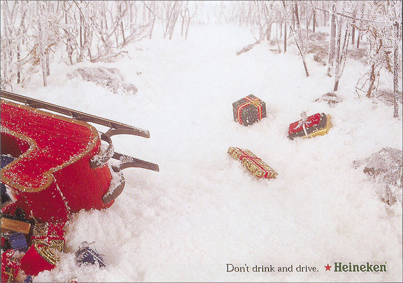
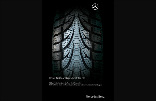
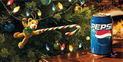
Some good Christmas Design Ads

Christmas is upon us yet again. We are all likely rushing around like a crazy people this week trying to get all your work done, finish up your Christmas shopping, preparing to travel, etc. Every year, we are asked by our loving clients to design them something for Christmas i.e. cards, e-cards, newsletters, Facebook banners and more, and every year we strive to design something different from your normal tinsel, red & green backgrounds with snow flakes and cursive typography. It’s just boring as bat shit! So we took some time out from our hectic graphic design schedule and took a look at some inspirational Christmas design that actually looks and feel different.

Let’s take a minute to slow down and absorb some solid Christmas design inspirations.

Some of these ads will make you laugh, others might earn an approving nod or even a roll of the eyes. All are definitely worth a look and are sure to get your brain in a creative mode.

jetta_santa.preview mcdonalds_christmas_fries santa-nike xmas-10 xmas-design_apple xmas-design_construction xmas-design_hp xmas-design_sillon xmas-design- xmas-design-heineken xmas-design-mercedes-2 xmas-design-mercedes xmas-design-pepsi xmas-inbev


Have a Great Holiday!

Whether you celebrate Christmas, Hanukkah or Festivus, we here at DesignLab would like to wish you a very happy holiday season.

DesignLabs Christmas Drinks

Last Thursday on November 27 saw our end of year Christmas party that we hold for all our clients to thank them for their support for the past year. It was a real success and a testament to how far we have come over the past couple of years.

We had such fantastic feedback from all our clients on the night, and most of them were quite amazed that little old us have such a vast range of clients, not to speak the quantity. On the night around 40 clients attended to an open bar and some of the tastiest nibbles (i.e. chicken popcorn, pork belly, prawn burgers and so much more) put on by The Grace Establishment on The Parade in Norwood (our neighbour).

A comment that kept being brought up on the night is that it’s rare for companies to take out their clients, usually a company takes out their staff, but we feel it’s more important and critical to the success of our business that we look after our clients. It’s our mission statement, our vision, it’s the reason we get up in the morning, we love what we do!

Some of the clients that attended were Adelaide Festival (we design all their marketing material for each festival on a yearly basis), Stratco (graphic design of brochures and trade books), City of Prospect (branding), City of Playford (graphic design), Top Tourist Parks (graphic design of all work) and Fork On Road (branding and web design).

We have had a successful year at DesignLab, in particular our new employee Raymond Carpozzi. Welcome Raymond!

Here’s to a even better 2015!

Merry Xmas from the team at DesignLab.

Brilliant print advertising

Print advertising is still the most powerful way to communicate the right message to your target audience. Unfortunately over the past couple of years in Adelaide there only has a small number of advertising agencies, but things are looking better for Adelaide and South Australia, as smaller design agencies are starting to produce more clever advertising.

If print advertising in brochures, print catalogues, flyers, posters and billboards is done in a creatively funny way, getting attention will be a lot easier. Most businesses today make sure to achieve this idea for their print advertising campaigns to stand out among their competitors.

With digital media such as viral videos, it’s easy to overlook the creative art of print advertising, but it’s still relevant and as powerful as old vintage posters ever were, whether it’s small scale or a massive form of advertising. As the saying goes ‘It’s Not How Good You Are, It’s How Good You Want To Be’.

You still need a good well thought out concept that’s going to stick in people’s minds. Take a look at these funny, amazing, innovative ads and we guarantee you’ll be jumping with inspiration by the time you reach the bottom.

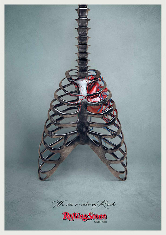
01. Rolling Stone

print-adverts-adelaide-9

Rock music meets Photoshop, with this cool, simple and sleek ad.

02. Ashtanga Yoga

print-adverts-adelaide-8

This brilliantly inventive ad hones in on the benefits of yoga practise for your back.

03. Moms Demand Action

print-adverts-adelaide-10

Moms Demand Action as if a Kinder Egg is banned in the US to protect children, why not assault weapons?.

04. Whiskas

print-adverts-adelaide-5

The ‘Big Cat, Small Cat’ campaign depicts a small furry feline as a big cat in the wild.

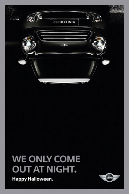
 05. Mini

print-adverts-adelaide-6

We love this clever Halloween-inspired Mini campaign.

05. McDonald’s

McDonaldsPotatoes

This cool new print ad featuring a box of fries carved out of a potato.

07. SANCCOB

print-adverts-adelaide-3

Inspired by the artwork of Dutch graphic artist M.C. Escher, these print ads feature clever optical illusions.

08. Publinews Braille Edition

print-adverts-adelaide-11

Lady Gaga’s illustration is accompanied by the braille caption ‘She recovers in a golden wheelchair’, which refers to her recent request for one after hip surgery.

Band Aid: Hulk

print-adverts-adelaide-1

We love the Hulk. This print advertising campaign from Band Aid showcases the ability of using a well-known here to the maximum effect.

There’s no text or tag-line; just the image of Hulk’s hand, along with the product in the bottom left-hand corner. It perfectly executes the product’s strength thanks to applying it to the world’s strongest character.

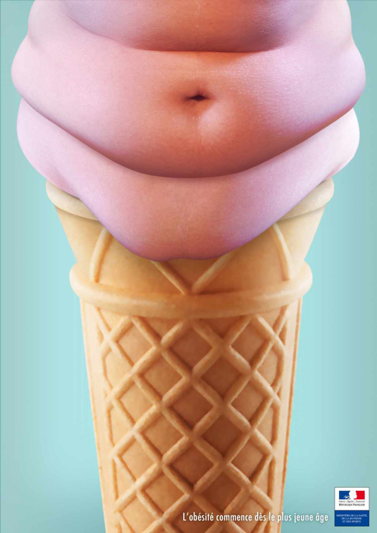
French Ministry of Health

print-adverts-adelaide-2

This ad campaign for the French Ministry of Health highlights the growing issue of obesity in children.
The copy reads “L’obesite commence des le plus jeune age,” meaning “obesity starts at a young age.”

Video production in Adelaide – Titanium personal water filters

Safe drinking water on the go. Game changing Titanium personal water filters. Guaranteed for life.

When the team at Go Walkabout approached us to film a video production in Adelaide for the world’s first titanium water filter, we just knew straight away that we had to get involved and help them with their Kickstarter campaign.  Our brief was to create a video that not only showed the product, but also inspire, motivate and captivate an audience that can kindly donate to the campaign so the team at Go Walkabout can produce and supply family – and village-sized filters to help provide communities in developing countries with safe drinking water, through both donation and sustainable microcredit plans.

The video consisted of a two day shoot in the factory plant at Advanced Metallurgical Solutions located in Lonsdale, South Australia. We felt that the factory was the perfect opportunity to show the audience where Matt, Craig, Josh and Gilbert invented the titanium water filter. There was a discussion about super-imposing the boys over a green screen and adding some fancy digital effects, but when we thought about it we realised that investors want to see these talented team in their natural surroundings, a place that is honest and real.

Editing consisted of one day to meet the short timeframe of under 2 minutes on the final cut. We know from experience with other Kickstarter campaigns that you only have a couple of minutes to grab a potential investors attention.

A little about the Walkabout Ti and Walkabout Ti Ultralight.

Titanium – is used for jet engines, medical implants, mens titanium wedding rings and now personal water filtration.

The Walkabout Ti and Walkabout Ti Ultralight are groundbreaking, world first titanium personal water filters. All other water filters are made of a hollow fiber plastic materials that can break or fail easily, but not titanium.

Personal water filters are great, they can save you the hassle of carrying big water containers when you in the outdoors and avoid any risks of drinking tap or bottled water from unknown sources. They are also useful in the event of “boil water” advisories, which are becoming more and more common. They also help reduce the number of plastic bottles made and disposed of for bottled water.

You have to be careful with personal water filters, you never really know when other water filters are going to fail.  This can be dropping, freezing, sitting on and overheating. And often you don’t know if they have failed. You can be sure that titanium won’t fail.
Walkabout Ti filters are an amazing and lightweight personal water filter that you can count on to give you safe drinking water when you go walkabout, or any other recreational activity.

video-production-adelaide-go-walkbout

Support the Go Walkabout team by pledging a donation through Kickstarter by clicking here.


Adelaide Festival 2015 Program Launch

Last Thursday 16th October saw the launch of the program for the 2015 Adelaide Festival. The 30th Adelaide Festival program was unveiled with the full line-up presented by Artistic Director David Sefton, and we had front row seats.

This being our fourth year working with the Adelaide Festival we feel very privileged to be invited to the launch party, especially when we get a mention from CEO Karen Bryant in front off all government officials and the media at the VIP party before hand about our graphic design work.

As a nod to the very first Adelaide Festival poster, the artwork for the 2015 Adelaide Festival of Arts is an interpretation of the iconic ‘double A’ from 1960. This was designed and developed by Voice.

The 2015 Adelaide Festival features over 22 Australian premieres and exclusive events including the ambitious digital arts event Blinc, which will open the Festival on Friday 27th February 2015, and will continue every night of the festival for free. Artistic Director David Sefton says Blinc is the “most ambitious public art event the festival has ever presented”.

Danny Elfman, will be in Adelaide for his production Danny Elfman’s Music from the Films of Tim Burton, which is a showcase of some of the memorable scores he has composed for famour director Tim Burton which includes Batman, BeetlejuiceThe Nightmare Before Christmas and Edward Scissorhands. The concert will be held at the Entertainment Centre and will be performed by the Adelaide Symphony Orchestra.

Other highlights of the program include Unsound, Tommy: which is a radical jazz reimagining of The Who’s double album, Fela! The Concert: A concert version of the Broadway musical about Afrobeat originator Fela Kuti, Blow the Bloody Doors Off!!: instrumentalist Terry Edwards celebrates the music of the iconic Michael Caine film such as Alfie, The Italian Job and Get Carter.  Cedar Lake Contemporary Ballet: The US company makes their exclusive Australian debut and Bill Viola: The work of the American video artist will be presented across three venues, The Art Galley of SA, Queen’s Theatre and St Peter’s Cathedral.

adelaidefestival.com.au

The social photos above in the slider were taken by Tony Lewis and you can see more by clicking here at Indaily’s website.