Advantages of using WordPress

WordPress-Plugins

Advantages of using WordPress to Power Your Company’s Website

At DesignLab, we only build our websites for our clients using WordPress. It has been around since 2003 and is the most popular blogging software around. Over the past years, WordPress has also become the content management software of choice for non-blogging websites. Here are some advantages why WordPress is so popular and why you might want to consider using DesignLab to build a WordPress platform for your company’s website.

1. Easy to Use

WordPress is very easy to use.  Adding new pages, blogs, images, videos, etc. on a regular basis is a easy and can be done quickly.  The technology is so simple, which means less time spent on formatting.

2. You Manage Your Website from Any Computer

WordPress is a browser-based software. You can login from any Internet connected computer and manage your site. Simple. Easy.

3. There is no HTML Editing or FTP Software Required

WordPress is a self-contained system and does not require any HTML editing software such as Adobe Dreamweaver or Contribute. You can easily create a new page or blog, format text, upload images (edit them), upload PDFs, video files, image galleries, etc. all without the need for additional HTML or FTP software.

4. Search Engines Love WordPress

The code behind WordPress is clean and simple, making it easy for search engines to read and index a site’s content. Each page, post, and image can have its own meta tag keywords, description, and title, and be optimised for specific keywords, allowing for very precise search engine optimisation.  You can also use tags to further enhance your search engine optimisation efforts.

5. Control of Your Site is Yours

No more waiting for a web designer to make simple updates on your website. You have control of nearly every aspect of your site and can easily make those simple updates yourself, and if you run into trouble there is tons of free help on the internet.

6. Design of Your Website is 100% Customisable

WordPress acts as the engine for your website. The look and feel of your site can be customised so your brand of your company can come through on your site and provide a unique experience to your visitors.

7. Blogs are Built-in and Ready to Go

WordPress was originally created as a blogging platform, which means blogging capabilities are already built-in and easy to integrate. Setting up a RSS / email subscriptions to your blog, commenting capabilities, automatically adding the most recent blog posts to other pages of the site are also simple to set-up, and help to extend your company’s reach and make your site more dynamic.

8. Extending the Functionality with Plugins

You can add an video gallery, event calendar, photo gallery, shopping cart, Twitter Feed, Facebook Fan Box and more to your site. WordPress makes this possible with plugins, most of which are free or reasonably priced. You don’t need to be a web guru to install them.

9. Your Site Will Grow as Your Business Grows

WordPress sites are so scalable. There are hundreds of thousands of pages or blog posts on your site and the performance of the site will not be compromised in the least.

10. Multiple Users

As an administrator of a WordPress site, you can set-up multiple users for the website and assign access levels and capabilities to each user.

Five SEO strategies to think about in 2016

SEO-Predictions-2016

Five SEO Strategies to think about in 2016

We are nearly at the end of 2015 and SEO marketers have likely been deep into links, keywords, content, and conversions. As you keep working hard, you would do well to adopt the following strategies to keep your momentum going into 2016.

1. Send social signs

There are lot of digital marketers who complain about low volume of incoming traffic from social platforms in relation to the efforts spent on those platform, but a silver lining has finally been added to the social big picture.

Just as backlinks act as votes for your site, raising your domain authority and rankings, so too does the popularity of content you share on social media.

Late in 2014, Google loosened its grip and took the first steps toward allowing non-Google social media platforms to be featured on its search engine results pages (SERPs). Social media platforms other than Google+ made their entry into Google’s Knowledge Graph.

With the removal of Google authorship, as well, from search result snippets, you can expect social signals from popular platforms to gain in importance in the years ahead.

2. Love the mobile

We all know the coming of age of the mobile Web, it’s been creeping upon us. With the share of smartphones at 80% of the US market, predictions are coming true. Further, mobile Internet activity now stands at over 40% of all Internet traffic and only half that are desktop computers.

Recognising the changes in browsing patterns, Google took the step of tagging sites on its SERPs as “mobile-friendly” as a tip off to searchers. The click rates and engagement for sites tagged specifically as mobile friendly are higher than others.

So hurry up and switch to responsive design (if you haven’t already). Search the site markers that Google uses to confer a tag on sites and implement these changes on your site ASAP, which include the following:

  • Make sure you have buttons that are big enough to be clicked easily on a small mobile device
  • Lots of whitespace to prevent the “fat finger syndrome”
  • Your copy should be large enough to read without zooming in
  • Links that are placed fairly apart to avoid wrong navigation

Take Google’s Mobile-Friendly Test and make sure your site passes.

3. Don’t abuse guest blogging

As content gains acceptance as a road to earning you links and growing authority, there was a mad rush between 2012 and 2013 toward guest-blogging simply for the sake of  links, no matter how irrelevant or unimportant the referring site. Thousands of low-quality websites and blogs exploded, soliciting guest posts and offering backlinks in return.

Not surprisingly, that extent of guest posting sites did not go unnoticed, and in early 2014 Google specifically highlighted guest-blogging as a strongly undesirable method of earning SEO brownies.

In the words of Google: “If you’re using guest blogging as a way to gain links in 2014, you should probably stop.”

But that does not mean you need to close the doors on guest blogging in 2016; it just means that resorting to spammy guest posts on spammy sites is a bad idea.

To avoid Google’s wrath, resolve to put quality over quantity. Aim to acquire high-quality links from respected and well-read websites rather than anyone who agrees to publish your content for the sakes of backlinks.

Doing so is easier said than done. A guest post on a high-quality site comes with two requisites:

  • Creating undeniably great content
  • Building a lasting relationship with high quality sites in your niche as opposed to simply looking for one-off links from them

4. Move to HTTPS

HTTPS (HTTP Secure) is technology for transferring data between your site and the Web servers with an additional layer of encryption called SSL (Secure Socket Layer) to make your data transfer very secure.

With the recent hacking of large-scale data breaches, including the famous Sony hack, security has been a priority of most digital marketers. Gone are days just e-commerce retailers, financial websites and the likes having to spend time and building airtight websites with SSL encryption.

In a move for safer browsing experience for all users, in August 2014 Google announced it would be using HTTPS as a definite ranking signal.

Keeping the ever-worsening Web security situation in mind, combined with Google’s announcement regarding HTTPS as a ranking signal, it is definitely worth your while to invest in an SSL certificate for your site. It’s even more important if your site needs login authentication or handles sensitive user data.

(However, bear in mind that SEO-related things can go wrong when migrating your HTTP site to HTTPS, so seek an expert agency to help you out.)

5. Focus on contextual search

Semantic search shot into focus with Hummingbird in 2013. SEOs of all kinds rushed to optimise their content to not just keywords but also their synonyms, product- and brand-related phrases, different content formats, and so on.

In 2014 processing capabilities of Google bots became more refined. A smart SEO strategy would approach keyword research from the perspective of search intent. So now, you must think like your user and come up with as many combinations as possible for queries related to your brand.

Instead of using single keywords to build authority, consider conversational queries that use natural language structures. If you do have to focus on keywords, use universal transactional words like sale, buy, cheap, discount, etc. to build probable search queries for your products or brands.

“Content that links back to your site does not have to be in your face with exact or partial match, or even branded keywords as your anchor text,” says Vaibhav Kakkar, co-founder of RankWatch, which offers backlink and on-site SEO analysis in addition to monitoring rankings.

Vaibhav concludes from analysis on its links to rankings interaction data that even a mere reference with no link back to your site adds to your ranking potential, just as long as your brand is mentioned in relevant context.

Even if your products are alluded to along with those of your competitors, search engines pick up on the fact that your brand belongs to the same product category as the others. If any of the brands that share space with yours happen to have high online authority, some of that authority rubs off on you via association.

Google always continues to keep SEO experts on their toes. The good news is that SEO is now more about how useful your site is to the end user than how smart you are at outflanking Google’s ranking systems.

The challenge is that it’s an uphill battle to be truly useful to today’s informed and savvy web searcher.

After years of umming and arring about social media’s relative importance to search rankings, Google finally acknowledged its place as a valuable visibility factor, albeit in a subtle way.


10 Must Have WordPress plugins

creating-a-wp-plugin

We love WordPress. It’s so easy and versatile to use and customise. All the sites we now build are in WordPress.  It is the most widely used and easy to manage content management system out there, and one of the fantastic things about it are plugins.

WordPress plugins are bits of software that can be uploaded to to extend and expand the functionality of your site, and we have listed 10 Must Have WordPress Plugins to make it perfect for your needs. As a Digital / Design Agency, we’ve made a lot of websites, so we’ve collated a list over the years of the top plugins.

1. Duplicate post

screenshot-2
This plugin allows to clone any page, post or custom post type – we use this all the time!
Free Download


2. Nextgen gallery

responsive-wordpress-gallery-pro

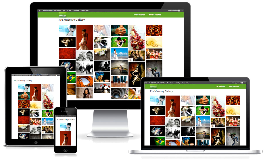
Nextgen gallery is the most popular gallery plugin ever for WordPress, which is fully responsive that we’ve found to date, it’s very easy to manage and we use it for every one of our websites.

Free Download


3. OrbitCarrot CTA Manager

ctamanager

OrbitCarrot CTA manager lets you create CTA (Call to Action Manger) boxes as widgets, and have full control of the look and content – it’s the only one we’ve found to date which actually links the whole CTA box not just the content. You have a choice of colours, or choose un-styled if you want to style the CTA yourself.

Paid Download


4. Yoast WordPress SEO

yoastsep

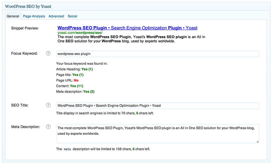
What can we say about this? We bloody LOVE this plugin. This is a MUST for every website. Yoast WordPress SEO is the easiest SEO plugin, it tells you where you are going wrong with your SEO for each page/post and gives you useful tips on how you can improve your SEO. They have even published an online know how manual. Do yourself a favour and get this!

Free Download


5. BackWPup

backwpup-589x500

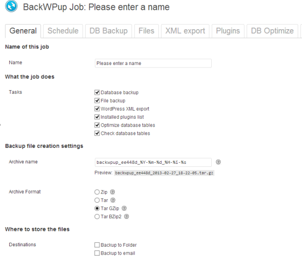
We all should backup our websites. I have had so many clients get in contact with us after a period of time and inform us they have mucked up their website. Back it up! This is the best WordPress backup solution, it includes email backups, Dropbox and Amazon S3.

Don’t forget that many dedicated WordPress hosting solutions will already include some kind of backup, or offer it as an inexpensive add-on, but these tend to be unreliable, so we have this as part of all our websites.

Free Download

6. Gravity Forms

gravity

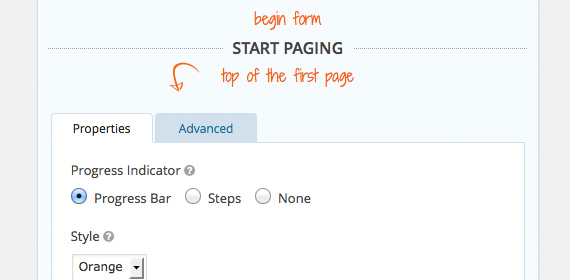
Over a million websites use Gravity forms. There are many free form plugins, such as Contact form 7 – so why are we recommending a paid one? It comes down to usability and functionality. Gravity forms unlike Contact form 7 have an easy to use UI, rather then a collection of shortcodes and code, which make up CF7’s UI.

Paid Download


7. Layerslider

LayerSlider_Full_width_1

LayerSlider WP is a premium multi-purpose slider for creating image galleries, content sliders, and mind-blowing slideshows with must-see effects, even from your WordPress posts and pages.  LayerSlider comes with 13 built-in skins, and it has tons of options to entirely customise the appearance and behavior of your sliders at the smallest detail.

Paid Download


8. CMS Tree View

treeview

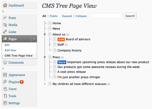
Adds a CMS-like tree overview of all your pages and custom posts to WordPress, often when you have loads of pages in WordPress it can be difficult to find pages and see a structure. This plugin solves this issue. Within this tree you can edit pages, view pages, add pages, search pages, and drag and drop pages to rearrange the order.

Free Download


9. Multiple Content Blocks

multiplecontent

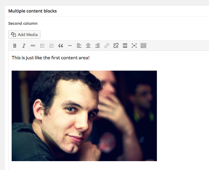
Multiple Content Blocks allows more content blocks in WordPress than just one. It creates columns or other page-specific content outside of the loop. Without your clients being able to screw up the lay-out 🙂 It’s a perfect plugin how adding content in between content in your sites theme.

Free Download


10. Restrict Widgets

restrictwidget

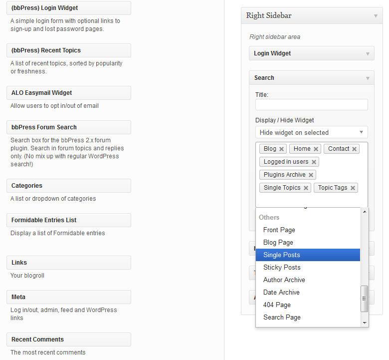
Restrict Widgets is all in one solution for widget management. It lets you control the pages that each widget will appear on and avoid creating multiple sidebars and duplicating widgets. You can also set who can manage the widgets, which sidebars and widgets will be available to selected users, which widget options will be available and how it will be displayed. This is really handy for any web developer.

Free Download

It's all in the design brief

Every time I meet a possible new client, the first thing they ask me is how much, but then they follow with ‘just don’t spend too much time on it’. Now how is any designer going to be able to get inside a client’s mind? We just can’t presume or guess. We need to understand our client’s motivations, what makes them tick, what are they thinking. We need to use a design brief!

A design brief is a document which has a series of questions which we ask our client to better understand what they envisage their logo or website will look and function. It plays a pivotal role in guiding both us and the client to an effective outcome. There may be stumbling blocks that crop up along the way – our client may disagree with a decision we have made. It’s at points like this when we can return to the details of the brief to back up your stance.

That’s not to say you won’t make design changes as a result of a disagreement – you want to please your client, after all. But the design brief exists to provide both of you with concrete reasons for making decisions throughout the design process.

Below is an example of a website brief we use for our clients. Have a look to see what I am trying to explain.

Writing your web design brief

The development brief provides potential web developers with sufficient information to base a proposal to undertake the development of the website. A good brief contains enough detail for external web developers to provide a firm quotation. Quite often it will just enable them to provide an approximate quotation which would be confirmed in the first stage of the project once they were appointed.

Below is the outline of a typical development brief adapted from the Australian Government’s e-strategy guide website.

Section 1. About [your organisation’s name]

  • Organisation’s mission statement
  • Services provided
  • History of the organisation

Section 2. Vision and objectives for your website

  • What is its vision?
  • What are its objectives?
  • What are the intended ‘deliverables’ to the public, your key audiences and your
  • organisation?

Section 3. Target audiences

Be as specific as possible about the target audiences for your site. Provide as accurate a breakdown of the demographics as possible, e.g. gender, age groups, location (state, national, international, rural, city), interests. Provide some assessment as to their likely experience using the internet.

Section 4. Project management

Explain the management structure within your organisation for building the site – who are the decision-makers, their respective roles, internal decision-making procedures. Detail your expectations re project meetings:

  • how frequently you want to meet with the developers
  • what is expected of the developers by way of reports
  • how disputes are to be resolved

Section 5. Background to the project

Provide any relevant history of the project and/or the organisation that would assist developers to understand people and content sensitivities, schedule, design, aims of the organisation etc.

Section 6. Content

Indicate:

  • content scope – how many words, images, maps, minutes of video, audio etc
  • content type – e.g. text, photos, audio, and their current format – e.g. digitised,
  • hard copy
  • provide an information design map showing all headings and sub-headings to be
  • used in the site and how they relate to each other.

Section 7. Functionality

Identify the functional elements that are to be included in the site. Describe in as much detail as possible how you envisage each function will work from the user’s perspective.

Include what results or information you want and what tracking you want to be able to do when users access that functional element. For example, for each online form stipulate how many fields of information, what information is sought, to who in the organisation the information supplied is to be sent and in what format. For example will it be an email with the text or is it to go automatically to a database or other program?

Section 8. Graphic and information design

  • Describe the organisation’s identity – does it need to complement the
  • organisation’s existing branding (logo, font, colours) or is it purposely different?
  • Detail your design criteria and provide web addresses (URLs) of sites you like the
  • look of and those you don’t.
  • Specify that images should in general be kept to a small file size and optimised for
  • fast download (users become intolerant of waiting for images to appear).
  • Specify accessibility requirements.

Section 9. General technical constraints

  • Speed – the optimum speed and any special factors that may impact on it.
  • Explain any restrictions you think will limit the target audience’s capacity to access
  • the internet – e.g. rural clients with limited access speed and capacity.

Section 10. Databases (if applicable)

Do users of the site need to access your organisation’s database(s)? If so, outline:

  • whether there is a need for instant links to keep the database up-to-date
  • instantaneously, or if periodic (e.g. daily/weekly) updating is sufficient
  • what restrictions are required for access to your database(s) and what level of
  • security is required
  • how often you expect users to access the database(s) and how many at any one
  • time.

Section 11. E-commerce (if applicable)

Do you want users to be able to pay for memberships, services and products, and donate money via this site? If so, be specific about:

  • what you want them to be able to pay for
  • the payment processes which are appropriate – e.g. instantaneous via a secure
  • online payment solution or users to provide credit card details with their order,
  • leaving the organisation to process the order and payment manually
  • the fulfilment details – how you are going to ensure supply and how the product or
  • service is to be delivered
  • how and where the terms and conditions of purchase (returns, refunds policy,
  • disclaimers etc) are to be displayed to users.

Section 12. Maintenance and training

Who will need to be trained from your organisation?

Section 13. Testing and revision

Over what period will testing take place? – at the beginning, during and/or just before launch?

Who pays for changes that are required as a result of feedback from the testing?

Section 14. Project schedule and deliverables

What’s the deadline for the site to be up and running?


Web Design Trends In 2015

Web Design Trends In 2015

Copied from http://www.elegantthemes.com/blog/resources/web-design-trends-to-look-out-for-in-2015

Web Design Trends To Look Out For In 2015

Now that 2014 is nearly behind us, we can now begin to look at the web design trends for 2015, in particular trends have and will impact the WordPress Community–from existing WordPress themes and plugins to the new opportunities these trends will provide.

1. Responsive Layout

design-trends-2015-responsive

Do you have a really good reason for not using responsive design? Over the last few years responsive design has solidified itself as the new standard for web design in general and WordPress themes in particular. Sure, there are still arguments over implementation, but no one is saying, “let’s get rid of responsive design” and in fact more and more sites are opting to go in that direction. That was certainly the case in 2014 and I wouldn’t look for it to go anywhere in 2015. This one has ceased to be a trend and can now be considered the new norm.

2. Ghost Buttons
design-trends-2015-ghost-buttons

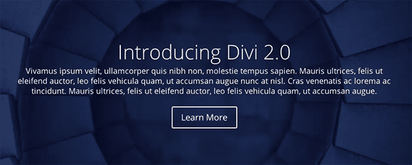
Ghost buttons are a prominent design feature in Divi. They’re minimal, stylish, and with the subtle hover animation they’re a delight to use. Look for this trend to continue into 2015; especially considering how well they pair with the large background images and videos we’ll talk about in no. 4.

3. Bigger Emphasis on Typography

design-trends-2015-typography

Image via Paul Rand

Usually web type-kits that allow for beautiful fonts and typefaces to be used on websites have been expensive. Meaning that sites leaning heavily on typographic design tended to require larger budgets–leaving the small guys (and most WordPress users) out of the fun. That however, is changing. Type kits are becoming more affordable (or free in the case of Google Fonts) and that means there is more freedom for designers working with a smaller budget to bring their typography skills to the web design table. Additionally, this allows WordPress theme designers to include more typographic flexibility in their themes, making stylish type-centric design attainable for anyone with a well designed WordPress theme.

4. Large Background Images & Videos
design-trends-2015-large-images-videos

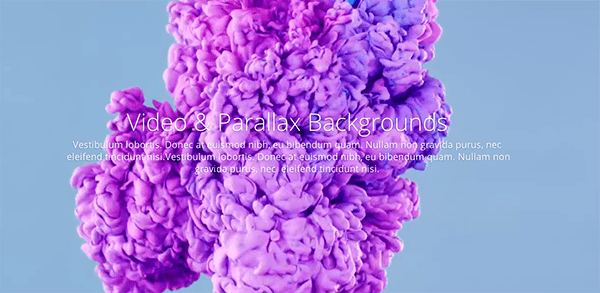
Another staple of Divi which has been and will continue to be a big hit are the large, beautiful background images and videos. One of the simplest ways to make your site stand out is by having great content displayed prominently. This trend is a wonderful way to accomplish that and when folded into a larger design style/philosophy it doesn’t feel gimmicky but powerful and elegant.

5. Scrolling Over Clicking

design-trends-2015-long-scrolling

As the mobile web continues to grow and web design continues to skew in the direction of a more effective and enjoyable mobile experience, scrolling will continue to dominate clicking. It’s more intuitive, easier to do, cuts down on load times and allows for more dynamic interaction to take place between the user and the website.

6. Card Design Will Get Better
design-trends-2015-card-design

Image via Pinterest

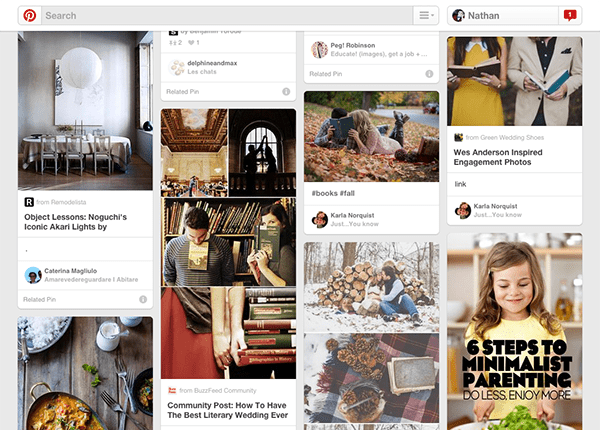
“Card” design, while not new, has proven to be a great tool for designers working on responsive websites. Cards are a great way to keep things modular, rearrange columns without things getting sloppy or disorganised, to browse a lot of general data, but also to prompt users to drill down and see more. In short, cards are clean and simple with a lot of versatility. Exactly what the web needs. So expect to see more of it in the remainder of 2014 and throughout 2015.

7. Flat Design is Growing Up
design-trends-2015-material-design

Image via Google Design

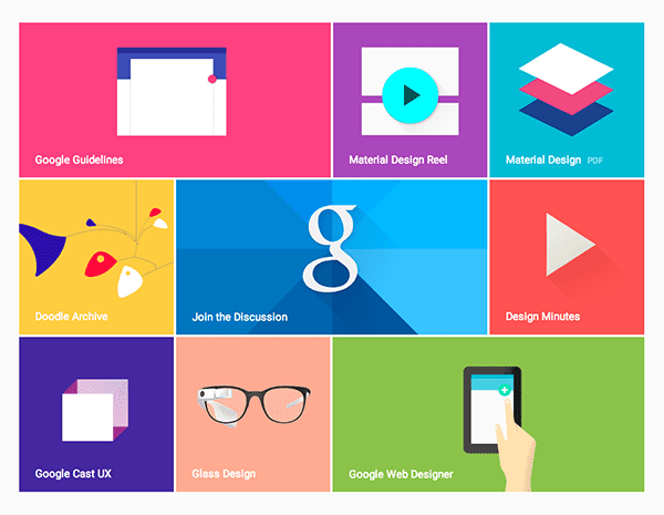
Flat design has achieved a lot of momentum over the last year or two and it appears to have staying power into 2015. However, it might be possible that as a concept, flat design is growing up. Perhaps into material design.  So, what is material design?

Material design is something Google unveiled this year as their new direction for mobile (and design in general). “Material,” to quote their brief, “is the metaphor. A material metaphor is the unifying theory of rationalised space and a system of motion. Our material is grounded in tactile reality, inspired by our study of paper and ink, yet open to imagination and magic.”

Outside of marketing speak (and including the observation that they’ve settled on something that might otherwise be called “almost flat design”) we can see that what the designers at Google mean when they say Material Design is a mostly flat design that uses very subtle gradients, layering, and animation to retain a sense of the tangible world (physical space and objects) while still achieving all the advantages of flat design. Some may disagree but personally, I think this is where flat design as a whole is headed and I look forward to seeing more companies and individuals adopt it in the remainder of 2014 and beyond.

8. Microinteractions
design-trends-2015-microinteractions

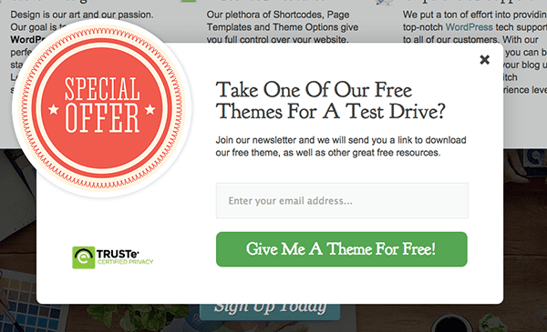
Microinteractions are a good trend to talk about after material design. What are microinteractions? They are contained experiences or moments within a product (or perhaps a module on a website) that revolve around a single use case. One example of this is the email signup box that pops up on this website. It sort of wiggles back and forth on the screen, giving a playful personality to an otherwise static graphic.  This microinteraction promotes an increase in user engagement; which in this particular case means more email signups. I’d look for this theory to further permeate web design in the coming years. I’d love to see more WordPress theme and plugin developers begin to think in this vein. In particular, I’d like to see plugins that don’t just add new features to a WordPress website but add new experiences.

9. Interactive Visual Storytelling
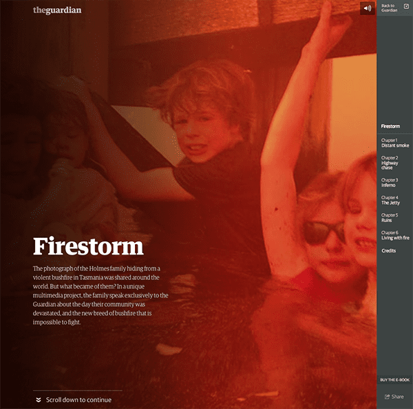
design-trends-2015-storytelling

Image via The Guardian

What do you get when you put all of that together? a better platform for telling compelling stories and narratives. Now of course I do not mean that every web page has to tell a fairy tale, yarn or other bit of fiction. That’s not what I mean when I say story or narrative. What I mean is that your brand is made up of a series of concepts or values (elegance, creativity, simplicity, etc.) and everything from your page layout to your font choice to your web copy and microinteractive page elements are narrative tools with which you can tell stories that embody those concepts and values by showing them in action. A perfect example of this is the Tesla website, which I talk about below.

10. Personalised UX
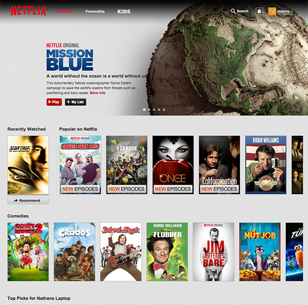
design-trends-2015-pesonal-ux

Image via Netflix

The idea of using cookies to help you display more relevant content to repeat visitors is nothing new. However, just as certain spammy practices (such as the popup) have made a classier return with better design and best practices in place, so too can the technique of using cookies to display certain content to repeat visitors be used for more than spam and shameless upselling. Netflix uses it to remember what you’ve recently watched. So does YouTube. Would it be so odd for a large editorial site to create a “recently read” sidebar widget for quick access to articles you may have enjoyed and/or commented on? Or perhaps hiding recently viewed content in order to highlight new posts/pages? I don’t think so and I think we’ll see more tasteful uses of this technique in the months to come. I’d also love to see that happening more in the WordPress community via plugins.

A Few Examples

Sometimes reading about all these design concepts can make it hard to imagine them working together seamlessly “in the wild”. To help remedy that I’ve put together a short list of three examples that collectively embody all of the web design trends I’ve mentioned in this post.

1. Apple

design-trends-2015-example-apple

You don’t have to be an Apple fan boy to appreciate good web design. Something that Apple has always accomplished with their trademark simplicity, and yet, continue to manage to squeeze in a remarkable number of current and future design trends. If you’re looking to learn but not mimic them, I think the thing to keep in mind is not that you have to create a site exactly like theirs but rather copy their insistency on subtlety to avoid making a trend come off as gimmick.

Visit Site

2. Tesla

design-trends-2015-example-tesla

One of my favorite websites right now, not just because I also love their products, is Tesla’s website. They combine all of my favorite trends into one fluid experience. I especially love their Go Electric page which uses large images, long scrolling, embedded infographics and interactive storytelling to explain their top five FAQ’s. It’s a brilliant bit of design chock full of delightful microinteractions that turns a traditionally boring part of most websites into a jaw-dropping showcase.

Visit Site

3. Divi

design-trends-2015-example-divi

Finally, we have an example that is not to be drooled over and dreamed of as hopelessly out of reach, but something that we can get our hands on and work with. Divi is without a doubt the best WordPress theme for the average user with limited (or zero) coding ability to achieve all of the trends covered in this article on their very own WordPress website. It’s possibly one of the most empowering WordPress themes I’ve ever come across. The drag-and-drop page builder takes advantage of interactive modules to help you create beautiful and effective pages of any length. And of course, thanks to its responsive design, that look and work beautifully on any device.

View  Theme

In Conclusion

The trends of 2014 look as if they will carry on into 2015, with a few of them maturing. In this case I’m speaking particularly about material design and microinteractions. The latter of which is the reason I didn’t include parallax in this post, as I would consider it a type of microinteraction that may or may not fade out in the next year but whose underlying concept will undoubtedly remain and mature.

As for what all this means for the WordPress community, I would think that we will see more themes follow the lead of Divi in creating more seamless ways for non-coding users to take advantage of these design trends. I also believe that as certain microinteractions become more popular in situations that have traditionally required custom development, the community will provide turn-key solutions via plugins; like they have with various popup form plugins.

I think the future of these trends will be decided by how far we push them in the months to come. Where will we find limitations that require refinement or perhaps going in a new direction altogether? I know I’m looking forward to watching it all unfold.


What’s Next in Web Design Trends for South Australia?

Back in March we looked at some of the design trends that would make waves for 2014. As we move past the halfway part of the year and look towards 2015, did we get it right? Here’s our web design report card and a preview of what’s coming next in 2015.

What’s Hot: Parallax, Flat and

In March, we said parallax scrolling would be popular. We were right, because web designers are making that effect do all sorts of great things. But many have gone even further, using scrolling effects to create columns that scroll separatelyhorizontal scrolling effects, infinite scrolling and more.

Flat design was another trend we mentioned that seems destined to be around for a while. As designers work more with flat design, we’ve seen a couple of other related trends. For example, minimalist icons work well with flat design (and with mobile first design). The web is awash with minimalist icon sets and minimalist mobile designs. Check out an example in the footer of the re:create site.

We were also right about card based layouts, which we have seen on social media and other sites. The proof is that Google has released new design guidelines (Material Design) which will be used to give all their products that layout. If Google‘s doing it, then you can be sure that design trend will be around a while longer.

Google Material Design


Bye Bye Slider, Hello Hero

Web design trends are not just about adding but about taking away. One old favorite that’s on the way out is the slider, because there are better ways to get attention. One of those is the hero area (the large area under the top navigation bar). This has become an important place to put images – the bigger, the better – to send a clear message about your business. Here’s one example from Airbnb.

airbnb homepage

award winning website development


Focusing on Type

Designers’ approach to type is changing. For a start, there’s a lot less text on pages, as companies use short videos to deliver the same message as a page of text. As we know, this keeps people on the site longer, so it’s probably a smart move.

Where type is used, it’s got a bit more experimental, with web pages mixing sizes and fonts to good effect. Check out the Poppies Flowers site where the navigation labels look like they’ve been written in chalk on a piece of wood.

Poppies Flowers type


One Page Websites

Many of the web design trends come together in the one-page website. These often feature large images, easy navigation and focus on minimalism. They can let businesses tell their story in a simple way and keep the user experience great for mobile and web users. And they usually use responsive design. Here’s an example on the BeNumo site.

numo


UX Goes Micro

Finally, many designers are focusing on micro UX – getting the small details right that enhances the user’s interaction with a website (or app). The Microinteractions site highlights some well known ones that we probably don’t even think about. There are also some good examples in this Econsultancy article, like the blurry animation below:

blurry


These are the trends that will dominate the rest of 2014. What other web design trends have caught your eye?

Go and visit http://www.trinetsolutions.com/ for more information.

9 steps to better web design

As the old saying goes, if you fail to plan, you plan to fail. Developing a web design without a plan is like constructing a building without blueprints. Things end up in the wrong place, features are overlooked, and the situation is ripe for mis-communication between website developer and client. Planning your website ahead of time will give it clear direction as well as prevent missed deadlines and backtracking. If you are a web developer working with clients, then this guide will help both of you to plan properly. If you are a business owner or employee of an organisation, then this guide will help lay the ground work for your website.

  1. Set your purpose and goals. What is the purpose of your website? To rally support behind a cause? Is it to gain publicity for your business? To sell your inventory? It’s important to identify your website’s purpose, as well as your target audience. You should also define your goals. How many visitors do you expect per month? How many do you expect will sign up for your newsletter? How much in sales do you expect to make? Set measurable, specific goals for your website that are in line with your marketing goals. An analytics tool like Google Analytics will allow you to monitor your website’s performance over time.

  1. Create a budget. Whether you’re an established, mid-sized organisation or a fledgling start-up, you should always set a budget for your website. This will probably include funds for web design, programming, and hosting (though other expenses may apply). Research the market by shopping around and consulting with professionals. Don’t sell yourself short by comparing prices alone. What you save in money you may later pay for with a lack luster site and lots of headaches. It’s better to choose team members based on experience, insightfulness, references, and examples of work.

  1. Assign roles. Assemble a team of people who will be working on your website. Your team may consist of:

  • Company stakeholders (owner, marketing manager, or whoever else represents a primary function of the business)

  • Content writer and/or editor

  • HTML/CSS professional

  • Web and graphic designer

Make sure everyone on your team knows their role and what is expected of them, and that they stay abreast of deadlines and new developments.

  1. Create a content strategy. Content is king! What kind of content will you be displaying on your website? Content is basically anything that gives your visitors information. It can include, but is not limited to:

  • Blogs

  • Documents

  • Videos

  • Photos / Pictures

  • Slideshows

  • Embedded social media feeds (such as your Facebook page or Twitter stream)

Your content strategy is the way that you plan to present your content over time. For instance, you may want to publish two blog posts a month, and put out a free quarterly report for your subscribers to download four times a year. Since content is such a vital aspect of a website, bring in help if you need it. Hire a copywriter who is experienced with writing for websites, and invest in some professional looking photos of your storefront and employees.

  1. Structure your website. Decide what pages you’ll be using and what features will be on each one. Most websites have an About and Contact page, but the pages you use should meet your business’ needs.

  1. Create a mock-up. A page mock-up, also know as a wireframe, is essentially the outline of your website. Usually created in Photoshops, you don’t have to put too much detail into your mock-up.  Use placeholder text to fill pages, and don’t worry about details. This is just to give everyone an idea of what the website will look like.

  1. Start designing. The importance of good web design can’t be stressed enough. Good website design includes both usability and aesthetics. An ugly website will drive away visitors, as will a website that’s difficult to navigate. Keep in mind some basic concepts of usability as you go:

    1. Make your navigation easy to understand and easy to find. Research shows that most users expect website navigation to be vertical and centered at the top of the page.

    2. Use an easy-to-read font for blocks of text. Choose a background color and text color that contrast well (Hint: No red text on a hot pink background).

    3. Make sure your site fits the screen. Use responsive design (or an equally effective approach) to make your website one that adapts to all screen sizes i.e. iPhone, iPads, etc.

    4. Keep your website light in image reproduction so that it loads quickly.

    5. Make your logo and tag line prominent on the page.

    6. Keep styles and colours consistent across the website.

    7. Make copy clear and concise, and put important information and features (e.g., your newsletter sign-up form) above the fold.

Make notes about what to include in the style sheet as you design, as you want to keep style and function separate. This is important, not only to comply with web standards, but to make it easier to change something in the future if you need to. You should also design with the future in mind. For instance, your website may only have a few blog posts now, but what about when you have two hundred?

  1. Test it out. Testing is important for getting out bugs out and catching details that you might have missed initially. Make sure your website shows up the way you want it to in all browsers, including Chrome, Firefox, Internet Explorer, and mobile web browsers like Safari and Opera Mini. Test it on your cell phone, your tablet, and your colleague’s cell phones and tablets too. You want your site to have a consistent appearance no matter what screen it shows up on. Make sure all of the links work, that the images are properly sized, and that you’ve replaced all of the placeholders with actual content. See to it that all of the forms and other input fields are working.

  1. Maintain your site. Once your site is launched, the work isn’t over. A website is an ongoing entity that continuously represents your company, so maintenance is very important. Monitor your analytics software to see how your website is performing with the public. Keep an eye on metrics like your number of unique visitors, bounce rate, and which pages are most popular on your website. You might find that certain metrics are more useful to you than others, but that is information you’ll find out over time.

You should also have a plan for maintaining the website, such as who is responsible for posting new content or monitoring site security. And of course, get feedback from your users. Feedback is a valuable tool for improvement.

Planning a website ahead of time is just as important as planning anything else in business, yet this step often gets overlooked by those anxious to claim their piece of internet real estate. Taking the time to plan your website is a great investment, and it will better you chances of having a finished product that serves you well for as long as you need it.

Using Your Website to Generate Leads

The other day I was sitting in a meeting with a new client, discussing their objectives of their website. What is it that you want it to do for you? This was the question that I asked them. There are many answers that usually follow. I usually hear things like:

  • Provide information about my business
  • Give people a way to contact me
  • Prove to shareholders that we are actively marketing online
  • Be on the first page of Google

Now, while these are all fine goals, they really aren’t the primary thing that we should be looking at. Yes, your website will provide viewers with information about you and your business. This should absolutely include a contact page, but is that all? About 5 years ago, this was enough, but the world has changed.

Online research for products and businesses has sky-rocketed and will continue to do so for the foreseeable future. Websites that act as nothing more than an online brochure are quickly feeling dated and out of touch. The big question is, besides a glorified Yellow Pages ad, what value is an online brochure providing?

Giving Your Site Purpose

For all businesses, the goal of their website should really be to collect sales leads first, and provide information second. I know this is contrary to usual thought, but it all works together. I am not devaluing the information on their website. In part, that information is how you get readers to visit. The primary question that I have is, what are you doing once you get them there?

Lead Capturing

The math is simple. Leads bring meetings, meetings bring sales, and sales bring more work. It is a constant cycle that has to happen for any business to survive. You wouldn’t pay a salesman that didn’t constantly generate new leads and schedule more meetings, right? Well then, why pay a website that just sits there looking pretty?

I am talking about potential customers leaving contact information of some kind. In some cases, this could simply be an email address.

So, how can you build your website to capture leads? It actually isn’t that hard. Here, are some simple steps to help decide what type of leads to capture, how to get it done, and how to track your results.

Step 1 – What Type of Leads Do You Need?

Great marketing requires laser-like focus. The first thing you need to decide what you want visitors to do once they get to your site. Do you want them to sign up for your email newsletter, fill out a bid request, or ‘Like’ you on Facebook? Decide on one main goal, and make it obvious.

Before you decide, here are a few questions to ask:

  • Who is my primary audience?
  • What type of leads do I want to capture?
  • Of those leads, what is their primary function on my site?
  • What would best motivate them to leave their contact information behind?
  • What methods of communication will they prefer? Email? Phone?
  • What is my system for handling new leads once they come in?

There are definitely more things to consider, but this is a good list to get you going. There are two primary types of leads that you can gather.

  • Email Leads – Gathering email addresses for an email newsletter is one of the simplest and most effective ways to gather new leads. It is an excellent strategy because it provides a very low barrier to entry, and will be utilized by many visitors. These leads typically include an email address and nothing more and require an email marketing program like Todaymail.
  • Contact Leads – Leads generated through a contact form, or ‘request a bid’ form usually come with the advantage of including a lot more information than just an email address, but can be far more difficult to gather. These leads are highly valuable though and certainly worth striving for. Leads generated this way are FAR more likely to actually turn into dollars over a simple email address.

Email marketing is one of the best online marketing tools available to those who use it right. While it doesn’t usually lead to an immediate sale, it does allow you to develop a trust relationship with leads over time. It is the slow and steady approach, but very viable. Contact form leads are extremely valuable and more likely to turn into business, but they are harder to get. We generally recommend a tiered approach that focuses first on email leads and second on the contact form leads.

Step 2 – Make Your Website Ready for Lead Conversion


Some leads will come no matter what you do, but for most of us – you need to make it easy. Here are a few tips on making your website lead conversion friendly.

Generate Inbound Traffic

To gain leads, you need to bring people to your website, and that is what inbound is all about. Traffic can be generated in many ways. Some common tools include, targeted inbound content through a blog, Google Adwords, referral sites, good SEO practices, and submitting your site to online directories and aggregation sites. This step involves a lot of moving parts, but should take care of getting someone to your site.

Nav to Suite

Yes, your navigation should be well considered and easy to use, but that’s not all. You should build your navigation in a way that leads your customer to your primary goal. Put things in their expected place. Contact forms should be easy to find, and e-news sign ups should be easily accessible.

Make it Obvious

Make sure you are clear about what you want them to do once they get there. Don’t beat around the bush. Remember last weeks lesson about being obvious and being repetitive.

Make it Valuable

You will probably need to incentivise customers to complete your lead capture system. Spend some time considering what they will value. A free estimate? A free digital download with tips? What will strike a cord with them and help them cross the finish line?

Don’t Get Greedy Half the battle in marketing is to be focused like a laser beam. Choose a strategic lead capturing goal and stick with it. Focusing on too many will lead to failure.

Step 3 – Check your Conversations

It is an absolute must to use analytic and website tracking programs to monitor lead conversations. Ideally, you should be using two metrics systems to get the best cross sampling of results. This process can get technical, but will give you pointers on how you can improve your lead conversion.

Use Goals

Most analytic programs have a goals feature that will allow you to monitor how many people have completed your intended goal. They will also outine the navigation path that they used to get there. You should be monitoring and analyzing this dataset regularly and making modifications to improve results.

A/B Test

A/B testing, when combined with goal tracking can be hugely powerful for monitoring lead captures. The key to this is making small, limited, adjustments to see if they make a difference lead capturing. Copy or design adjustments can make a significant impact on goal conversation when leveraged properly.

Make Adjustments

Whatever you do, don’t just set it and forget it. Goal tracking and A/B testing only work if you are willing and able to make ongoing changes. Your website is not something that you should update every three years, it is something that you update every three days! Constant changes and improvements should be made to make it better, and meet site goals.

Step 4 – Rake It In

Now that your site is perfectly tuned to generate new leads, you will need to have a good system for handling them and closing the sale. For each business, this will be different, but it is not something that you want to forget. If you plan to actively capture leads, plan to actively utilise them with an email marketing program or a customer management system that allows you to track customers and leads. Being smart on both sides of the new data is key.

[This post is part of the ongoing Better Websites Series.]

Adelaide Web Design

We are an Adelaide web design agency based in Adelaide.

We deliver cutting edge desktop websites, mobile responsive and powerful on-line marketing solutions for clients in Adelaide.

Responsive mobile web design

Web design is no longer limited to the desktop. With the popularity of portable devices increasing, it comes as no surprise that mobile and tablet internet usage is set to overtake desktop internet use by 2016. The team at DesignLab are experts when it comes to responsive web design, creating websites that provide the highest user experience no matter the device.

Search engine optimisation

Why get a brand new website if no one’s going to see it? Did you know that 80% of internet users never scroll past the first page of search results? Your customers will only click the first few links that appear in Google, and unless your site is professionally optimised, you will lose out on valuable business.  We have SEO experts in our agency, making sure your website is Search Engine Optimised properly.

Website Design Services we offer

  • Adelaide Website Design
  • Website Development
  • Content Management Systems
  • Social Media
  • SEO + SEM
  • Email Marketing
  • Website Hosting
  • Domain Registration
  • Website Maintenance


Graphic and web design trends for 2014

With 2014 well on its way we thought it was a great time to look at this year’s graphic and web design trends to help you work towards achieving your competitive edge.

iStock Photo by Getty Images asked creatives around the globe to weigh in on what’s hot and what’s not for 2014. The resounding response was that simplicity is king, even as we’re introduced to more and more complex devices, platforms and channels than ever before. From flat design to reigned-in parallax scrolling to 5-second social media videos, think of simple design as the yin to technology’s yang.

10 Graphic and web design trends for 2014

1. Simplicity

Simplicity will undoubtedly be the most powerful tool for expressing the highest level of sophistication.

2. Flat Design

Hopefully we see better ‘flatness’ than we did this year. Many screen and app designs have applied flat shapes and solid colours with such fervor that they created layout, rhythm and usability issues. The many screens and wearable tech gizmos will require us to design clever and connected experiences.

3. Improving Parallax Scrolling

Over the past few years parallax scrolling has become a very popular tool enlivening the delivery of content on the web. More and more we will see this used in a restrained way — with more of a ‘light touch.’

4. 5-7 Second Storytelling

The biggest social media trend will be 5-7 second storytelling — clickable videos, Vine, and animated Gifs all use small pieces of moving media to tell a story quickly.

5. Logos With Depth

The increasing simplification in logo (re-) design is overused. In many cases this leads to a loss of brand sovereignty.

6. Real Models

I believe there is a trend in portraying reality more. We know models are meant to help to sell products…but the imagery of normal, real people also sells and can enhance public affinity with the brand.

 7. Digital Innovation

The Brazilian advertising industry is becoming more and more mature, focusing on what is really relevant to consumers, not just on what wins awards. Advertising needs to change to adapt to a market that has already changed.

8. 3D Printing

New forms, designs and patterns by 3D printer will be gain more popularity in 2014.

9. Creative Inspiration

We need to invest in knowledge about ourselves, about the world we live in, about the role of creativity on this planet. This knowledge will help us transform reality into something closer to what we dream of.

10. Trend Lists

I don’t believe in design trends being overused. The issue is around timing; if you’re using an aesthetic, design or idea that people are sick of, you’re not doing your job. However, I think creatives get jaded with new design styles way before the general population, so I’d say feel free to overuse more. People like consistency.

To download the full infographic visit iStock.