benefits-of-heatmaps

Benefits of heat maps

The benefits of a heat map are very rewarding, let’s say you’re wanting to know which areas of your website are getting the most attention, then a heat map shows you in a visual way that’s easy to understand and then make strategic decisions from.

Why a website audit is important

Why a website audit is important

Your website is one of the most valuable properties your business has, and this is why a website audit is important.

If it’s been a while since you’ve updated your website then it’s time to take a look at what’s working and what’s not in today’s online world.
Conducting a website audit benefits your business because it can aim to increase your online presence and online sales. A website audit can identify problems with your website architecture, and as a result, you can learn where to improve technical site performance.
A website audit discovers discrepancies that could result in Google penalysing your ranking on Google’s search engine rankings

The website audit can be broken down into:

  • Site health
  • Traffic
  • Functionality
  • User engagement
  • User experience
  • Website performance

Site Health

A site health audit will assess architecture and the usability of a website. It also analyses likely gaps in content structure and speed. It also discovers new opportunities for key performance indicators (KPIs).

The following are steps we can take on your behalf to fine-tune your website in order for it to stand out online.

Visit your website like a visitor

We will take a good look by visiting your home page as if it were for the first time we had seen it, and look at it from your customers point of view. We can note of how long the page loads, how easy the content is to read, the graphics, and and how it looks on a mobile device. By subscribe through your opt-in box and double checking all your links are linking to the right pages. We will follow the entire email sequence and track whether your messages are timely, relevant, and correct.

Check all your content links

For your website in particular it could have expired or removed backlinks, which can be checked through by our web developer. This may take some time to evaluate with little cost, but it will greatly improve your website’s speed and help move up your ranking in Google.

Optimise images and outdated plugins

Another issue that slows down websites are too many large sized images and outdated plugins. We can optimise your graphics for faster loading, and update or replace any old plugins in order to remove errors and lag times.

Making sure it’s mobile-friendly

We’ve mentioned this before in our other posts, but it’s worth repeating again. Most consumers these days search and shop straight from their smart phones — the bottom line is that your website needs to be easy to find and navigate or your presence will almost be lost.

You can take a look at what your website currently looks like on all devices including a desktop, laptop, and mobile.

Measuring ROI (Return on Investment)

If you have an eCommerce website then you will want to install tracking for all of your PPC ad campaigns. This is done directly through your Google Adwords account, and is pretty easy to set up:

By checking your website at least every six months will save both time and money.

Remember that a well-tuned website is basically your business’s calling card, and it needs to stand out from your competition in order to get noticed. If its outdated or has too many images or text with broken links, your prospects might be moving on next door to the competition.

By addressing these points will greatly improve your search engine ranking and improve your subscriber rates and sales.

What can your business expect after doing a website audit?

You will receive a report that will includes any discrepancies discovered. It also shows you the most effective way to fix them. Regular website audits keep businesses aligned with Google’s best practices.
 
A website audit is an essential step to improve the efficiency of your website. Website audits improve Google search ranking while increasing website traffic and performance. A website audit provides your business with an unique opportunity for growth online.

What do you do if your website audit needs urgent attention?

If the audit has some negative reports that make you realise some change is in order, contact us for assistance in making changes.

We would love to assist you!


set goals and objectives for your website

Set goals and objectives for your website

When planning a new website, every business or organisation should set goals and objectives for your website. It’s obvious that you might want to skip ahead to the “fun stuff” and brainstorm ideas.

What is UI Design?

What-is-UI-Design

What is UI (user interface) Design? is difficult to answer because of its large variety of misinterpretations. While User Experience is a mishmash of tasks focused on optimisation of a product for effective and enjoyable use; User Interface Design is its compliment, i.e. the look and feel, or the presentation and interactivity of the product. But it is easily and often confused by the industries that use UI Designers. To some extent that different job roles will often refer to the profession as something completely different (i.e.UX).

You will find perception of the profession that is alike to graphic design. Sometimes spreading to branding, and even front end web development as well.

If you look at an expert explanation of User Interface Design, you will mostly find descriptions that are in part the same to User Experience. Even mirroring the same structural techniques.

So what is the right answer? The conflicting answer is: Neither of them.

But both are close in minor ways. Like User Experience Design, User Interface Design is a all-round and challenging role. It is responsible for the transportation of a product’s research, development, content and layout into an appealing, guiding and responsive experience for a user. It is also a field that dissimilar to UX, is a strictly digital profession, as per how the dictionary defines it (as per below):

user interface
noun Computing
the means by which the user and a computer system interact, in particular the use of input devices and software.

Whether you choose UX design or UI design, it is important to understand how the other one works, and how to work with both of them.

Below are some of a UI designer’s key responsibilities:

Look and Feel:

  • Customer Analysis
  • Branding and Graphic Design
  • Design Research
  • Branding and Graphic Design
  • User Guides/Storyline

Interactivity and Responsiveness:

  • Interactivity and Animation
  • Implementation with Developer
  • UI Prototyping
  • Adaptation to All Device Screen Sizes

As a interactive and visual designer, the UI role is important to any digital interface and for customers a key element to trusting a brand. While the brand is never the responsibility of the UI designer, its translation to the product is.

A responsibility for “implementation” of the design with a developer is generally how UI have worked in the past, you should be aware that the lines are dim, as the term “Web Designer” (in short is a UI designer who can code) is being replaced by expertise of User Interface Designers. While UX has no need for coding, UI is a role that as time will  progress, will rely on it as part of building interactive interfaces.

Updating Your Website Without Sacrificing Your SEO

We all need to keep up to date with web trends these days, and usually that means every three to five years you should consider redesigning your website. But often a client does not think what impact this will have on their SEO (if it’s optimised well to begin with).

Why should you consider SEO in a redesign?

In short, because you have a lot to lose. Let’s say your website’s ranking really well. Rankings are strong, organic traffic is flowing and revenue is growing. Do you really want to undo all that hard and expensive work?

However, by thinking strategically, you can take the opportunity to improve a site’s performance after a redesign.

SEO-ranking-graph

This diagram shows a steady increase in traffic followed (from the red circle) even during the re-indexing phase. If you do a redesign correclty, you won’t lose any traffic or rankings; in fact, you’ll gain them.

Below is some tips that can help you understand the test site being built and your current site from an SEO point of view. This is ciritcal when changing your website around.


Tip 1 – Think about your SEO

First thing is to think about SEO. Very often clients don’t stop to consider the impact SEO has changing their website. They chuck away valuable content from historical pages or completely change every single URL without redirecting the old ones.

This happens because they misunderstand how Google reads a website and how URLs hold credibility. It’s no fault of their own, it happens.


Tip 2 – Crawling the existing site

You should know what your site’s structure looks like, you will fail if you don’t. Grabbing it’s meta data and URLs is critical to identifying exactly what is changing and why.

How do I do that?

Your SEO crawl will give you a road map of what your site is currently set out. The best way to do this is to use a tool like Screaming Frog. Once you have the current site’s meta data and structure, you will know how to match with the new site.


Tip 3 – Auditing the old site

Free tools like Woorank will do, but we advise you to get your hands dirty so to speak, and manually do it yourself. There’s nothing like getting into the nitty gritty of your site to find any problems.

Why audit the site?

You need to know what search engines like and don’t like about your site. This helps you recognise any problems, but also enables you to see which areas must be retained.

What am I looking for?

Here are some tips to check. Using Screaming Frog, I advise checking the following:

  • Duplicate page titles
  • Missing H1 tags
  • Duplicate H1 tags
  • Multiple H1 tags
  • Missing meta descriptions
  • Missing page titles
  • Duplicate meta descriptions
  • Canonical tags
  • Canonicalisation
  • Broken internal/external links
  • Image alt text

You should also be checking for:

  • Robots.txt
  • Site speed and performance using Google’s PageSpeed Tools
  • Duplicate content (do exact match search “insert content” or use Copyscape)
  • Pages indexed by Google (do a site: command in Google)
  • Site speed and performance (here’s a tool to check)
  • URL structure
  • XML sitemaps
  • Pages indexed by Google

Tip 4 – Noindex you’re test site

If you’re working on your test site, you do not want Google to index it. If you have added new content, it will get indexed. So when the new site is ready to launch, the new content will have no value because it has been duplicated because of the index while you were working on it.

A site can be noindexed in two ways by your web developer.

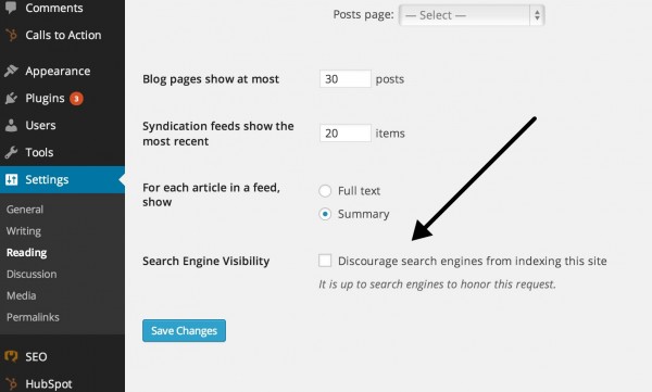
If you have WordPress you can simply check the box that says: “Discourage search engines from indexing this site.” under the Settings tab.

wordpress-SEO-setting

This adds the following code in the <head> of every page:

You have a second option which is to block the site in the Robots.txt file. This is a little tricky however; which is why most CMS have a box-ticking option which is easier.

If your CMS doesn’t allow for this, you can put the following in your Robots.txt file:

User-agent: *
Disallow: /


Tip 5 – Crawling the test site

You need to understand how your test site will be structured. Using a site crawler crawl the test site again to see how it looks in comparison to your current site.

What do to:

  1. Open the first crawl of your current site and make a copy. Click “Save+As” and name the file for example “Current Site Crawl for Editing”. This will be your editable copy.
  2. Then crawl the test site. Export the test site crawl and save this one as “Test Site Crawl”. Make a copy and name it “Test Site Crawl for Editing”— this is the one we’re going to use.
  3. Take the new created old site crawl (Current Site Crawl for Editing) and do a find and replace on all the URLs in a program like Excel. Then replace your domain name: “domain.com” with your test server’s domain: “test.domain.com”.
  4. Select all the URLs and copy them into a txt file. Save this one as the “Testing Crawl for Screaming Frog”. You should have the following files:
    • Current Site Crawl(xls)
    • Current Site Crawl for Editing (xls)
    • Test Site Crawl(xls)
    • Test Site Crawl for Editing(xls)
    • Testing Crawl for Screaming Frog (txt)
  5. Using  Screaming Frog, find the Mode in the menu bar and select List. The system will change, and you’ll be able to upload a .txt file.
  6. Locate your txt file (Testing Crawl for Screaming Frog) of all the URLs you just changed and load that into Screaming Frog. Then hit Start.
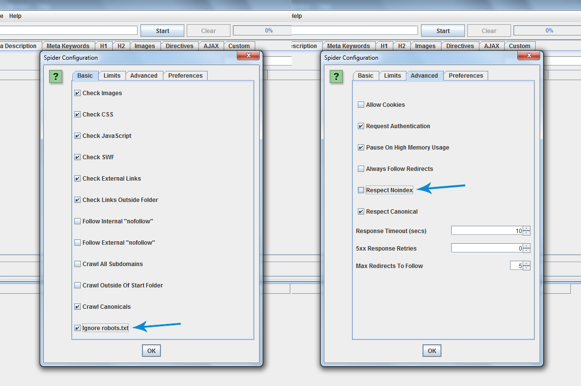
  7. If followed correctly, you will end up with all the URLs being crawled. If it didn’t, you have to go back and make sure you didn’t miss anything. You will need to allow the crawler to crawl blocked/noindexed URLs. Click Configuration and Spider. Then you’ll find a tick box that says Ignore robots.txt. You may need to tick this. On the same part in the tab called Advanced, you’ll see Respect Noindex; you may need to un-tick this, too. Have a look below at the example.

screaming-frog

Now download all the HTML files and save it as an Excel file. Name it “Final Crawled Test Site”. This can be the test crawl you’ll check later. But also, hold onto the very first crawl we did of the test site (Test Site Crawl).

You’ll have the following docs:

  • Current Site Crawl(xls)
  • Current Site Crawl for Editing (xls)
  • Test Site Crawl(xls)
  • Test Site Crawl for Editing(xls)
  • Testing Crawl for Screaming Frog (txt)
  • Final Crawled Test Site (xls)

Now you have the data in Excel format, and you can see what works on the test site. This allows you to understand what’s missing from the test site that is on the current site.


Tip 6 – 404 time

If your’e pages have a 404 error, it means that the page doesn’t exist anymore. So we’ll need to do one of two things:

  1. Create this URL on the test server.
  2. Redirect the old URL to the test server’s new URL.

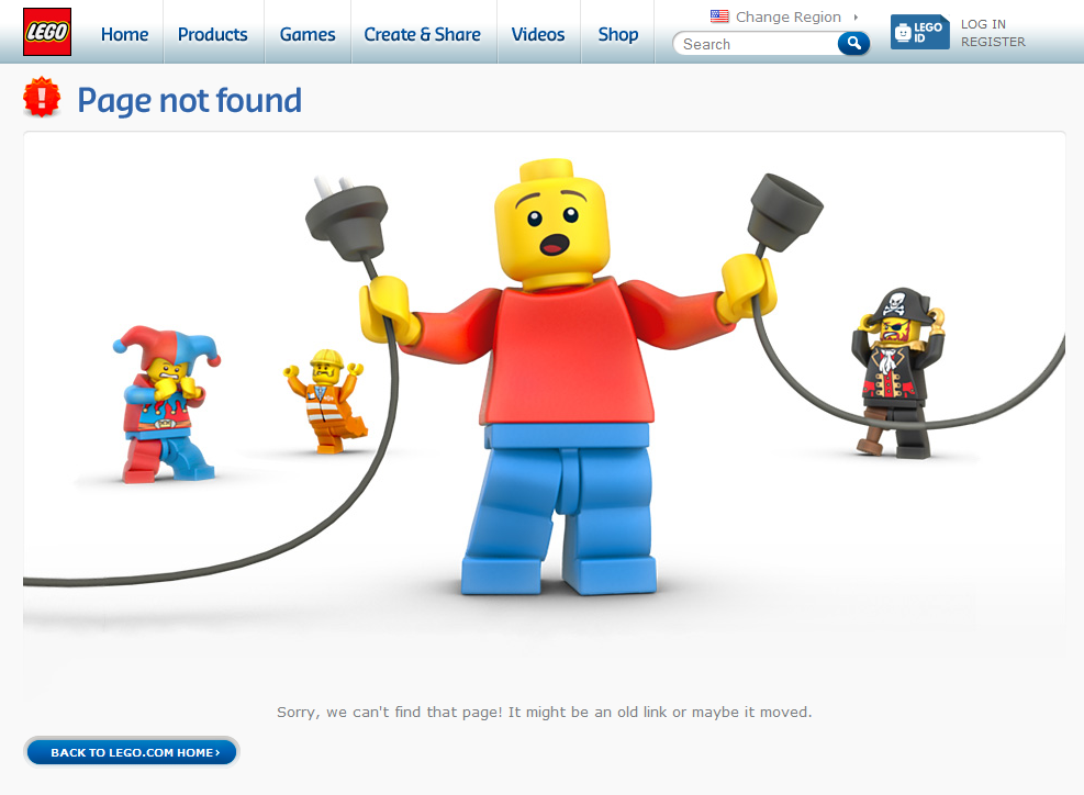
Here’s an example of a 404:

404-error


What do to with a URL that isn’t on your current site?

Like with any page on your website, it has to be optimised correctly.

When you redirect pages to a new site you will lose around 10%-30% of your link equity. But you’re giving search engines the best opportunity to bring over your old site’s strong reputation.


Tip 7 – Checking all the additional checks

Rank check

A rank check measures how you’re site performs for a host of keywords in the search engines. You can use this data as a comparison for the new site. If things change, you can react and identify the problems when you check the results.

This is what to look out for:

If a keyword jumps from page 1 to page 10, you could have a problem. Look out for any big or unusual movements by checking the following:

  • Did the URL change?
  • Did you change any of the meta data?
  • Has the page lost all of it’s content?
  • Is there a redirect in place?
  • Does it have a noindex tag in place?

Content

Don’t delete anything you don’t need to. You might think your old blog posts are old and useless, but they are all adding to the credibility of your site. Without these, you’ll lose a chunk of SEO value.

Google Analytics code

Make sure you place your Google analytics code back in the <head> section of you’re site. It’s really important to check the e-commerce tracking and goals if you currently have those in place.

Unblocking the site

It’s time to check the new site to see if it’s allowing search engines to index it. Just do the reverse of blocking the site to what you did before . Whichever method you used to block it, just do the reverse. If you don’t do this it will create big problems.


In summary checklist

Here is a checklist to use that will help you run through it again.

tickThink about your SEO from the start of the website

tickCrawl the current site

tickAudit your existing site

tickStop the test site from being indexed

tickCrawl the test site

tickFind and replace URLs

tickCheck 404s on test site

tickOptimise all new pages

Fix Your Website Bounce Rate with Responsive Design

bounce rate


In the world of Internet marketing, a website which as a high bounce rate is considered to be a very negative blow. It’s a warning sign that something is wrong with your website, so if you want to capture more sales and leads, a high bounce rate is a issue you can’t afford to ignore.

A bounce rate measures the percentage of visitors who come to your site and leave after viewing only one page. In most instances, this means that they land on your site, look at it for a few seconds, and then leave.

A bounce rate also shows you how effective your brand connects with your visitors, and today mobile website visitors have less patience than a desktop visitor does. It’s a fact that internet traffic shifts more heavily towards mobile these days, so the best way to engage visitors and lower your bounce rate is to have a responsive site that offers a great mobile experience.

A great questions is why do people bounce? Something brought made them come to your site, it could have been a page title, a meta description, or a social post, but they were at interested enough to click on your page. And they may just leave because they didn’t get the information they were looking for, or the page took too long to load.

A high bounce rate means people aren’t engaging with your website enough, which more than likely means they’re not buying your services. So, reducing the bounce rate on your website needs to be a priority if you want to see an increase in sale conversions.

We all get put off by the way a menu is not displayed correctly on a site that is not mobile responsive, it could be that the text is jumbled and images are not shown as intended. This often means that the user will move on to another website instead, perhaps your competitor whose website is responsive, and much easier to navigate on a mobile device. If your website is mobile responsive, things like Calls to Actions can be easier to find. Some interesting studies have been found by MoPowered, which state 30% of mobile shoppers leave a transaction if the experience is not optimised well for a mobile.

A desktop visitor can bounce 45% of the time on average. Mobile users are more likely to leave so you have to expect a mobile bounce rate figures to be up to 18% higher than desktop figures. The difference between mobile and desktop bounce rate percentages can be even more bigger with lead generated websites because of the requirements to complete large forms on a website. The expected bounce rate for tablets is up to 15% higher than desktop bounce rate numbers. A much higher percentage for mobile and tablet devices may indicate that the website is not optimised for smaller screens.

How to create a High Converting Landing Page

How do you create a high converting landing page that drives maximum conversion rates in Google?

What’s a landing page?

A landing page is what your customers view after clicking through Google’s search engine.

These web pages are designed for one purpose: to convert a visitor.

Whether that conversion goal is to get people to either buy a product, or to book an appointment, it can be done by strategically arranging elements on your landing page.

What’s the difference between a landing page and all the other pages on my website?

Most businesses have an “About us” page, a variation of a “What we offer” or “Services” page, and a web page dedicated to your customers. These pages, help make your website — the purpose of which is to teach your customers more about you’re business.

Landing pages work different. They’re designed specifically to convert visitors into leads, which means they need to be persuasive than any of the other pages on your website.

The people who land on these pages don’t want to learn your vision, or meet your team. They’re there because they’ve been enticed by your promotion and want to see what you’re offering.

So how do we go about creating a landing page layout that will boost the chances your visitors convert?

The best landing page layout, above the fold:

If you want to make a good impression, place your important elements above the fold. They will help you quickly convey the benefit of your offer, and show prospects what they need to do to claim it.

Your logo

If you don’t include your logo somewhere on the top of your landing page, your’e visitors may wonder who are you. It’s important to practice consistent branding, so that customers know they haven’t been redirected to some spammy site.

Like most sites, this company has placed their logo in the upper-left corner

Landing Page Logo

You need to do the same, because the upper left corner is where most of your customers will look to find you.

No navigation

A landing page is a little bit like a well-designed trap. Your customers should be able to get in, but not leave, unless they buy.

That means no navigation menu across the top for visitors to escape with. The only three ways they should be able to get off your landing page is:

  • By buying
  • Or by hitting the “x” in the corner of their screen to exit the browser window
  • Or by clicking the back button

A strong call to action

Your call to action should be the first thing your customers read when your page loads. Use big, bold text to draw attention, and communicate your unique selling proposition in a way that explains how it will benefit them.

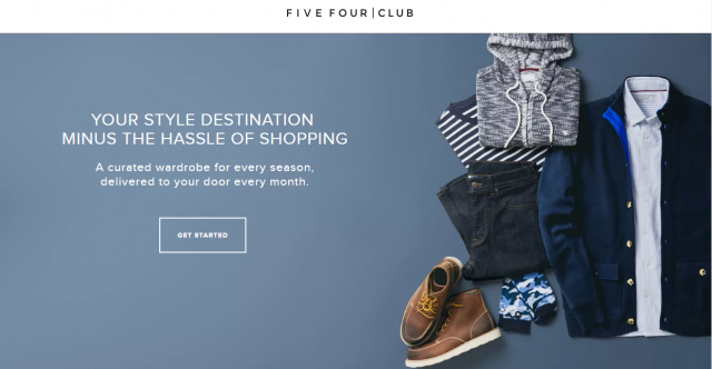
Here’s is a great example from Five Four Club:

Call to Action headlines

Their unique selling proposition is that they deliver your clothing to your doorstep. So how does that benefit the customer?

They don’t have to go actually go shopping.

When thinking of your headline, think about the problem your customers face, and communicate how your business is going to solve it for them.

Without a great call-to-action, your landing page is could fail.

Remember, the entire purpose of a landing page is to get your customers to take action, and this is how it happens. Your visitors have to click a button to convert.

If you have a contact form, position your Call To Action button just below.

Engaging media

More and more these days we process the world visually through gestures and facial expressions. We’ve evolved to prefer images to text when processing information.

The quickest and most efficient way to get information across is to show it.

Hero shot helps your customers imagine their lives after they have bought your product; infographics like charts and graphs help them better conceptualise the information; videos and case studies help them understand your product in a easy way.

Engaging Media

A detailed form

You may or may not require your customrers to hand over information about themselves in exchange for what you’re business is offering.

If so, you will need a lead capture form, like the one below from Salesforce:

lead capture form

These contain a combination of fields, allowing customers to submit more information about themselves, but forces them to at least give you the bare minimum you need.

Include a lot of required fields and you’ll get more information from your customers who may convert. More information allows you to deliver marketing messages, on top of giving you a greater insight to your target audience.

But, sometimes the more you ask, the likely your customers are to fill out the form properly. They may not have the time to finish a form that is too long.

On the flip side, the less you ask, the more likely it is your customers may finish filling out the form, which means the more leads you may generate. But, they won’t be as much as the leads you generate from a longer form.

Benefit-oriented copy

“What’s in it for me?” That’s what your customers want to know when they land on your page. Don’t waste time getting to the point by fluffing around. The more direct, the better.

Something else to keep in mind when writing your landing page copy is that people don’t like to read block text. Big text blocks were the last thing people want to look at.

Make it simple and small.

Minimal footer

There should only be a couple of ways off your landing page: the back button, the little “x” in the corner of the browser window, and your call to action button.

When it comes to creating a footer, it shouldn’t include a sitemap, or links to your social media sites. The only thing you should have in your footer is:

  • Terms & conditions
  • Privacy information
  • Copyright information

Here’s an example of a footer.

simple Footer

Remember that any link that isn’t your CTA button simply acts as another way for your customers to escape your page without buying.

Contact information

If your landing page has done the job, your customers will be able to decide whether or not to buy your offer.

But it’s not always easy to anticipate all your customers questions. Sometimes they want to talk to a person, and a contact information lets them do it.

Add yours to your footer, or even to your header.

contact info

Bad Design Habits for Websites

An important part of being a professional web designer is knowing what and doesn’t work. There are bad design habits for websites that a lot of builders don’t take notice of. Everything you design on a client’s website should be there for a specific reason, and should follow the most current design practices. Unfortunately, sometimes we all get stuck in a rut, and add certain website elements out of just habit, unaware that there might be a better, more freshen approach.

Dead Macintosh

We are half way through 2016, and it’s time to take a look at some of the most common offenders of web designs. Some are now out-dated, while others are actually toxic to the success of a website. We will examine why each should be forgotten, and what you can do instead to make sure you’re designing with the most current trends at your disposal.

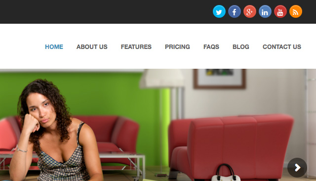
Social Media Icons at the top of the Header

Every time your client has a visitor to their website, it’s a small win. So why would you want to give them a brightly coloured exit sign?

Usually in most cases, the point of a social media campaign is to drive visitors from social network sites to your client’s website, not the other way around. Even if a visitor follows the link with the specific purpose of following your client, the chances are that they will get distracted somewhere along the line, and not come back.

Social Buttons in Header

A Solution:

Your best approach is to start using social media plugins (WordPress) rather than a simple link icon. These will allow your visitors to like your Facebook or Twitter page, or add you on other social channels without bouncing them off the page. It means the users stay on the page, keeping your client’s visitors where you want them.

Try taking the emphasis off by moving them down the page, to either the footer or a sidebar. Also, I recommend to style them in perhaps a less eye catching way. It should only be visible for users who are looking for them, if you make them too colourful, it may entice the visitors to leave.

Tacky Stock Photos

We all know that full-width images are a popular and tired trend in web design, and they have actually been shown to increase conversions. Unfortunately, photos that are clearly of the stock variety can have the opposite effect. People can be turned off by anything they deem to think is not real, which causes distrust, thus taking conversion rates down.

Tacky Stock Photo

A Solution:

You have some choices, but will be largely determined by your client’s budget.

The first choice would be to hire a photographer. Customers respond very well to authenticity, so if your client’s actual photos are professionally taken, it will go a long way building trust. Photography can range in any price, so it can usually be achievable. These days, even a smartphone can take decent photo, if you put a little effort into it.

Another option, stick with stock photography, but choose it much more carefully. We have actually designed many websites using stock photos, but the trick is find the right image that don’t look cheap, and suits your clients business.

Only recently is there stock photo businesses that specialise in “authentic” looking photos. The kind that look like you would find scrolling through your Instagram feed.

Email Links

If part of the website you’re designing includes some type of staff bios, the question of email links will always come up. It’s an easy way of letting people get in touch easily with staff members, but it comes at a cost.

When you click an email link, it will trigger your computer’s native email client, which you may or may not use. Then, I must right-click the email address to save it, and paste it into my gmail.

Another issue is email links are usually crawled by robots, making your client’s website a sitting target for email spam.

Email Links

A Solution:

Most website have an email form on their site, (contact page,) just use this technique everywhere on the site that requires an email address. In the case of individual staff contacts, design one template you can use for each staff member, each with their own mini-contact form that will send to their email address. There are advantages to this approach:

  • Form emails are easily tracked
  • Emails sent through forms can be filtered through apps such as Google’s mail app
  • You can set up specific fields for emailers to complete

If you must include an email address on the website, just make sure they are not linked if you’d like to sidestep email spam. Your clients will appreciate that thinking.

Client-focused Copy

One of the best marketing tools you can bring to any website is professionally copy. In most cases clients use their websites as a brag-page, shouting to the world what makes them so damn amazing. The truth is, their customers could not care less.

Visitors need to be enticed in order to make a conversion. And what entices a user? Benefits. Specifically, how will this product or service benefit me.

By taking up valuable real estate space to brag about your client, you really aren’t looking at what matters. Take a look at the following example:

Client Focused Copy

Visitors don’t really care as much about the fact that they have been innovating since 1949.

A Solution:

Whether the websites copy is coming from you, or directly from your client, it has to address the benefits for the customer. A benefit is not a feature, and it’s not a brag. It should address an objection for a customer, and specifically say how they as a business can solve it.

So instead of “Packaging Quality, Service, and Innovation Since 1949,” you might try “Are You Tired of Paying for More Than You Need? High Quality Offset Packaging With No Minimum Orders.”

This addresses a specific point, and solves the problem easily.

Ghost Buttons that are a Call to Action

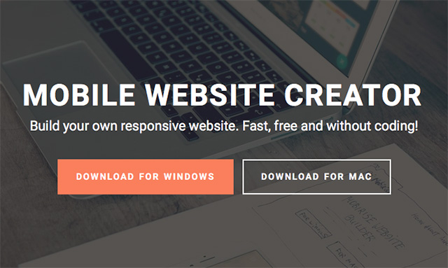
Ghost buttons are form over function. While they are not old-school it takes the visual weight out of a button, by surrounding the text with a simple rectangular stroke, it makes for a nice looking design element, but it comes with a price: it decreases click-throughs.

The trouble with ghost buttons is that they don’t always read as buttons. Good user experience states that buttons should be clickable obviously, and ghost buttons sometimes don’t hit the mark.

A Solution:

Simply stick with the basic. Your buttons (especially your main CALL TO ACTION) should be styled to look like a typical button. Here is some tips to design the perfect CALL TO ACTION button:

  • Shape – Rounded rectangles work better. Web buttons have always been associated with rectangles, and the rounded corners draw the eye inwards toward the copy.
  • Copy – Use action words wherever possible that highlight what the customer is getting, not what they are giving up. One example is “Get” is a more saleable word than the word “Buy.”
  • Color – The colour you use for the button should contrast with the background. Don’t go for subtle; You want your CALL TO ACTION to pop out at your customers.

While you should aim to avoid ghost buttons for your CALL TO ACTION, it can often a way to style your secondary line, especially when it is in close proximity to your primary line.

Ghost Buttons

In Summary

Every now you need to take a step back to see what features and techniques are adding to the success of your websites, as well as which ones are only getting in the way. We learn more about user behaviour, so we should always be evolving our methods in order to deliver the best possible result for our clients.


SEO Tips for Designers

SEO For Designers

Search Engine Optimisation (SEO) is a important component of any website. As a web designer or graphic designer, it’s important you understand how SEO works. There is in fact a serious lack of resources for designers who don’t know about SEO out there. Here are some easy SEO NJ tips for designers that will immediately improve the SEO on all of your websites.

Tip 1: Do Not Cheat

Do you think you could outsmart a room full of genius scientists with PHDs? No. Google has many genius scientists with PHDs, and their job is to work tiring hours a week to make sure you can’t fool Google. No matter, what you do, you can’t outsmart them. Just ignore trying to cheat Google and focus on making a web site with great content, and your site will show up fine in the search engine.

Tip 2: Use Your Keywords

Pick some keywords or phrases that describe your website. Use words related to them, whenever it’s natural to do so. Repeating keywords is no good, use them in headlines, sentences and links.

Tip 3: Yes, Content is King

Users search for content. If your website doesn’t have the content people want, then no one will look at it. It’s that simple.

Each page should lead with a relevant H1 tag with one of your keywords, and the first paragraph of text should be a summary of the rest of the page.

Tip 4Clean Code is Searchable Code

Build your website and write clean and readable HTML. It should follow the conceptual structure of your page, this means navigation is first, followed by the H1 tag, then the first paragraph. Try to use descriptive tags when possible. For example using UL for lists, P for paragraphs, H tags for heads and STRONG for bolded text.

Your site can still look great, this is why you CSS.

Tip 5: Home Page is the Most Important Page

The home page is the secret to your website being found by Google. It has to summarise the rest of the site, and give a clear, compelling reason for a user to look at the other pages in the site. It needs to sell your product or company, see it like a advert. You have one shot only to attract the buyer.

Tip 6: Links Need to Have Meaning

Links

Search engines do pay a lot of attention to the links on your website. Never use words like “click here” or “see more” for a link. The link text needs to describe where the link will take the user, for example “examples of CSS web design” or “learn how you can improve your SEO.”

The more relevant the links on a page, the easier to find the page becomes. Don’t go overboard, and don’t link to anything irrelevant.

Tip 7: Title Tags

Every page in your website should have a title with the site name and a short description of the page. About 70 letters in total. Include one keyword. Remember the page title is what appears in Google’s search results, it should give your user a reason to click on it.

Your navigation links should have title attributes that match the titles of your pages. This looks like <a title=”name of page” href=”link”>. It’s a small thing, but it will give you a significant SEO improvement.

Tip 8: Alt Tags Do Matter

Every image on your website needs to have an alt tag, especially images that are relevant to the page. If your page is focused on clothes for example, then label a screenshot “car for sale”, this will improve your page’s searchability. Labelling it “Pic-001” or “image” will not help.

Tip 9: Ignore Meta Tags

A long time ago meta tags were the secret to good searchable SEO. Those days are behind us now. The only meta tag that really matters now is the description tag. Some search engines may use it to provide the text under the link to your page in their results, but make sure it describes the page in a way that explains why a user searching for your content would want to look at your page.

Tip 10: Must have a Site Map

Just make sure you have a site map. This is an xml file that describes the breakdown of pages in your website. Make one, and upload it to Google.

Just remember that search engines are designed to find what a user want. This means the best way to make your site findable is to design it for a dummy (make it dummy proof). Your job as a web designer is to solve a problem, not make art, or feed your ego.

Your problem is to provide your users with a website that is easy to use and have helpful information for what they’re looking for. If you can do that, then the search engines will find you.

I recommend this page also SEO Guide for Designers.


Generating Traffic to a WordPress Site

Generating Traffic to a WordPress Site is not so difficult to do these days. WordPress is a fantastic CMS to generate SEO with. You have access to many SEO plugins, our favourite pick is Yoast. But there are many other things you can do to your WordPress site to help generate SEO.

Here are some tips to help you generate traffic to a WordPress site.

How to generate traffic to a new WordPress Web Site

1. Focus your content on your audience who are likely to share it

Content is king“. The quality of the content you write can take you to the top in Google; and poorly written content can make you lose your audience. The key point here is to write unique and informative content. There must be no grammatical errors, and copying is a strict no-no.

When planning your content, think from the perspective of your customers.

For example what do they want to read from you? Audiences are of different types, there regular visitors, some active users, and less active users. Some people love to share what they ‘like’. Those people are highly active on social networks such as Facebook, Twitter, etc.

Your aim should be to identify those users who will share your content. What makes a person share certain posts? Use capturing images, infographics and videos in your blogs. Stats show that people feel more connected with visuals, and such posts are more likely to get shared. The more your blogs get shared, the higher the chances of getting more traffic on your site.

2. Make your content SEO friendly

Wordpress Settings

SEO, done right, will gain you traffic. Search engines such as Google are a great source of traffic and WordPress is a very SEO friendly platform. You just need to change its settings to make you website search engine friendly.

During developing your site, you need to check the privacy settings. Uncheck the box that says “Discourage search engines from indexing this site”.

There is a Permalink setting where you need to configure the URL that is search engine friendly. Never leave your blog uncategorized; always choose a suitable category for it. Similarly there are many small changes that can help you make your blogs SEO friendly which help you gain better traffic. The old age saying that “20% efforts done in right direction can bring 80% of desired results” is so true.

3. Make good use of Google Analytics

Google Analytics

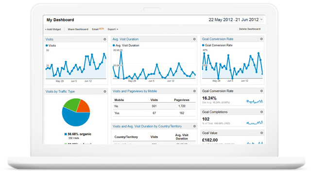
Google Analytics is a great tool that every one must install to check the sources of their traffic. It gives all the information such as what are the sites which are sending maximum traffic, average time spent by the visitors, total visits, percentage of new visits, bounce rate and much more. And the best thing is it’s FREE!

All this data is very important in working out the marketing strategy for your site. You can find out the sources of high traffic as well as sources of high quality traffic. High quality traffic means visitors spending more time on your site which is exactly what you want. This can then help you create a strategy and concentrate on sites giving you high quality traffic.

4. Use Social Media as much as possible

Social Media

Social media is becoming an extremely powerful means of gaining traffic. LinkedIn and Google+ have more than 300 million users. Facebook alone has more than 1 billion users and this count is increasing every day. People who are active on social media can be referred to as “content distributors” or influencers. 

Here are some useful tips:

  • Create a business page for your site in all social media sites such as Facebook,Twitter, LinkedIn, Pinterest, Google+ etc.
  • Make sure the profiles and the pages that you create for your business are 100% correctly completed. Fill in as much information as possible. Profiles that are complete are more likely to gain more trust and credibility from your audience.
  • Share all your posts on all these social media sites. Make them appealing so that more people want to share your posts.
  • Connect directly with the audience at your page.
  • Attaining success at social media sites requires patience and persistence. Make sure you follow all the above mentioned tips carefully.

 5. Use effective images, graphics and illustrations

Pexels

It is always smart to use relatable images, graphics and illustration in your site. A image speaks more than content. You can either create your own images, or you can purchase them from sites such as Shutterstock or free from Pexels. These images are a great source of traffic through the means of image searching.

One tip is, always allow other people to share your images but on condition that they link that back to your site. That way you are making great use of your images. If anyone shares your images without giving you a back link, then find this out using the Image Search function. You then contact those owners and ask to give you back links and chances are they will.

6. Keyword research

Keyword Planner

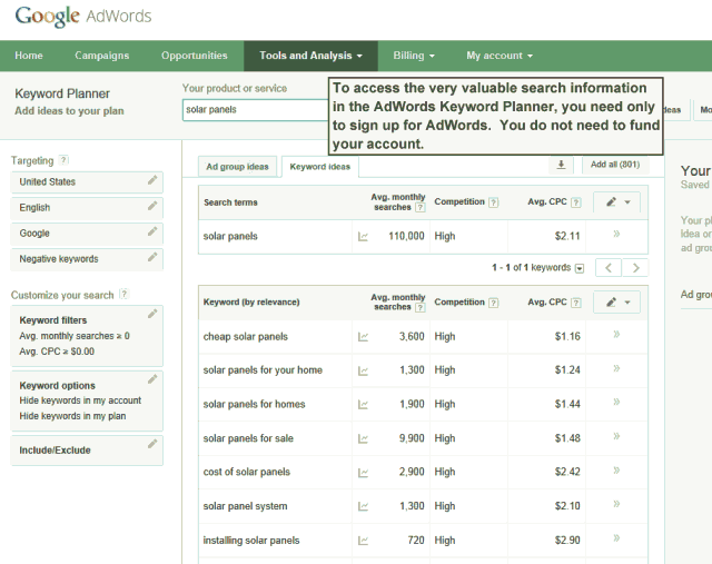
The choice of right keywords can play a major role in the success of your website. There are many tools out there that can help in this regard such as Keywordtool.ioAdwords Keyword Planner. You can use these tools to find out the phrases that are commonly searched by people related to your business. These keywords should be used to make titles for your posts. Optimising blogs with target keywords can help you get better traffic. The target keyword should be used creatively in title and the content should be focused on the subject.

7. Guest bloggers

Guest blogging is also a great way of gaining traffic. For new blogs, it is difficult to get consent of established blog owners to post on their blog. It is recommended to use any personal connections in these instances. Contact people who already have an established audience. Guest blogging is an excellent way of building a brand and contacting new people.

8. Optimised site design

A well optimised website design is a ‘no-brainer’ for the success of any site, and a good template is the backbone. A professional design can help gain confidence. The usability also plays a major part. Make sure your site is easy to navigate. They should be able to easily find and do what they want to do. The design should be responsive on all platforms such as smart phones and tablets.

9. Interact with your visitors

When visitors read your blogs and if they like it or not, they are likely to hopefully leave comments. Reply to all the comments. If there is a doubt, delete it right away. If it is an appreciation, then thank the visitor. Feel free to remove negative comments and make sure you don’t allow blog spamming. Visitors like when they find that the blogger is giving them attention and their chances of them revisiting your blog increases.

The success of a website depends upon on traffic, so follow these tips for success!

DesignLab can also help you with SEO optimisation for your WordPress site. Call Spiros on 0431 926 575.