Graphic Design Adelaide
Graphic Design Adelaide – We are a Branding Adelaide agency based in Adelaide.
Graphic Design Adelaide, Website Design, Logo Design, Branding Adelaide, SEO – DesignLab.
Graphic design Adelaide is the art of communication, and problem-solving through the use of type, space and image.
We specialise in graphic design and website design. We design logos, brands, build websites and produce print in Adelaide.
The field is considered a subset of visual communication and communication design, but sometimes the term “graphic design” is used interchangeably with these due to overlapping skills involved.
Graphic designers use various methods to create and combine words, symbols, and images to create a visual representation of ideas and messages.
A graphic designer may use a combination of typography, visual arts and page layout techniques to produce a final result.
Design often refers to both the process (designing) by which the communication is created and the products (designs) which are generated.
The types of graphic design
- Visual identity graphic design
- User interface graphic design
- Publication graphic design
- Marketing graphic design
- Advertising graphic design
- Packaging graphic design
- Motion graphic design
- Environmental graphic design
- Signage graphic design
- Art and illustration for graphic design
More information about AGDA – Graphic Design
Graphic Design Adelaide
Graphic Design Services we offer
- Graphic Design
- Advertising Design
- Annual Reports
- Brochure & Editorial Design
- Direct Mail
- Print Design & Management
- Typesetting
- Signage
Logo Design Services we offer
- Corporate Identity
- Corporate Branding
- Corporate Stationery
- Logo Concept & Design
- Visual Branding
- Brand Identity
Website Design Services we offer
- Website Design Adelaide
- Website Development
- Content Management Systems
- Social Media
- SEO + SEM
- Email Marketing
- Website Hosting
- Domain Registration
- Website Maintenance
Adelaide SEO Services we offer
- On Page SEO
- Off Page SEO
- Keyword Research
- SEO Website Audit
- Google Adwords
Branding Adelaide is ‘the marketing practice of creating a name, symbol or design that identifies and differentiates a product from other products.’ It’s what consumers think of your product / image / company.
A Brand is how you want your audience and everyone else to view your company. Branding is what your audience can expect from your services or products.
But how do you create a brand?
Step 1. Define your brand
Before you create your brand you must first define it. Work to define the following to focus your brand:
- Company mission statement.
- Characteristics of your company.
- What are our company goals?
- Characteristics you would like your company to have.
- Who is our target audience?
Finding the right Design Agency
At DesignLab we value and practice forming close partnerships with our clients, so it can be stressful finding the right design agency when you are shopping around.
In an industry where design agencies seem to pop up overnight, it’s important that you cut through the spin and find out exactly who you’re really dealing with to ensure that the “connection” is right for your needs.
Below we have listed down a number of basic rules to help you find the right partnership.
1. It’s all about relationships.
- Do you need a quick turnaround or it just could be a a one-off job? Or could it be an on-going service where you need to deal with the same designer often.
- Do you want to deal with the account manager or are would you prefer dealing directly with the graphic designer?
- Are you happy with a “Tiger Airways” experience or do you want all the bells and whistles?
The above will play a big part on who will prove the right partner.
2. Budget Range
As the old saying goes “champagne taste on beer money”. If you’re spending $500 on a quick logo then don’t expect it to go far in a bigger agency that has large overheads. But, if you’re a large corporate company it’s not realistic to expect a freelance to have the capacity or experience to work on a project such as yours.
3. Size does matter
Just think your local mechanic doesn’t have the experience or tools to fix a Ferrari, a smaller design agency may not have the experience or staff to deal with a complex work. And as my experience shows I have seen smaller agencies try very hard to convince you otherwise, just beware of silver tongue “yes of course we can”. But if you’re a start-up/small business with a small budget, then a small agency is perfect for you.
4. But experience matters more!
Always ask to see a portfolio and case studies of the agency’s past work. Only then can you decide whether they have a proven track record of customer service and delivery. Look for the type of clients that agency has worked with. Do they have a portfolio of clients in your industry? And do they understand your market and your customers.
5. Client testimonials and references
This doesn’t mean just accepting what you see on the design agencies website, it’s better to see a real sample client list or even better yet call them yourself. You would be amazed what you might learn!
6. Industry Standard
Every industry has some sort of yearly awards, competitions etc. and the graphic design industry is no different. Find out if your agency tries to excel and submit their best work for annual awards. I mean graphic design awards on their wall won’t guarantee the right outcome for you, but it tells you that the agency has at some point proven they have the ability to deliver quality work at the highest level.
Another thing to do is check to see if that design agency is an accredited member of their respective association. If so, are they published on a industry website?
7. Don’t just be led by price
Trust me, the bitter after taste of bad design will long linger after the sweetness of the low price has been forgotten! Amazing design is always worth that bit more – it’s proven to help drive your business, generate sales and persuade customers, also you feel proud seeing it, I mean you have to live with it day by day, so you better love it! The design agencies who hold on their rates are often the busiest and best ones, because they don’t need to discount their prices. Why are they busy? Probably because they’re good at what they do and they know it.
8. Understanding the landscape
Over past ten years the graphic design landscape as a service has changed beyond recognition. Today you can hire an international design agency that you don’t even need to meet. On the other end of the spectrum there are numerous start up freelance designers offering a much more basic level of expertise, but at a very competitive rate. Design agencies come in all shapes and sizes, and most with a range of different services. From your traditional large agency (who are beloved by big brands and the public sector), to a mid-size or boutique agency who’s offering is every bit as good, but which target a different client profile.
9. It’s all about getting results
At its roots, graphic design is not about creating “a pretty picture”, it is an effective communication tool that, in the hands of professionals produces results. This means there should be an agreed objective or a measure of success. Find a partner with an understanding of both the commercial and marketing challenges that face your business, and don’t be tricked on just a design solution to a marketing problem.
10. Finally, it’s all about chemistry
This is important. At DesignLab we are all about chemistry that connects. Go with your gut and move on to an agency you feel more comfortable with. Remember you are entrusting the face and reputation of your business with this agency, so chemistry is critical.
Talk to DesignLab today about forging a partnership for your business and finding the right design agency!
Want to know how to design a logo like a professional? Well that takes years to master. This is why you seek a professional design agency in Adelaide such as Designlab.
However I can guide you to an easy and quick breakthrough of how we approach a logo.
First of all learn what a logo is & what it represents

Before you can design a logo, you must understand what a logo is, what does it represent and what is it supposed to do. A logo is not just a mark – a logo reflects a business’s brand by the use of shapes, fonts, colour, and images.
A logo inspires trust, admiration and recognition for a company and it’s our goal as a graphic designer to create a logo that meet its objective.
One must know what a logo is before continuing.
Read about what is a logo check out Wikipedia’s.
Understand The Principles of Effective Logo Design
![]()
Now that you know what a logo is, and what it represents you must learn about what makes a great logo; the basic rules and principles of an effective logo design.
1. A logo must be simple
A logo must be simple, it’s design allows for instant recognition and the logo should be versatile & memorable. A good logo features something unexpected without being overdrawn.
2. A logo must be timeless
An effective logo should stand the test of time. Will the logo still be effective in 10, 20, 50 years? A good one does.
3. A logo must be memorable
An logo design should be memorable and this is achieved by having a simple, yet, appropriate logo.
4. A logo must be appropriate
How you position the logo should be appropriate for its business. For example, if you are designing a a logo for restaurant, it would be appropriate to use a classy font & colour scheme.
5. A logo must be versatile
An effective logo needs to work across a variety of applications and mediums. Logos should be designed in vector format, this ensures they can be scaled to any size. The logo must also work in just one colour, as well as colour.
Learn Off Others Success & Mistakes
Successful Logos
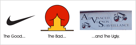
Now that you know the basic rules of good logo design, you can distinguish the differences between a good and a bad logo… By researching why other logos have succeeded, and why they have succeeded can give you a great insight into what makes a great logo.
A great example, is the famous Nike Swoosh. The logo was created by Caroline Davidson in 1971 for only $35 yet it’s still a strong, memorable logo and effective without colour. It’s simple and fast and represents the wing in the famous statue of the Greek Goddess of victory, Nike – something which is perfect for a sporting apparel giant. Nike is just one of many successful logos, think about other famous logos that you know about and check out their logos – what do you think makes them successful?
Check out Logo Of The Day, it has some successful and not so successful logos, worth a look.
Not So Successful Logos
We can also learn off logos that are not successful (look above in the picture or view these bad logo designs. Some logos can depict things that may have not always been noticeable to a designer or they are simply just bad design.
Establish the Logo Design Process
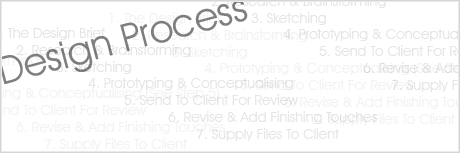
Now that you know what a logo is, what it’s principles and rules of logo design are, and what makes a logo successful we can finally begin designing. This is the hardest part and is its own topic in itself – Each designer’s logo design process is very different however check out The Secret Logo Design Process Of Top Logo Designers for a guide.
A logo design process usually consists of the following:
- A Good and Clear Design Brief
- Research & Brainstorming
- Sketching on Paper
- Prototyping & Conceptualising
- Send To Client For Feedback
- Revise & Add Finishing Touches
- Supply Final Files To Client
- Give Fantastic Customer Service
Learn The Software & Complete The Logo

After you have got your design ideas planned, it is usually a good time to begin learning your software (Adobe Creative Suite is the industry standard) but remember you can’t design a logo by just hopping straight onto the computer… brainstorm first!
After you have your initial sketches you can then usually jump onto a computer to start drawing your logo. After you have got a great concept you can send it to your client, get feedback, and (eventually) finish the logo.
Why White Space is Good For Graphic Design
Graphic design is a method to communicate a certain message by using elements such as visual arts, typography or layout techniques whether we are referring to newspapers, ads, logos or websites. This style of design is defined by visual communication and it takes time and experience to master the best of its techniques so that your audience will understand your message.
Graphic design is a process that consists of seven steps that you have to take into consideration when designing. That way you can ease your work, be more organised and meet deadlines in time. It can begin with analysing your audience, stepping through defining the purpose of your message and then establishing layout and visual graphics that you will use in order to send your correct message.
There are hundreds of tips on how to perfect graphic design, but our blog is dedicated entirely to white space.
1. What is White Space?
White space means having a good eye for composition. This means you have to be able to find the right composition so that the information or whatever you are focusing on will be easy to read and spot.
There are 2 types of white space:
- Active (this insures a better structure and layout in design, it gives focus to the content. It is usually left out on purpose)
- Passive (this is the default white space left out at borders or in between content in order to make it readable)
White space DOES exists for a reason – it is to ease the process of analysing graphics so this is what you have to remember while using it in graphic design. It is a tested fact that the human eye percepts an organised and clean layout better than a cluttered space full of disturbances.
Why should you design with White Space?
To balance the layout
Passive white space is one of the reasons why text is visually received and understood easier, whether it’s regular white space or negative space, used in designs with dark background and white text. The more space you use the easier to read and it also improves readability. Space creates a certain balance in your output, making it easier to digest.
Emphasise objects
In order to focus a viewer on a picture, try using a white border. This way you will attract attention on what’s inside the object or a picture for that matter. Always make use of white space in these situations and you will see how much more improved your design will be.
Focus on certain content
Another great technique for using white space in your graphic design is using it in a excess way. This does not always work for all designs, but when used appropriately it can really be effective and powerful. Imagine a text that has lots of white space around it. Tumblr has so many pictures like this and your eyes go straight to the text.
People really do appreciate it
At the end of the day the simpler the design looks, the better it is received by people. A cluttered design is like a cluttered desk – you can never find what you need, or if you find it than you spend lots of time looking for it. There is a bigger chance that your customers will love your design.
Your layout really appreciates it
Sit down and play with your layout, see how much it changes when you make use of all the white space. Instead of cluttering for example your images and your text that goes with it together, try separating them by using white space. It will depend on whether you use a vertical or horizontal layout, but white space will focus more on your content.
An elegant design is guaranteed
We have always considered white and black as the most elegant colours. They are simple, classic and timeless, and they do send the right message when you need them. White is pure, black is strong and this is why most graphic designers make use of these two colours. Larger companies use a lot of white space to advertise their products.
Remember white space is important, but it does depend on you how you want to use it, you need to be experience. If you use it in excess you might get either a boring design or on the flip side a truly unique design. Use it a little bit to get a cluttered design, or to leave out the most important elements.

To understand and know what good graphic design is or know why some designs work and others don’t you need to know about the basic elements and principles of design.
Elements of Design Lines, Colour, Type, Imagery, Texture Lines are used to direct the eye and create forms. Basically, lines are found in layouts to separate content, such as in magazine, newspaper, and websites.
Colour is an important element in design, it can be used to make an image stand out, to evoke emotion.
Type, is all around us. In graphic design, the goal is to not to just place some text on a page, but rather to use it effectively for communication. Choice of fonts (typefaces), size, alignment, colour, and spacing all come into play.
Imagery (Art, Illustration & Photography) A powerful image can make or break a design. Photographs, illustrations and artwork are used to tell stories, support ideas, and grab the audience’s attention. Texture refers to the actual surface of a design or to the visual appearance of a design. In the first case, the audience can actually feel the texture, making it unique from the other elements of design.
Principles of Design The principles of design apply to any piece you may create. How you apply those principles determines how effective your design is in conveying the desired message and how attractive it appears. When designing a piece ask yourself the following questions:
Balance, Proximity, Alignment, Repetition, Contrast, Space
Balance
Visual balance comes from arranging elements on the page so that no one section is heavier than the other. Are your page elements all over the place? does each portion of the page balance out the rest?
Proximity
Closeness creates a bond between elements on a page. How close together or far apart elements are placed suggests a relationship (or lack of) between the information, i.e. Are title elements together? Is contact information all in one place?
Alignment
Brings order to chaos. How you align type and graphics on a page and in relation to each other can make your layout easier or more difficult to read. Is there a common alignment — top, bottom, left, right, or centered — between blocks of text and graphics on the page?
Repetition
Repeating design elements and consistent use of type and graphics styles within a document shows a reader where to go and helps them navigate your designs and layouts safely. i.e. do page numbers appear in the same location from page to page? Are major and minor headlines consistent in size, style, or placement? Have you used a consistent graphic or illustration style throughout?
Contrast
Helps different design elements stand out. Is there enough contrast between your text (size and colour) and background (colour and pattern) to keep text readable? Is everything all the same size even when some elements are more important than others?
Space
Designs that try to cram too much text and graphics onto the page are uncomfortable and may be impossible to read. White space gives your design breathing room. Do you have enough space between columns of text? Does text run into graphics?
Psychology Principles to Use In Design
Did you know that psychology is everywhere in design, because psychology has helped us understand that red is the choice colour for restaurant logos and marketing—because it stimulates our appetite. There are psychology principles to use in design that can help your design reach your target audience quicker and easier.

You can’t ignore psychology since principles of the human mind influence how people react and interact with designs.
Have a read of the below psychology principles that can help you incorporate into your design practice.
The Von Restorff Effect

The Von Restorff effect tells us that the more out there an element is, the more it will stand out and be remembered. In branding world we call it ‘differentiation’.
The theory was tested by Hedwig von Restorff around 1933. She made a bunch of subjects look at a list of similar items. If the item was isolated (i.e. highlighted) it was easier for the individual to remember the item over others.
This same principle can be applied to design. The obvious is that if you want to draw attention to something, you isolate it, such as through colour, size, spacing, etc.
Because people focus more on the isolated item, they remember less about the others. Keep the inverse in mind when considering whether or not to highlight an item. Do you want your customers to remember the one thing, and only that one thing? Don’t highlight that particular item if the other items are equally important and you want everything remembered.
Psychology in Color

A good designer should have a clear understanding of colour and how it relates to a design. Some new designers tend to ignore how colours affect the mind, instead choosing to design with colours they like themselves. Are you considering how your design influences your audience?
Colours can influence emotions. Adobe lists colours and their corresponding emotions, the positive ones as follows:
- Black: sophistication and power
- White: cleanliness, sophistication, virtue
- Yellow: happiness, optimism,
- Red: power, courage, strength; can also stimulate appetite
- Green: sustainability growth, balance
- Blue: calmness, peace, trust, safety
- Yellow: optimism, happiness
- Purple: luxury, royalty, spiritual awareness
- Orange: friendliness, comfort and food
- Pink: tranquility, femininity, sexuality
Emotions people associate with colour can change depending on cultural and/or religious backgrounds. The above list refers to our culture.
Maslow’s Hierarchy of Needs
Did you study Maslow’s Hierarchy of Needs in high school or college? If not, here’s what it is:

The pyramid was designed to show how one must take steps to reach self-actualisation. Before a person can feel loved they must have their physiological and safety needs met first.
How does this apply outside the psychology classroom? Marketers and graphic designers can use Hierarchy of Needs in advertising and public relations.
Try this, when designing any marketing material, use the theory when developing a buyers persona. Think about where your client’s target audience is in the above pyramid. How can your design motivate them to the next stage of the pyramid?
Hick’s Law

Hick’s Law relates to how long it takes for someone to make a decision. If someone has more choices to choose, it takes them longer to decide. In many cases, it takes them so long that they’ll decide to make no decision because the burden of deciding has become too stressful and hard.
You can incorporate this concept into design also. For example, say you’re designing a website for a client, and you want to keep your top menu panel as simple as possible with just a few options to choose, you can group the pages into drop-down menus so it’s easier for a web visitor to categorise their options which in turn makes it a quicker decision.
This also is what we do with a ‘call-to-action’. When designing a poster, you don’t want to tell users to do many different things. You want a call to attention. For example, your poster may focus on collecting donations with a call-to-action of “Donate Now – Call This Number.” The secondary call-to-action could a QR code that leads to your client’s social media page.
Personalising It

Using faces into your design is one of the most effective techniques, it pulls someone right into your design. We are all drawn to faces—so much that we see faces where there aren’t any. Case studies show that when faces are added to websites, it boosts conversions.
This idea can be applied in many ways.
You can use faces to connect with your audience. Just put a face on your design, I bet you you’re more likely to catch a viewer’s eye.
You can also direct their attention based on which way your model’s face and eyes are facing. Eye-tracking studies show that people follow other people’s gazes much like they follow arrows.
You can use a face to convey lost of emotion. There are a number of facial expressions:
- Sadness
- Happiness
- Surprise
- Fear
- Anger
- Disgust
Utilising this can immediately set the tone for your design, as well as communicate across language barriers.
Fitt’s Law

Fitt’s Law is a scientific law that’s used to describe computer-human interaction. It says that “the time required to move to a target is a function of the target size and distance to the target.”
You can use this same principle in web design. For example the larger a clickable area is, the more likely it is to get clicked on.
When you design a web page, you make the navigation menu items clickable. But what is the area of the clickable link? Will only the words link to the target URL, or will the tabs themselves be clickable?
You can also design with the opposite in mind. Links that you don’t want to be clicked on often such as delete or cancel buttons—should have small clickable areas.
Occam’s Razor

Occam’s Razor tells us that the simplest explanation is usually the correct one. Even though this is more of a philosophical idea than a law of design, it still can easily be applied to design. First time designers usually create complicated designs with elements that are unnecessary to show how creative they are. But you often find that these designs are not user-friendly.
This relates back to Hick’s law. If you’re trying to cram too much into a poster instead of going for the simplest solution, people will just not read it. The design becomes overwhelming and people will quickly abandon it.

We constantly get asked all the time ‘What does a Project Manager do’? ‘What is it doing in your breakdown of costs on our quote’?
As a design professional I meet a lot of people that have no idea what a project manager does, and how important they are in delivering a quality product, with no hassles.
It’s a tough question to answer. Especially because in many design firms the project manager is still an emerging position.
Project managers are responsible for the leadership of the project from start to finish. They lead a team and help negotiate relationships within the project—whether it’s with clients, team members, printers, photographers, etc.
Project managers are not the people chasing work and developing new relationships. Instead, they maintain a healthy client relationship throughout the course of the project. This often can turn into a long-term business relationship.
Once the contract is agreed upon and signed, the team is then assembled. Most projects start with a team meeting, that may differ depending on the goals and scope of the work. It is up to the project manager to decide what the best approach to the work should be. Sometimes project managers tend to forget their role is to lead, not dictate, they need to have a vision and an approach, as well as have a clear understanding of the goal.
For us at DesignLab, “It’s all about the relationships.” In a collaborative project setting, successful relationships between team members are essential, and the job of keeping the foundation often falls to the project manager. Conflicts can be an important part of the creative process, but it’s really important that it doesn’t sidestep the project.
One way is to make sure that every team member feels valued, and that they are an important part of the project. This can include making sure that team members are coached effectively, and praised, especially during the challenging stages. It is the project manager’s job to care about the quality of work, and that is the same about the quality of the working environment. Maintaining a positive working environment builds good rapport between the team, and keeps enthusiasm levels on a high.
For the hands-on graphic designer, the profession and work consists of big ideas and the small details. It’s not just enough to have a great concept these days — you have to be able to execute it, and this often means working through painstaking precise and multiple iterations of a concept until you get it right.
It’s the project manager who has to keep an eye on the goals & objectives of the project, both for the client and the design team. Clients can be just as easily fooled by sexy layouts, but it’s the project manager’s job to avoid those temptations and make sure the project meets its objectives.
Although design agencies can benefit from a project manager, they are not always required, especially if an agency has many experienced design professionals. Project managers usually are best in mid-sized to larger agencies with at least 20 staff or more.
In smaller design agencies, an art director or design director often functions as the project manager, and may be capable of handling the role. But sometimes project management is the last thing an art director wants to — or should — be doing. This is where a project manager can relieve the pressure of the art director of these responsibilities so that they can focus on the quality of the design rather than the project process.
Hiring a project manager will not solve all of your agencies issues. But allowing for leadership of your projects, and your agencies work will enable smoother outcomes, and a better workflow, and maybe even encourage leadership within your agency.
Finding the right team, giving correct direction and managing the working environment — while focusing on a strategic direction and staying on top of deadlines and deliverables — are all part of a project manager’s role. It’s a challenging task. But if you can find someone who is good at it, you can build your business and improve the quality of your portfolio.
In Summary
As you can see psychology can play a huge role in how we go about our day-to-day lives, and if you’re a designer, it’s important to pay extra attention to those psychology principles to help create artwork that translates to your audience, which converts for your clients.
‘Rebranding’ is, first, about changing or reaffirming an organisation’s right to exist in an existing market niche.
It’s different than when the original logo was launched because it is so important not to lose existing brand equity it has earned with current customers and stakeholders. We recognise the challenge as one of needing to ‘evolve’ the current corporate identity to retain as many visual cues as necessary to maintain the recognition and loyalty of existing customers.
Be Ready For Change
However, rebranding any business or organisation often requires a shift in thinking; being prepared to make a clean break and discard any ‘baggage’ and personal, subjective equity in a logo and its supporting visual identity.
Before we ‘pick up our pencils’, let’s determine Who YOU WANT To Be
- We will need to be crystal clear about the problem we are trying to solve, so we can take the steps to figure out what the company aspires to be.
- Why doesn’t its current brand fit who they are?
- What is the purpose of the company, and what are its goals?
- How does the marketplace and company feel when they see the current logo; how is the company perceived?
- Most importantly, how does it want to be perceived? And how do its customers and stakeholders need and want to perceive it.
- We will seek, in collaborative partnership with you, to answer these questions before we ‘pick up our pencils’!
Does a Company Need to Copyright a Logo?
We get this question all the time from our clients, and it’s one we often find difficult to answer.We get this question all the time from our clients, and it’s one we often find difficult to answer. Should you trademark or copyright a logo?
Copyright and trademarks are used to protect the owner’s intellectual property against infringement (copied). Copyrights usually apply to written films, work, music and computer files. Trademarks consist of symbols, words, phrases or a combination of the three that represents a company on signs, documents and marketing materials. Because logos include original artwork, a company may wish to get both a copyright and trademark to protect itself from another company using the brand recognition for its own benefit.
Does a Company Need to Trademark a Logo?
A companies logo is among the most valuable asset a business can possess. A logo helps customers recognise and identify the company and distinguish it from other competitors. A logo is one of the most common forms a trademark takes. Companies do not need to trademark their logo; simply just by using the logo in commerce, the company already has a trademark.
Logos often contain pictorial or a graphic element, this means the mark may be eligible for protection as both a trademark and copyright if it is an original work of authorship or otherwise meets the copyright requirements. Whether the company needs to register the mark or also seek protection as a copyright depends on many factors. Businesses should seek the advice and counsel of an attorney before proceeding.
How to Find Out if a Logo Is Copyrighted?
Look for an identifying mark or name on the logo. If an image or design for a logo is copyrighted but not trademarked, it may contain a phrase that contains the word “copyright” followed by the year of copyright and the name of the copyright holder. It may also include a copyright symbol © and date of copyright followed by the name of the copyright holder.
Look for a registered trademark ® to determine whether the logo is trademarked. While the images used in a logo may be copyrighted by a designer, most companies register a logo as a trademark rather than copyright. In most cases, you will be looking for a trademark ownership and not a copyright one, for example with McDonald’s and it’s golden arches logo. The name of the company that owns the trademark for a logo will be included with the registered trademark symbol.
Here is some more information about copyright and trademark for a logo
http://www.ipaustralia.gov.au/understanding-intellectual-property/ip-for-business/design-a-logo-and-brand/
Why you should rebrand?
Why you should rebrand is a question I get asked often, and the answer is if there’s one thing that running a branding agency has made me appreciate, it’s the ever-changing nature of the marketplace, there is one abiding truth about modern day business: Every business at some point has to rebrand.
Why? Because rebranding breathes new life into your business, but to do it correctly it has to be done with a focus on strategy, a creative vision & thought and most of all for the right reasons.
Why? Because you are defined by how you are perceived.
What Does Rebranding Mean?
It is the reshaping, remodelling and recreating of your business and it’s brand identity. It can involve anything from making a few changes to your current brand; you developing new and improved strategies that will enrich your business and create a closer bond between you and your clients.
Why Should You Rebrand Your Business?
There comes a time in everyone’s life when we need to make changes. For example we change houses, jobs, diets, wardrobes – all for the purpose of bettering ourselves. Now sometimes these changes happen over time, and sometimes we have to make these changes ourselves because of some changes in our lives.
There’s a saying we have all heard “Out with the old, in with the new,” we often say.
Below are many reasons to rebranding:-
1. Staying Current
Keeping your business relevant and current is one of the most common reasons for a company to decide on a rebrand.
2. Growth
Not just financial growth; but it could be expansion into a new market.
3. Moving with the times
Your current identity may have be outdated, and not reflect your business as it is. It could even be that when you first started the business, you didn’t have the budget to have your logo professionally designed.
4. Change in the business
Target audiences, Value propositions and just the market can all change during a businesses lifecycle. Maybe it could be that was once highly effective may now hold your business back, which is a perfect time to rebrand and reach a new target.
5. Differentiate your business from competitors
Sometimes the branding of your business looks similar to that of a one of your competitors, which could mean that your customers may find it difficult to tell the difference. A business should be individual and communicate why it’s different to its competitors.
7. Simply… you’re not captivating that top paying customer.
It’s simple: The best talent want to work with the best brands. One example could be if you’re struggling to recruit reliable and professional employees for open positions, it could be because your brand seems dull to potential customers.
Be Ready For Change
However, rebranding any business or organisation often requires a shift in thinking; being prepared to make a clean break and discard any ‘baggage’ and personal, subjective equity in a logo and its supporting visual identity.
Before we ‘pick up our pencils’, let’s determine Who YOU WANT To Be
- We will need to be crystal clear about the problem we are trying to solve, so we can take the steps to figure out what the company aspires to be.
- Why doesn’t its current brand fit who they are?
- What is the purpose of the company, and what are its goals?
- How does the marketplace and company feel when they see the current logo; how is the company perceived?
- Most importantly, how does it want to be perceived? And how do its customers and stakeholders need and want to perceive it.
- We will seek, in collaborative partnership with you, to answer these questions before we ‘pick up our pencils’!
Talking to people – existing and potential customers and stakeholders
In the absence of readily available, independent market research DesignLab would seek to establish at least some qualitative information about your existing and potential customers’ and stakeholders’ attitudes towards and opinions about your company’s values, products, services, and brand image.
We will work closely with you to clearly establish a market segmentation for your brand – exactly who are the current homogenous groups who already or are likely to use Top Holiday Parks and sub-brands’ services. It is essential we understand exactly whom you want to reach and talk to and the ‘tone of voice’ that should be consistent, visually, with what you wish to say to them.
‘Rebranding’ is, first, about changing or reaffirming an organisation’s right to exist in an existing market niche.
It’s different than when the original logo was launched because it is so important not to lose existing brand equity it has earned with current customers and stakeholders. We recognise the challenge as one of needing to ‘evolve’ the current corporate identity to retain as many visual cues as necessary to maintain the recognition and loyalty of existing customers.
Things a Graphic Designer Doesn’t Tell You about Effective Website Design
Have you Ever had a run-in with a graphic designer who promised you a outstanding website design but all you got was a big mess?
You know when you’re being taken advantage of. All you wanted was a website design that would promote your business and help you succeed, and what you got instead wasn’t worth the pixels it was painted on.
What’s worse is you have to start over. You’ve lost weeks or months of time, wasted thousands of dollars and possibly hurt your business reputation, and now you have to do the whole thing over again.
It’s daunting, let’s be honest. What if DesignLab were just as much of a nightmare?
Lucky for you, we’re not going to let that happen to you again. Here are some secrets many graphic designers don’t tell you, and knowing this can save you a time and money:
#1: Always being pretty doesn’t count.
Of course you want your website to look great and create a visual impact with your customers, but good looks don’t bring in sales.
A great tour guide does, though – and that’s your website’s job. It presents your business to customers and welcomes them, showing them around and introducing them to points of interest they should definitely see before they leave. As tour guide, your website has the task of providing visitors with the right guidance to direct them to where they want to go – and to where you want them to go as well.
You can have both a beautiful design and still get results. If you find yourself having to choose between one or the other though, stick with getting results. Winning design awards may be nice, but it doesn’t pay the bills.
#2: You don’t need to redesign.
Remember, your web design is just one piece of a bigger picture. What if your message is wrong, and you need a copywriting overhaul? What if your brand image is pulling in the wrong target market? What if your marketing strategy has holes in it? What if there’s an issue with your product or service?
You can’t afford to ask a dozen specialists their opinion.
Ask a big-picture specialist for help – someone who can analyse elements of your website and pinpoint the problem.
You might be surprised to find out there’s nothing wrong with your website at all, and just a copy tweak or a new marketing strategy does the trick.
#3: You don’t need to spend a fortune.
There is a saying, you get what you pay for, and sometimes, that’s true. But it’s not true that you need to spend a fortune on a good website.
There are too many designers out there preying on this factor, charging enormous rates for their own profit. They blind you with techspeak and fancy coding terms.
Don’t be fooled by it.
Work out your budget and find a graphic designer who can work within it. Look for a designer that fits the style of a website you’d like for your business. Look at other sites you like and see who designed them. Ask for quotes, take your time and shop around.
#4: Maintaining a website isn’t always expensive.
Many business owners get ripped off on this one. Since graphic design and website development is usually a one-time expense, providers try to con you in as a customer so they can bill every month for recurring charges. Charges that don’t need to be.
So let’s look at web hosting? You can pay as little as $5 a month – why pay more? Look around.
Do you need to pay maintenance charges? Why? The upgrades that might come along every now and then? Opt for WordPress that lets you do your own upgrades just by clicking a button. We do.
You need to change content? A content management system wins again. Login to your site, and in two or three clicks, you’re updating your site, changing copy or adding a new page all by yourself. It’s that easy with WordPress.
When someone offers you an upsell maintenance package, ask what they’ll do for that money. Then go to Google and find out just how easy it is to do what they’ve offered you.
If your’e not interested in maintaining your site then by all means, hire someone to do it for you, but just be sure you’re not being overcharged for quick and easy jobs.
#5: You don’t need to be totally unique.
You do need to stand out these days and look different from all your competitors. The problem is that some graphic designers can take it a too far, and they design you a website that’s so unique it breaks all the rules of web design. Your expensive website ends up being a confusing experience for your customers.
Designers need to create websites that follow proper web conventions and usability rules, because these are the guides to navigating your site quickly and easily.
For example, consumers know they’ll generally find an RSS or email opt-in on the top right of a site – it’s always found here. Logos are usually found in the top left of a site, and navigation bars are usually found below header areas.
If you change that you’ll create a customer experience that’s similar to walking into an alien world. Nothing is where it’s supposed to be, everything is backwards.
And then what happens? Your potential customers leave. Your website becomes crippled and ineffective, all in the name of being unique.
#6: Branding is a specialist skill, and not all designers can do it well.
Most graphic designers are not skilled in developing brands. They’re good at developing graphic design that reflects your brand identity.
They assume your target market, and what appeals to those ideal customers. They’re assuming the values of your business and its marketing message. They’re assuming its personality and the type of experience your customers will have when they work with you or buy from you.
It’s far better to work with a branding expert to your developer your identity before you hire a designer, or work exclusively with graphic designers who understands branding and can develop a site that reflects your brand. Otherwise you’ll just attract the wrong kind of people, and the entire website will be a waste of time and money.
#7: Good Design Isn’t Just about Photoshop. It’s so much more…Psychology.
The secret to a great website isn’t in having a pretty design and some compelling content. The real secret is in psychology and consumer behaviour.
A graphic designer needs to know psychology. They need to know what imagery will appeal to your customers, and why it appeals to them. They need to know what’s going on in people’s minds when they land on your site and as they navigate through yours.
Are smooth curves better than concentric circles? What will draw your customers to the right or the left? What emotional state should your website create? Should the design be modern and simple or colourful and bold or soft and comforting? Where do a person’s eyes travel, and what will make them stop?
Good designers know all this and much more. They understand that their goal is to influence a visitor’s psychological state of mind and perception of your business. The more designers know about how people behave, what makes them take action and ways they react to different elements, the better they can implement persuasive strategies into your site.
Then they build you a site that captures interest, holds it, and ultimately brings you sales.
Ways to uncover clients budgets
As a design agency every time we meet a prospective new client one of the most challenging things is the conversation that surrounds uncovering the client’s budget. We have figured out some ways to uncover clients budgets.
How many times have you submitted a proposal and then never heard from that prospective client? Or learned that the project was awarded to someone else because your price was too high?
You get frustrated wasting valuable time writing proposals that you never win. A solution is to learn how to recognise the possible prospect from the other competing agencies before you agree to send a proposal. That means you have to find out what the client’s budget is. So you ask the client if they have a budget for this work.
And the most common answer to this question is “No, not really.”
Now the prospective client may not have a firm figure in their minds, but I bet you they’ve nearly always got some rough idea of what they want to spend. Usually they may not want to share this with you because their fear is that you might have been willing to help them with their project for a lot less than the figure they have in mind.
So the client isn’t willing to share their budget, and you aren’t willing to take a rough guess at what it will cost to resolve the client’s challenge. You’re at a standstill. What can you do?
Discovering a client’s budget isn’t that difficult; it just requires some persistence and creativity. It’s one business skill you can learn if you want to save yourself time and, more important, frustration and time.
You need to learn to talk more and write less, and agree on a cost verbally before we put it in writing.
Here are some ways to uncover clients budgets.
1. “Can you share with me in round figures?”
Instead of asking the client what their budget is, try asking them if they would mind sharing with you “in round figures” what their budget is.
This softens the statement and will often put the client at ease, this shows that you’re talking in general terms rather than specifics.
And you can also do the same and share with the client “in round figures” what you expect the project to cost.
That way neither of you are holding the other to fixed costs, which means you can negotiate.
2. “What don’t you want to pay?”
So you ask the prospective client “Do you have a budget in mind?”, and their reply usually is “I’ve no idea”, which you can reply “Let start around $2000.”
“Oh my no,” says the client. “I was thinking more of $1000.” If a prospective clients tells you that they have “no idea” of their budget, try offering them the highest figure for the work you would charge. They typically will share that they didn’t want to pay that much, ask them again what they have in mind. This will hopefully motivate them to share their realistic budget.
3. The bracketing technique
The clients wants an estimate from you, and sways you by saying “We won’t hold you to that figure”. But you know from past experience that if you quote a number and later on that numbers rises, the client will complain.
One way to avoid this is to use what is called ‘the bracketing technique‘.
So for example you have a rough idea of the cheapest figure you could do the project for – let’s say its $3000 – and alternately an upper figure you’d like to do the work for is $6000.
You offer to the client that, based on previous experience working with other clients who had similar challenges to them, the project will cost between $2000-$3000, or between $5000-$6000.
You are doing two things. You’re not committing to a exact figure that you can be hold against later, and you’re showing the client that you have previous experience in solving a similar challenge.
You would assume that everyone would go for the cheapest option (and some might) but many times I’ve seen a client who was reluctant to share their budget earlier in the conversation pick the more expensive options and say, “That’s great, we had budgeted $5500 for this work.”
In Summary
A conversation with any prospective client must tackle the awkward subject of money.
Many of us are uncomfortable talking about money, but the reality is that if the client does not have the budget for you to do the work, then you’re wasting your time and their’s continuing the conversation.
Using the three techniques as ways to uncover clients budgets which can help the client to share their budgets with you, and get a much better idea of whether you’ll be able to help them or not.
Checklist for a Successful Brand
As an experience creative designer I truly believe and practice that it’s important to make a good impression visually. With that in mind, below is a checklist we have written in creating a successful, memorable and more importantly a consistent brand, because consistency builds trust, and trust wins customers!
1. Logo plus Tag Lin/slogan
The most important of them all, a logo. Every business needs one. From a highly creative design to simply your name in a font, no matter what your logo (and tag/slogan line if you have one), CONSISTENCY IS A MUST. This major key point applies to all the other areas covered in this blog.
Make sure your logo is presented in a consistent, professional and brand-related manner, ensure no previous logos are being used in your collateral (signage, website, vehicle, stationery, etc).
2. Business Stationery
Business cards, letterhead, compliments slips and envelopes – make them count when using them. Ensure all your details are presented with current details and the quality of the stock, printing and finish, matches your brand image. Double sided option gives your business a huge boost to your brand power. It’s quite affordable to print double sided, and I promise you it’s well with the investment, because I truly believe that your business stationary (cards in general) project your image at first handover.
3. Website
Does your website match the rest of your brand image? Most websites are designed to look ‘fresh’ but people forget to integrate it with the rest of their brand guidelines. Compare your website with your business cards, marketing materials, signage, etc. If you find there are discrepancies (for e.g. logo on light green everywhere and dark green on website because it fitted the design better) fix it, either on the website or the other items.
4. Social Media
Review all websites that you use and make sure you’ve incorporated your logo, corporate colours and fonts everywhere it is an option to have them. And ensure that all images posted are in line with your brand image – do they give the right message and would they be acceptable for other marketing communications? These sorts of mixed messages can really send the wrong message.
5. Emails
An often overlooked part of your visual identity. With the volume of email contact in today’s marketplaces, it is important that you don’t slip up here – it is your electronic letterhead after all. Everyone in the company should use a branded email address (@yourdomain.etc), a branded email signature including logo and tag line, plus approved colours and fonts in the email content – matching your website styles.
6. Uniforms
Not every business has their brand on clothing but most have a ‘branded uniform’, whether that be a apron or overalls. If you’re not supplying a uniform then you only have so much say in what your staff wear – you can recommend certain colours that match your brand image.
7. Vehicle Signage
This same rule applies as with uniforms. Strict maintenance is important, and choose colours that compliment your brand image (a blue car when your logo is brown on black probably isn’t the ideal solution). You can always opt for magnetic signs during work hours, meaning you can have the image of ‘company vehicles’ without actually having to print on the car.
8. Office
Well maintained and clean. As well as making sure your logo and brand colours are well presented (this should be even down to carpet used and the planted pots), your office should be brand related – if your brand is ‘fun’ then your office should reflect that; if it’s ‘hi-tech’ then it needs to present that. A lot of businesses wouldn’t even consider their office, but this just adds that consistency I stress about.
9. Advertising Material
Do you advertisements and brochures align together? Lay them all out on a table; does it look consistent or messy? Are you still using old adverts that just need to be amended with the new logo and brand styles? Take your best advertising communications and with a little ‘tweaking’ you can use them across all mediums – and this exponentially increase your return.
10. Internal And External Documents
PO forms, site reports, credit applications… this is where I have seen many businesses go wrong. Either they don’t include your branding (even using different fonts), or your logo is slapped in wherever there is room, and this is because they get staff who have no design skills to work on them to save costs. These forms contain vital and important information, so shouldn’t these documents look professional and align with your brand image. Ask your design agency to create one or two templates and adhere all your documents to these.
All these points are vital for to present your business in a professional and consistent manner. Design truly plays an important role in promoting your business, which is why we have presented this checklist for a successful brand.
Finding the right Design Agency
At DesignLab we value and practice forming close partnerships with our clients, so it can be stressful finding the right design agency when you are shopping around.
In an industry where design agencies seem to pop up overnight, it’s important that you cut through the spin and find out exactly who you’re really dealing with to ensure that the “connection” is right for your needs.
Below we have listed down a number of basic rules to help you find the right partnership.
1. It’s all about relationships.
- Do you need a quick turnaround or it just could be a a one-off job? Or could it be an on-going service where you need to deal with the same designer often.
- Do you want to deal with the account manager or are would you prefer dealing directly with the graphic designer?
- Are you happy with a “Tiger Airways” experience or do you want all the bells and whistles?
The above will play a big part on who will prove the right partner.
2. Budget Range
As the old saying goes “champagne taste on beer money”. If you’re spending $500 on a quick logo then don’t expect it to go far in a bigger agency that has large overheads. But, if you’re a large corporate company it’s not realistic to expect a freelance to have the capacity or experience to work on a project such as yours.
3. Size does matter
Just think your local mechanic doesn’t have the experience or tools to fix a Ferrari, a smaller design agency may not have the experience or staff to deal with a complex work. And as my experience shows I have seen smaller agencies try very hard to convince you otherwise, just beware of silver tongue “yes of course we can”. But if you’re a start-up/small business with a small budget, then a small agency is perfect for you.
4. But experience matters more!
Always ask to see a portfolio and case studies of the agency’s past work. Only then can you decide whether they have a proven track record of customer service and delivery. Look for the type of clients that agency has worked with. Do they have a portfolio of clients in your industry? And do they understand your market and your customers.
5. Client testimonials and references
This doesn’t mean just accepting what you see on the design agencies website, it’s better to see a real sample client list or even better yet call them yourself. You would be amazed what you might learn!
6. Industry Standard
Every industry has some sort of yearly awards, competitions etc. and the graphic design industry is no different. Find out if your agency tries to excel and submit their best work for annual awards. I mean graphic design awards on their wall won’t guarantee the right outcome for you, but it tells you that the agency has at some point proven they have the ability to deliver quality work at the highest level.
Another thing to do is check to see if that design agency is an accredited member of their respective association. If so, are they published on a industry website?
7. Don’t just be led by price
Trust me, the bitter after taste of bad design will long linger after the sweetness of the low price has been forgotten! Amazing design is always worth that bit more – it’s proven to help drive your business, generate sales and persuade customers, also you feel proud seeing it, I mean you have to live with it day by day, so you better love it! The design agencies who hold on their rates are often the busiest and best ones, because they don’t need to discount their prices. Why are they busy? Probably because they’re good at what they do and they know it.
8. Understanding the landscape
Over past ten years the graphic design landscape as a service has changed beyond recognition. Today you can hire an international design agency that you don’t even need to meet. On the other end of the spectrum there are numerous start up freelance designers offering a much more basic level of expertise, but at a very competitive rate. Design agencies come in all shapes and sizes, and most with a range of different services. From your traditional large agency (who are beloved by big brands and the public sector), to a mid-size or boutique agency who’s offering is every bit as good, but which target a different client profile.
9. It’s all about getting results
At its roots, graphic design is not about creating “a pretty picture”, it is an effective communication tool that, in the hands of professionals produces results. This means there should be an agreed objective or a measure of success. Find a partner with an understanding of both the commercial and marketing challenges that face your business, and don’t be tricked on just a design solution to a marketing problem.
10. Finally, it’s all about chemistry
This is important. At DesignLab we are all about chemistry that connects. Go with your gut and move on to an agency you feel more comfortable with. Remember you are entrusting the face and reputation of your business with this agency, so chemistry is critical.
Talk to DesignLab today about forging a partnership for your business and finding the right design agency!
What is Brand Meaning?
The best brand meaning stand for something: a big idea, a strategic position, a defined set of values, a voice that stands apart. Symbols are vessels for meaning. They become more powerful with frequent use and when people understand what they stand for. They are the latest form of communication known to man. Meaning is rarely immediate and evolves over time.
Brand Meaning drives creativity
Designers distill meaning into unique visual form and expression. It is critical that this meaning is explained so that it can be understood, communicated and approved. All elements of the brand identity system should have framework of meaning and logic.
Brand Meaning builds consensus
Meaning is like a campfire. It’s a rallying point used to build consensus with a group of decision makers. Agreement on brand essence and attributes builds critical synergy and preceeds any presentation of visual solutions, naming conventions, or key messages.
Think Flag
A nation’s flag begins as a design. Distinctive colours and shapes are chosen for their symbolic meaning. The flag is unique and dramatically different from other nations. Seeing the flag arouses feelings of pride, passion, or disdain. Logos are the same, this is brand meaning.
Symbols engage intelligence, imagination, emotion, in a way that no other learning does.
![]()
Nike was named after the Greek goddess of victory. Nike’s logo, an abstraction of a wing, designed by Carolyn Davidson in 1971, was meaningful to a company that marketed running shoes. In 1988 Nike’s “Just Do It” campaign become a battle cry for an entire generation of athletes. When consumers see the “swoosh”, as it’s called, they are inspired by the bigger idea to live the slogan.
8 Biggest Branding Mistakes
Here is a list of the biggest branding mistakes
When branding a new business or existing re-brand can be daunting without the proper knowledge or know-how, so it’s best you avoid our 8 biggest branding mistakes.
Businesses and companies have learned to follow their competitors, and those that have failed before them to uncover the true secrets of correct branding.
But, it is not as simple as just ticking a few boxes on a check list, and as many companies are well-aware, branding is continually shifting all the time.
Some of the biggest mistakes in branding have come from pure ignorance, and lack of initiative on the company’s part until its too late.
Below is a list of what we feel are the worst branding mistakes, and how we can help you effectively avoid them so to grow your brand correctly.
1. Poor business name
Building a brand on an unidentifiable name or slogan is your first mistake.
Businesses can make or break their reputation no matter what niche they may fall into with the wrong, or mislead name.
A appropriate brand names is essential to being recognised by your customers as well as your competitors.
Before starting a business, reconsider the name you have chosen to represent you in your market.
Building a company on the market without a proper name will end badly for your business.
A good tip is to choose name that flows naturally, represents what you sell or do, and doesn’t require a linguistics degree.
2. Not focusing on your brand’s vision
Any successful brand needs to establish their vision, and focus on long-term milestones which is an essential part of their success.
The primary goal of any company is to provide their customers with quality service, as well as making a profit whist doing so.
The more, bigger question is… how does a brand get to that point without losing their momentum along their brand journey?
By choosing their focus inside a niche they operate in, and ensure that they are offering something that no one else on the market is capable of offering.
3. Inconsistent design
Brands that not capable of differentiating themselves in a visual language often find themselves in the shadows of their better competitors.
The obvious example for consistent visual consistency is Coca-Cola, with its red and white colour palette that separates it from the crowd.
Everyone recognises a poster, advert or a cans that came from a Coca-Cola factory because of its consistent and proper branding style.
We can help you find ways to incorporate a colour scheme into your brand, and make sure that all the deliverables follow the same layout, style and colours.
This is what helps you stand out from the crowd without needing to hire any translation skills to do so – it is all in the visual style.
4. Not researching your competition
Your competition is your best and worst enemy when it comes to branding.
Companies can get ideas from their competitors for tips on what to do with their brands. but this can lead to a market that looks similar when it comes to a company that offers the same product and/or services.

Just remember your competitors is your direct rival, thus meaning that both of you are in business because you want to make a profit.
The worst thing that can happen is to repeat the mistakes of companies that have long since become irrelevant on the market due to their incompetent research.
5. Not communicating with your audience
While your audience will always have something to say about your company, its important to know when to listen to that feedback.
Giving your customers a direct method of how they can communicate their advice, support requests and opinions is a great way to boost your PR.
It can really help you find interesting insight about your business practice that can only be seen from the outside.
Make sure that you have social media pages and a customer support line for these particular type of requests.
It will not only put your business on the positive end with your customers, but also help build your brand and increase your profits.
Ignoring your customers only leads to one result, and that is something you do not want to find out!
6. Cutting your marketing budget
Marketing is one of the areas you do not want to cut your budget on when it comes to marketing your brand.
The most usual marketing platforms that everyone uses is social media. You should consider online and offline marketing.
For example if you are a local brand that sells products through retail chains, offline marketing plays a massive part in creating brand awareness around your business name.

If you don’t market yourself then people will not know about your service, which means your business will suffer.
Don’t cut on your marketing costs just because it is insignificant investment. It’s vital to any company succeeding. How will your customers buy from you if they don’t know you exist.
The money you invest into marketing will come back ten fold much sooner than you anticipated, making it a sure way of creating a buzz as well as building your brand.
7. Blending in with the competition
Every brand has to differentiate itself from their competition.
One of the worst mistakes you can make is copying too much from your competition without adding anything original to your brand.
This can only lead to disaster, not to mention possible potential copyright lawsuits that might happen depending how close you are.
To avoid this make sure that you have dedicated marketing staff to keep your brand safe guarded.
You should always have some in charge of making sure that your brand is on the right track when it comes to to remaining as original as possible.
Use the competition for tips, and learn from their mistakes.
8. Non innovation
A successful brands should always aim to evolve alongside their market, no matter how good their business model looks now.
This is because you need to be continuing to differentiate yourself from your competitors.
A brand’s aim is to ensure those are met, whether it is a new car or a unique web design template being used on a client’s site.

Innovation is progress, and a driving force of the global market and your brand is required to follow trends so it can stay relevant to your customers.
If you stay the same and ignoring the marketplace shifts it can have a devastating consequence should your competition upgrade it’s business model.
Keep the original idea of your brand alive via improved interpretations of global trends to provide maximum satisfaction for your customers and ensure your brand always stays relevant.
It’s a great question, how can a small agency compete with the larger agencies? It’s important to understand the benefits to the client for using a smaller agency over the larger ones. These below benefits are great to keep in mind when you meet with potential clients.
The Client deals with the principals – The client is not being shuffled around a never-ending ladder of relationship managers, accounts managers and account assistants. In a small agency – especially the large ones – the client is dealing directly with the decision-makers, the owners, the managers and the creative team. This is a huge advantage, as they feel way more comfortable in a tight-knit relationship.
![]()
Apple customers quickly become brand zealots. When they see the Apple logo, they think innovation and delight. The logo, designed by Rob Janoff in 1976, is an apple with a bite out of it a friendly symbol of knowledge, and as lore has it, a symbol of anarchy from the PC world. The original logo was filled with rainbow stripes, but now it is a simple one colour icon.
9. Internal And External Documents
PO forms, site reports, credit applications… this is where I have seen many businesses go wrong. Either they don’t include your branding (even using different fonts), or your logo is slapped in wherever there is room, and this is because they get staff who have no design skills to work on them to save costs. These forms contain vital and important information, so shouldn’t these documents look professional and align with your brand image. Ask your design agency to create one or two templates and adhere all your documents to these.
All these points are vital for to present your business in a professional and consistent manner. Design truly plays an important role in promoting your business, which is why we have presented this checklist for a successful brand.
What Makes A Bad Logo?
We spend a lot of time discussing about what makes a great logo, so we thought it was time we showed you some examples of what DOES NOT make a good logo, but what makes a bad logo.
Nowadays it seems many people claim to have the knowledge and expertise to design professional logos. The amount of work involved in creating a unique logo is usually underestimated.
If someone claims they can provide you with a professional quality logo for under $200, you have to question exactly how much time and effort is being spent on developing your logo. Not a lot.
Why does quality of your logo matter?
Your logo is what identifies your business and helps you stand out from your competition. It’s your first chance to make a good impression with potential customers.
If it’s cheap, dated or a generic design, what does that say about your business?
When it comes to your branding your business it’s always best to work with experienced graphic designers.
But with so many people claiming to be able to offer professional logo at cheap prices these days, how can you spot a bad logo design if you don’t know anything about logo design?
Here’s are some tips to look out for:
1. Obvious design
![]()
Be aware of the ‘obvious’ logos which are the ones without any real idea thinking behind them. One of the first things you think of that relates to a hair salon is a pair of scissors right? or a paint brush for a painter.
And below that is text that is kerned. Everything is much tighter and better for the eye to take in. The spacing between each letter appears much more equal.
It’s so minute that you may not be able to notice a significant difference, but some fonts have bad automatic kerning than others. If it’s not adjusted, the text can look ugly.
The word ‘been’ for example…

And now the word ‘been’ is kerned.

2. Bad Typography
The most common sign a designer has no experience is typography. It’s one of the bigger challenges any designer needs to learn. Professional designers pay close attention to those details that you probably wouldn’t notice unless you were made aware of it.
One of the most important and time consuming processes is known as kerning. This is manually adjusting the spacing between each letter to make the text a lot easier to read, and avoid those awkward gaps between some letters.
Below is an example of text that’s not kerned. You can see the uneven spacing between some of the letters (in particular the word ‘been’).
3. Bad choice of font
Let’s use this logo for a funeral director, now the question is would you consider leaving your loved one in the hands of a funeral director who’s logo has a cartoony font? I wouldn’t.

Fonts imply a tone of voice and help evoke a feeling or emotion related to your business. What tone of voice does this logo convey above? Silly, funny, non professional. The wrong choice can be devastating for your company.
4. Bad choice of colour
 Colour is a really important consideration in the design process. It says a lot more about your business than you think.
Colour is very important because it’s where first impressions of customers are based. Colours are more than just a visual aid because colours convey emotions, feelings and experience
A professional designer will be able to help you on colours to use and which to avoid.
A good word of advice, stay away from bright neon colours!
5. Uses photos
![]()
You do not use photos in logos. Period! A photograph is an image created from pixels. You therefore cannot change its scale without losing detail and causing pixelation.
Logos have to be created in a way that they can be reproduced in one, two or three colours, and a photograph is made up on CMYK, therefore you cannot print it in one colour on a uniform or hat for example.
Any logo that features photography is a clear sign the designer has no idea about what they are doing.
6. NO clip art
![]()
Grabbing an image from a website, and throwing a company name on it and calling it a logo is not professional. The abomination created is not a professional quality logo.
Look at the example above and you can see there is white edges around the flowers, obviously this is not meant to be there, but because it’s copied straight from the web which is the problem.
Don’t go no where near clip art.
7. Relying on effects
A good logo should work in black and white.
Even though using gradients is a bit of a trend at the moment, it’s important to remember that a logo must also work as a solid black shape without the effects.
Here’s a ‘logo’ that has gradients and glass effects.
![]()
Here it the same logo without the effect in black.
![]()
It’s just a circle above some text. It could be the logo of any company.
8. Clutter

An good logo relies on simplicity. How many times have we heard the phrase ‘Keep It Simple’. It’s not about what you add, but what you take away.
Think of how simple some of the most iconic logos; Nike, Apple, etc,
These logos are perfect examples of effective logo design. They are simple, memorable. They work without colour and without text and you’d recognise them even when they are small.
Extra ‘elements’ just detracts the eye and cheapens the logo. It also affects legibility at smaller scales, see example below.
![]()
To summarise
There are many websites that claim to offer professional logo design and will happily take your money and chuck together a logo for you in a matter of hours. Is the face of your business really worth cheapening? Is it really only worth a few hours?
Your logo is the face of your company. Try to see it as an investment, not an afterthought.
We understand everyone has a budget but it’s worth seeking out a true professional and getting your brand designed properly.
At the end of the day you get what you pay for.
What is a Customer Journey Map?
Your brand is defined by your customer’s experience.
So how can you improve?
By aligning your marketing strategies with your customer’s goals.
To connect with more customers, businesses need to think like a customer and analyze the steps or stages a customer takes to accomplish their goals or meet their needs.
Let’s get started.
STAGES OF THE CUSTOMER JOURNEY
The customer journey is a process in which they discover, encounter, and interact with your brand. You might have heard this referred to as the buying cycle or purchase process.
The customer journey stages include:
- Awareness: Prior to this stage, the customer may not be aware they have a need or problem. Then, something happens. They have a moment of realization which causes them to find a solution.
Example: The customer’s car breaks down and to fix the problem, they need a mechanic. - Evaluate & Compare: The customer researches, compares, and evaluates possible solutions.
Example: They search online for “the best mechanic in (location).” There are several options to choose from, so they compare hours, locality, pricing, or reviews. - Decision: Then, based on information and their priorities, the customer makes a decision.
Example: The customer likes your great reviews and hours, so they decide to schedule an appointment. - Try/Advocate: The customer not only uses your products and services, but their experience was outstanding, they refer you to others.
Example: The customer appreciated your excellent customer service. You were even able to fix the car ahead of schedule. This brand experience built customer loyalty and they told their friends.
To support a customer’s journey through the various stages, you need great content.
Address a customer’s needs, thoughts, and concerns so they can make informed decisions.
But, to get true wins, your content must provide value by answering the most common questions at each stage.
Do an audit of your content. Consider:
- What does a customer need to know at this stage?
- Does my content accurately reflect my brand?
- Is my business information consistent across platforms?
- Is the messaging clear?
After the audit, evaluate communication errors across every touchpoint with the customer. Are there areas of improvement?
If so, try developing new content through competitor research and interviews.
COMPETITOR RESEARCH
Research your competitors to find opportunities.
In what ways are you similar to your competitors? Different?
Whatever they’re doing, you can do it better.
How?
Define your Unique Selling Proposition (USP). Going back to our mechanic example, let’s say you offer mobile service, but your competitors do not. This may be part of your USP especially if customers value it, and choose it. It doesn’t count if you think your staff is more experienced if customers don’t notice or validate the benefit.
CONDUCT INTERVIEWS
Interviews provide good insight about your target consumer. Their input will help you understand their decision process, needs, and goals.
Start with the demographic basics, and then dive deeper for better insights.
Use the stages of the customer journey to come up with questions.
Questions for the Awareness Stage
- Describe the problem you’re trying to solve?
- How/why did you realise you had a problem or need?
- What goals or challenges did you have?
- What information was helpful?
Questions for the Evaluate & Compare Stage
- What steps did you take to research your problem?
- What criteria did you use to compare products/services?
- Were there any solutions that stood out more? Why?
- What information or resources would have helped?
Questions for the Decision Stage
- Why did you decide to take action?
- What was the most important decision criteria?
- What motivated you to do x, y, and z?
- What’s an example of a bad experience you had with a brand?
- Were any other people involved in making the final decision?
The next step is to align the customer experience with the right type of content, using the right medium.
There’s an easy way to do this. All you need is a map.
A customer journey map is a visual framework to align your content marketing strategies with customer goals.
You can use the map to explore opportunities to address their problems and needs through useful content and a great brand experience.
STEP ONE: CREATE PERSONAS
Using insights from your research and interviews, develop a persona.
Personas are a way to profile your target customers. They help shape marketing strategies and tactics. They allow you to generate content in a tone and style that addresses your target customer’s needs, thoughts, opinions, expectations, and more.
Start with one persona and test content and tactic strategies. Over time, continue to evaluate and adjust personas to improve messaging and content.
STEP TWO: IDENTIFY GOALS, COMMUNICATION CHANNELS, & TOUCHPOINTS
There are several ways a customer interacts and experiences a brand. It could be an email, Facebook, In-store, on the phone, a website, and more.
One persona might favor connecting through Facebook, while another persona prefers online text help.
How does your organization support the customer through the various stages of awareness, comparison, and decision-making based on how they prefer to interact?
Are your channels of communication working? Do the messages and offers relate? Are your employees delivering excellent customer service?
Identify gaps between your customer’s expectations or perceptions.
STEP 3: CONTENT DEVELOPMENT
As you begin to map content, offers, etc. to your purchase process, prioritize content which will answer the customer’s key questions quickly.
Marketing is always changing. And so is how customers make their purchasing decisions.
As customers move to online platforms, make sure you have valuable content to support their online research.

Mapping the customer’s journey and addressing their questions helps you maintain a customer-centric perspective and identify growth opportunities in your content strategy.
But how do you know if the content is working? By measuring your content’s value.
STEP 4: MEASURE MARKETING TACTICS
A measurement plan for each tactic tracks effectiveness and helps identify needed adjustments.
You can use an Economic Value Measurement Model, and assign values to specific parts of your website, including email signups and contact forms. Or try Google Analytics to measure the traffic of website pages.
Data helps you make smarter decisions about your marketing plan and content strategies.
Need Help with Your Customer Journey?
We’ll help you Engage customers with compelling content and build your business through an effective marketing strategy that includes personas, social media, blog posts, case studies, and more.
How can a small agency compete with the larger agencies?
More faster – Sometimes that’s all a client requires. Because your team is smaller and your process is more stream lined, you can finish the project in half the time of a larger agency – and without sacrificing the quality. Having the ability to turn things around much quicker is a huge selling point for smaller design agencies.
More flexible – At a larger agency, the majority of staff are usually production-side; they’re either in the studio or managing the studio. At a smaller agency, there is a lot more flexibility with the staff. There is no need to staff the entire project in-house – you can hire sub contractors, which means you can take on projects outside of your scope by putting together a more flexible team of experts. This flexibility can also extend into other areas – one example is, you can have employees work virtually, which means you can expand your reach into geographical areas without the need for a studio space.
Better with technology – Small agencies are leading the way in areas like mobile apps and animation, because they’re able to experiment and try new things, where a larger agency may find it difficult adopting new technologies,
More cost effective – This doesn’t mean you’re cheap, or you don’t produce quality work. It means that because you’re smaller, you employ less people, you have less overheads, and this is reflected in your price. And for many of us, price is usually the deciding factor.
Here are a few ideas on how a small agency can market themselves and compete with the larger ones.
Choose a Niche: Many smaller agencies discover their success through honing in on a niche, whether that be website development, branding or corporate identity. With a niche you can focus your attention on dominating one specific market, it’s easier to win larger clients in your niche if you can demonstrate your expertise in their area.
Networking Locally : Don’t forget the amount of business you can acquire in your area. As a smaller agency, you are instantly more approachable to the SME’s who often attend networking events as opposed to the larger agencies. Make sure you do join networking groups.
Combine Forces: A powerful way way to leverage networking relationships and get one-up on the larger agencies is to join forces with other smaller agencies to offer the same range of services but as a larger agency, and without the big price tag. If you’re a graphic design agency, you could partner with a strategic content agency to create monthly content packages for clients. That way your clients get a great deal and both your agencies benefit and possibly even get steady work.
Sell the big fish: the client is a big fish in a small sea. They’ll be getting personal attention from the agency directors, especially if they’re a big account. This is a huge advantage for the client, who loves feeling like the agency is simply an extension of their company.
Pitch: When a pitch goes out, don’t think that the larger agency will automatically win it and say, “We’ll never get that.” You don’t know until you try. Big brands choose small agencies some times if they feel they’re a great fit for their brand. Never say ‘no’ to a pitch – if the opportunity arises and you think your agency would be a good fit, then why not go for it!
Pitch: When a pitch goes out, don’t think that the larger agency will automatically win it and say, “We’ll never get that.” You don’t know until you try. Big brands choose small agencies some times if they feel they’re a great fit for their brand. Never say ‘no’ to a pitch – if the opportunity arises and you think your agency would be a good fit, then why not go for it!
Hire the best people: Creative talent are usually drawn to smaller agencies, and this is because they have more freedom to experiment, and take ownership of amazing and exciting projects. Work to build a top team, and build that team through constant development.
Brand as experts: If a client sees you as THE agency to call, then they’re not even going to waste time and LOOK at another agency.
If you’re seen as the expert in your industry, customers will flock to you because they see you as someone who has the answers, and even more importantly someone who can be trusted. The question you are thinking is how do you brand your agency as the expert? By publishing articles on your website, appearing on podcasts, writing for well-known blogs in your industry, and speaking at events will show people that you are a thought-leader in your space.
Small agencies offer better advantages to clients, and with a little ingenuity and creativity (two things a design agency should be famous), a small agency can WIN against the larger agencies.
What Does Rebranding Involve?
There are is a delusion about branding, the biggest is being that a logo is a brand.
A logo identity is just a small part of the overall branding process. It’s often the most recognisable element used to communicate with your customers; this sometimes means that a logo is often the only element that a lot of businesses focus on when they rebrand. But a brand is the sum of all of the touch-points that comes into contact with your customers. These do include a logo, stationery, website and marketing collateral, but it’s more than that, its also how your staff communicate with your customers. A brand is what your customers think of when they hear your business name or when your logo is seen. It’s a perception.
Below are some great examples of big brands that have rebranded over decades.
How branding adds value to your business
COMMUNICATION: At the heart of every communication strategy is a core message, and this needs to be communicated to the right audience; questions like what sets you apart from your competitors, how you add value, the benefits of your product/service, the values which are instilled within the business etc. This will increase the chances of engaging with your consumers in a relevant way. You need to have a story to tell, but not telling it right can mean your messages fails.
AWARENESS: The greatest value an effective brand can bring is awareness. Your business would not exist to your potential customers if they’ve never heard of you. Building awareness is one of the biggest challenges, but it has the potential to have a huge impact on the bottom line.
PRICE: An effective brand has the power to influence the price of its services or products because of it’s reputation it has developed in the minds of it’ customers. Why do we pay more for a Starbucks coffee when we could get it much cheaper from a local business? Maybe the ingredients are different and the recipe more precise, but their know reputation and supporting brand is responsible for the premium price we’re willing to pay.
ENGAGEMENT: Every business has a target audience it needs to engage. The more you engage positively with your audience, the better you are to sell to more people at a better price. The best know brands engage with their audiences so well that they develop a following of brand advocates. These advocates become persuasive sales tools for your brand! Word of mouth can be the most powerful marketing channel.
CONSISTENCY: When it comes to building a great brand, consistency is the key. You need to deliver it in-line with your promise to your customers at every thing they come into contact with; for example you customer service, quality of your product, your communications, your staff members, and in particular your design. They all need to align and deliver a consistent message.
PERSONALITY: A successful business sells more than it spends, and most will aim to maximise their profit, hit targets and out grow its competitors. Consumers fall over themselves to buy what they are selling, because they can engage with the brand in a very emotional way.
Branding adds value to your business by building a strong bond between your business and it’s customers which enables you to charge a premium price for your services or products or services.
One major element in the creation of any successful brand is the ability to expand a core service or product with additional and distinctive values that separate it from it’s competition because the importance of adding value to a product.
Why is adding value to your brand important? Whilst many small and medium-sized enterprises focus on practical values, less develop brand values that are easily copied, like the emotional value that is of optimal relevance to your target market.
Higher valued companies help create and preserve esteemed bonds between brands and their customers enabling the brand to charge a premium compared with the price in a non branded situation. Perfect example Coca Cola demand a premium over other colas.
How can brand make a difference?

With a free market, customers will usually pay more if they believe they are getting more value for their dollar, whether this in a functional, emotional or expressive. A brand has the capacity to add this additional value whether it’s real or just perceived.
The importance of value in marketing your brand is really critical if you are to succeed in business. People who drink Coca Cola don’t just drink a brown sugary drink, but a brand with many significance. It tastes like many other colas on the market, but it’s ability to conjure a desirable lifestyle and encourage positive self peer groups is why people buy it.
Small and medium-sized enterprises should look at the value their brand offers and make sure this extends beyond the functional and that their values they have created are credible and relevant.
This is how branding adds value to your business, does your businesses branding meet these suggestions?
In this regard a brand audit is a good place to begin.
Mistakes To Avoid with Logo Design
One of the best ways to distinguish a business is by having a unique and memorable logo; but designing a unique and memorable logo is not as easy as it seems. Here are some common logo design mistakes that amateur logo designers do.
Typography chaos
Typography in logo design can either make or break a design, so it’s important you know your typography. A logo should be kept as simple as possible while still portraying the intended message, and to achieve this a designer must consider all typographic aspects of the logo design. It is a skill that is learned, not done on the spare of the moment.
Don’t use too many fonts. Don’t use crazy fonts, I believe a simple and timeless font always works. Pay close attention to kerning, spacing, and sizing and most importantly, ensure you’ve chosen the right font(s) for the project.

EasySpeedy Logo: See how this logo uses just one font but with different styling. The italic convey speed while the bold conveys ease.
Bad font choice
When it comes to creating a logo, choosing the right font can make or break a logo. The fonts chosen can often take just as long as the creation of the logo icon itself, and it should not be done quickly.
You need to spend time researching all the different font choices that could be used for the logo, narrow them down, and then see how each one works with the logo. Keep in mind how the logo’s font could be used across the rest of the brand in conjunction with other fonts.

Emotive Analytics: Every font has it’s own personality, so you need to choose the right “font personality” for your logo. The font chosen in this logo is much more serious.
Not too complex
Memorable logos are more successful as they allow for easier recognition; but for a logo to be memorable it must have something unique about it. Simplicity just doesn’t make a logo more memorable, but it also helps the logo to be adaptable, this means it can work over more mediums. For example logos need to work on something the size of a stamp and on something as large as a billboard. So don’t make the logo too complex, keep it simple.
Don’t rely on effects
If a logo requires a special effect to make it a stand out, then it’s not a strong logo. Start off by working in black and white first, and then add the special effects. This will allow you to focus on the shape and concept, rather than a special effect. Don’t use drop shadows or embossing to luster up your logos — a good logo will stand on its own.

Opus Grex: So yes this logo does have gradients and colour, but if we took away these effects it still is strong, and simple.
Vector images
A logo has to be designed in a vector graphics program like Adobe Illustrator, to make sure that the final logo can be scaled to any size, this helps the logo to be applied easily to any media. A vector graphic is made up of precise points, these ensure visual consistency across all mediums and sizes. A rastered image (is made out of pixels, like what you would find in Adobe Photoshop) can’t be scaled to any size, this means at larger sizes, the logo would be not usable. Make sure you use a vector graphics program when creating logos.
Don’t use visual clichés
Light bulbs for ‘ideas’, speech bubbles for ‘discussion’, etc. These ideas have been done over and over again, they are often the first thing to pop into someone’s head when brainstorming, and for the same reason should be the first ideas to be not used. How is your logo going to be unique when so many other logos have the same idea? Just stay clear of these visual clichés, come up with an original idea logo.
Copying or stealing
In a world where we can easily rip something off the internet is just all too easy, and it’s an all-too-common practice these days to steal or copy another design. A designer sees an idea that they likes, does a quick change, it could be a colour change, and then calls the idea their own. This is unethical and downright silly but you’re also going to get caught sooner or later. And do not use clip art either — isn’t the point of a logo to be unique and original?
Don’t get too much client influence
Yes, the client is paying you as a professional to come up with a design, which means you need to direct the client to the best possible solution. The best way to do this is to offer your experience, so not let them direct the project. If a client asks for a change that you feel will not work, explain why and offer a better alternative. If they refuse, then send your own design changes, as well as their suggestions. They often realise that their suggestions may not have been the best idea, but you as a logo designer should also realise that you also, are not always right, so try and give the client’s suggestions a look — you never know, sometimes they are right.
Don’t provide too many ideas
Even though you as a designer may have a lot of concepts you have worked on, you need to use your expertise and narrow it down. If you provide 8 concepts to a client, you run the risk that they may choose what you consider is the ‘worst’ out of the lot. A good rule of thumb is to only send three concepts that you personally feel would work the best for their business.
Provide the correct files
Delivering the final files to your client is one way to make sure that your client doesn’t comes back asking for more changes. It also allows the logo to be displayed correctly in all formats, which cane be supported by a logo style guide.
You should provide the client four high-quality files — spot-colour file, a CMYK, a black file, and a reversed (white) one. These generally are in EPS, JPEG and PNG formats.
In Summary
The above logo design tips should help you become a greater logo designer, but it’s important to let you know that although lists such as these are a good starting point, they should not hold back your creativity — having said all the above rules are made to be broken & there is no ‘right’ way when it comes to design.
To design a logo
Want to know how to design a logo like a professional? Well that takes years to master. This is why you seek a professional design agency in Adelaide such as Designlab.
However I can guide you to an easy and quick breakthrough of how we approach a logo.
First of all learn what a logo is & what it represents
Before you can design a logo, you must understand what a logo is, what does it represent and what is it supposed to do. A logo is not just a mark – a logo reflects a business’s brand by the use of shapes, fonts, colour, and images.
A logo inspires trust, admiration and recognition for a company and it’s our goal as a graphic designer to create a logo that meet its objective.
One must know what a logo is before continuing.
Read about what is a logo check out Wikipedia’s.
Understand The Principles of Effective Logo Design
![]()
Now that you know what a logo is, and what it represents you must learn about what makes a great logo; the basic rules and principles of an effective logo design.
1. A logo must be simple
A logo must be simple, it’s design allows for instant recognition and the logo should be versatile & memorable. A good logo features something unexpected without being overdrawn.
2. A logo must be timeless
An effective logo should stand the test of time. Will the logo still be effective in 10, 20, 50 years? A good one does.
Digital marketing is the most affordable approach to reaching your target market.
But what really is digital marketing?
What is Digital Marketing?
Sometimes called internet marketing, digital marketing is the process of promoting a business or brand and its services or products over the internet using tools (like social media) that help drive traffic, leads, and sales.
Digital marketing is a pretty broad term that encompasses a range of marketing campaigns and strategies which can include email, content, search, advertising and more.
These days, though, internet marketing is often used interchangeably with “content marketing.”
Why?
Because content marketing is the internet marketing of the present and future.
Content Marketing Institute defines content marketing as:
“A strategic marketing approach focused on creating and distributing valuable, relevant, and consistent content to attract and retain a clearly defined audience — and, ultimately, to drive profitable customer action.”
Think of it like this: content marketing (or inbound marketing) is in direct opposition to traditional advertising (outbound marketing), and in direct integration with the patterns and habits of today’s generation.
We don’t like to be sold to, we have our ad-blockers on, and we barely watch cable anymore.
Content marketing serves up content that addresses our pain points, and is there when we want it.
Here’s a great illustration of that from Voltier Digital:
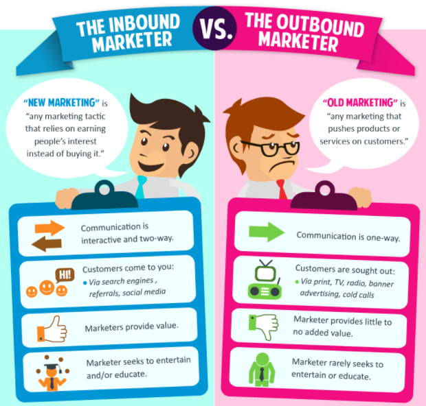
Content Marketing vs. Traditional Advertising
Here’s the evolutional pathway behind the modernized form of marketing that is most successful today.
Selling no longer works (a.k.a., traditional advertising).
Why?
Traditional advertising focuses on pushing messages at the consumer to get them to buy.
It’s interruptive, obstructive, and intrusive.
It shouts, “Hey, look at me!” while waving its arms.
You may try to avoid eye contact, but traditional ads are persistent.
You know what traditional ads look like because you’re bombarded with them every single day.
Think TV commercials, billboards, magazine ads, radio ads, and web banner ads.
Ads have been around for a long time, as evidenced by this traditional ad for “honest-to-goodness” coffee from the 1950s.
Ads may still work in some strategic places.
But Internet users can just click away from ads if they don’t want to see them.
Which is exactly what happens.
According to a PageFair report, 615 million devices in use today employ ad blockers. Additionally, ad blocker use increased by 30 percent in 2016 alone.
You know it, I know it, everybody knows it.
Ads are annoying.
And, they aren’t the way consumers prefer to learn about new products anymore.
Instead of businesses shoving themselves in consumers’ faces, they need to take a different, gentler approach.
Content marketing is exactly that.
Brands and marketers who use it publish content that teaches, inspires, guides, or solves a problem for their target audience.
With some handy tricks, the targets can find that content on the web without it being pushed at them.
If the prospects gain something useful from the content, they’ll keep coming back for more.
Finally, consumers can interact with the brand organically and share their content on social media.
Trust is forged.
Authority is established.
Connections happen.
These loyal followers can then be converted into leads and sales – naturally.
All of the above happens with a focus on giving value to the user.
Help users – offer them value and they’ll reward you in return.
That is what internet marketing/content marketing is all about at its core.
Why Internet Marketing?
Now that you know what internet marketing is, you still may be wondering whythere’s so much hype around it.
Well, the hype is totally founded.
Internet marketing has shown proven success over and over again.
Here are some stats gathered from around the web to help give you an idea of why internet/content marketing stands tall:
- By 2019, content marketing is set to be an industry worth $313 billion.
- 91 percent of businesses already are convinced of its power and have already adopted it as an essential marketing tactic.
- Content marketing costs 62 percent less than traditional, outbound marketing, but pulls in 3x as many leads.
- If you’re a small business with a blog, you’ll rake in 126 percent more lead growth than your competitors without a blog
- If you have a blog and publish content, you’re likely to get 434 percent more indexed pages on Google, on average
From my own content marketing endeavors, I have seen my small business take off.
With 99 percent of our focus on content marketing, we managed to grow our worth to millions of dollars.
Bottom line: This stuff works.
5 Content Examples: Providing Value for Big Returns
Reading about great content marketing is not enough to truly understand how it works. Instead, you have to see it in action to grasp its fundamental value.
Because when content is really good, it can do amazing things.
Here are some top examples of content types from brands who knocked content creation out of the park.
1. Blog Posts & Articles
One of the most common content types is blog posts and articles.
A blog, in particular, is a great content platform because it gives you a foundation for lots of posts, pages, and content that all point back to your site.
Think of a blog as a tree trunk. Your individual blog posts are the branches that reach out into the corners of the internet and search engines. Users can find your branches and follow them back to your core site. That gives you a greater shot at leads and sales.
For a great example of blogging content, look to Content Marketing Institute. They create troves of valuable, useful content for content marketers in order to teach, instruct, guide, or inspire.
The result?
Devoted fans, followers, and customers for their events, training, and consulting.
2. Infographics
Infographics are fun, visual ways to present valuable information.
They use charts, graphs, pictures, and illustration to explain concepts. This type of content is easily digestible and totally shareable.
Here’s a fantastic example of an infographic about baking bread from RJ Zaworski:
And here’s another highly-shared infographic from Curata about the anatomy of a content marketer:
3. Case Studies
Another popular and effective form of content is a case study.
In general, a case study is an in-depth look at some action your brand or business completed that had measurable results for success.
Usually, this translates into something you accomplished for a client.
Here’s a great example of a case study by Fractl:
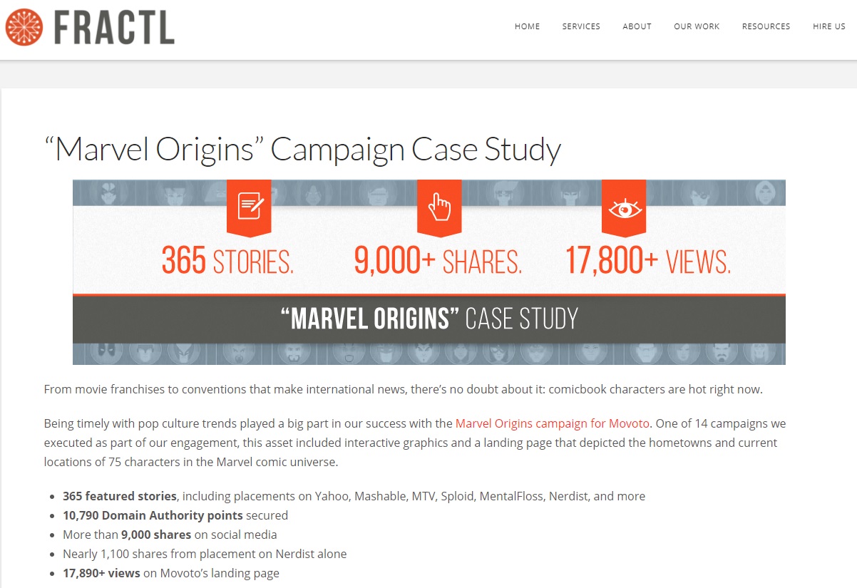
In it, the agency showcases how they executed a successful content campaign for a real estate brand. They talk about how it came together, the “whys” of the project, and the results (presented in measurable stats).
This type of content is an awesome trust-builder for obvious reasons.
4. Podcasts
For those of you who shudder at the thought of writing a blog post or in-depth article or case study, there are content mediums out there for you.
Podcasts are huge.
The State of Local Search 2018: Expert Webinar
Join a panel of the biggest local search experts as we explore how the industry changed in 2017 and predict what search engines might have in store.
They’re similar to the storytelling and news radio shows of yore, except people can download them and listen to episodes however and whenever they want.
If you are a good speaker or interviewer, this content format can be a great one for sharing valuable information with your audience.
For an example, check out Search Engine Journal’s Search Engine Nerds, about SEO, paid search, social media, and content marketing.
5. Videos
Videos are the hottest content type right now.
The stats are staggering. According to Social Media Today:
- By 2021, videos will grab 82 percent of all internet traffic
- Every single day, over 500 million hours of video is consumed on YouTube
It’s easy to see why videos dominate.
Videos are simple to consume, they’re entertaining, and they appeal to the current attention-span deficit that we suffer from when we surf the web.
For a great example of a marketer making the most of video content, check out Neil Patel’s YouTube channel:
What You Need for Internet Marketing
So, you’re totally on-board for this internet marketing thing.
You love the idea of getting creative, sharing value with your prospects/audience, and building brand loyalty and customer relationships organically.
Hold on a second, though.
You can’t just jump into this blindly.
You need to understand the key pieces of successful internet marketing, first.
They include:
A Content Marketing Strategy
Content marketing without a strategy will ultimately fail – it’s just the sad truth.
You must have a direction, a plan, the right tools, and ways to measure your progress if you expect to get anywhere.
Here are the key content marketing strategy fundamentals involved:
- Goals. This is vital. You have to know where you want to go, and what success will look like for you (and you alone), before you can head down the road to get there.
- Your Brand Persona and Target Audience. When you eventually start creating content, you have to know who you’re talking to and tailor your brand voice to appeal to them uniquely. If you aren’t targeting the right audience (those people who will lean in to hear what you’re saying), you won’t find success. And, if you can’t find a way to stand out, you’ll blend into the hordes of other brands competing for attention in your industry.
- Keywords and Research. Once you know the why and the who, you have to address the how. How will you reach your audience? What do they want to learn, what problems do they need to solve? Research keywords to target to get found in search engine results, and find topics that have an inherent interest for your audience before you create any content.
- Content Focus and Commitments. What types of content will you create? How often will you post? Where will you post? You have to nail down these foundations so you can create content with consistency and quality.
- Content Creation. Once you have topics, keywords, a distinct voice, and a target audience, you can create content. However, if your content isn’t really good, you’re wasting your time. Get help if you need it, spend the time to tweak and perfect your output, and always put out the best content you can.
- Content Promotion. Your content will go much farther if you promote it the right ways. Promotion is even more effective if you plan when you publish your pieces, strategize about publishing on your blog and sharing on social media, and build up a community of followers who can help push your engagement over the top.
Search Engine Optimisation (SEO)
When you use SEO with content marketing, it can take you farther, longer.
These two pieces together help power-up your organic (read: free) reach and visibility on the internet.
SEO encompasses a variety of techniques that help get you into prime spots on search engine results pages (SERPs). This means people can find you just by looking up some topic they’re interested in or need help with.
The overarching goal of good SEO is to get your site pages ranked on the first page of Google. (After all, most people rarely, if ever, click to Page 2 on their quest for information.)
Here are some basic SEO techniques that will help your content get indexed and ranked in search results:
- Strategically-placed keywords – You should place your target keyword in the headline, in subheaders, in the content, and in the meta description to help Google immediately pinpoint what it’s about.
- A well-designed, well-organized site – Google looks at how usable your site is, or how easy it is for people to click around, find what they’re looking for, and read your content.
- Clean page URLs – The URL structure for your pages shouldn’t be gibberish (i.e. http://yourdomain.com/blog/content123xyz-asdfkla). They should be simple and easy to read (i.e. http://yourdomain.com/blog/how-to-do-seo).
Of course, this is just bare-bones SEO. To get a better, in-depth look, check out SEJ’s ebook SEO 101: Learn the Basics of Search Engine Optimization.
A Boost from Paid Methods
Organic search can give you great click-through rates. It also gives you the benefit of the inherent trust people have in Google results.
However, sometimes investing in paid search can give you a boost.
Here are some good examples from Search Engine Land:
- Use paid search to remarket to visitors who found your site through organic search, and tailor ads for them based on their experience.
- Test different versions of ad copy (A/B testing) to see which performs better – then use what you learned for your landing pages on your site.
- Paid search can increase your visibility in ways that organic search cannot, such as giving you air-time for high-volume keywords for which you’d have a hard time organically ranking.
The combination of paid search and content marketing gives you a cohesive internet marketing whole.
Organic and paid traffic can merge to net you higher visibility and better results for driving traffic, which can increase your leads and sales.
Patience & Fortitude
Content marketing requires some pieces that are far less tangible than strategy or SEO, but are perhaps the most important.
When it’s truly successful, content marketing is a long-term strategy.
It takes time to start seeing the ROI from your content efforts.
The blog post you publish today will not pay off by tomorrow, next week, or even next month.
Instead, you must have the patience and fortitude to wait months – maybe even up to a year or longer – to start seeing the returns.
The good news?
Content marketing is internet marketing that builds momentum over time. HubSpot calls this phenomenon “compounding.”
High-quality content gets increased visits over time. This helps build the page’s authority, and can increase its reach through the ways people interact with the content as they discover it.
Think linking, sharing, engaging, and more.
Most importantly, all of these compounding returns can help your content climb the Google ranks, which in turn helps it reach more people organically.
Pretty soon, your hard work on that post starts paying off in spades.
It doesn’t happen right away, but it will happen if you set up your content for success, with strategy.
It just takes patience and fortitude to see it through, and to keep putting out content with the months ahead in mind.
What Now? How to Dive into Internet Marketing
By now, you may be hopping with excitement about this thing called content marketing.
You want to dive in, like right now.
If you’re ready and raring to go, here’s what to do next:
1. Pace Yourself & Set Goals
Remember, this is a marathon, not a sprint.
Pacing yourself is essential to doing it right – otherwise, you’ll start spinning your wheels, and burnout will be inevitable.
Instead, take stock of where you are in your business.
Think ahead to where you want to go in the next year.
- Do you already have customers?
- Do you have a website?
- Are you starting from square one?
Pick up a pen and paper, or settle yourself in front of your computer, and start formulating some goals for content marketing.
Make your goals achievable (but not too easy), and make them measurable.
Need some guidance about goals?
Here are some tips from CMI on setting goals, including how to tie them to key performance indicators (KPIs).
For ideas about goals to reach for, read this article from Copyblogger on 10 Content Marketing Goals Worth Pursuing.
2. Secure Your Content ‘Home Base’
For content creation, lead gathering, and more, you need a home base on the web.
This is:
- Where your content will live.
- What you’ll link to when you share your content on social.
- Where you’ll gather leads from the traffic you pull in.
If you don’t have a website, start researching options.
If you have a website, make sure it’s optimized, user-friendly, and organized by following SEO and usability best practice
Now that you have goals, a home for your content, and enthusiasm, it’s time to surge ahead with the rest of your content marketing strategy.
We’ve already discussed strategy, but here are the actionable steps that make it work:
6 Key, Actionable Steps for Content Strategiwing
- Target audience research and brand persona development
- Keyword research and SEO opportunity research
- Topic ideation and content planning
- Creating/writing/producing content
- Community building and nurturing
- Sharing and promoting content on social channels
This is a broad list. Each step has its own set of actions and planning involved.
It’s important not to skip any steps. Each is vital for winning at content marketing.
Yes – this takes time, effort, planning, patience, fortitude, and teamwork to get it all done.
3. Start Strategiving
Once you get your internet marketing rolling, though, just one piece of content in your arsenal can have an impact like this:
And that’s just what one piece of content can do.
Imagine if you started up a consistent, quality content publishing schedule and built your cache of content assets.
The possibilities are unreal.
…But only if you’re ready to roll up your sleeves and get your hands dirty.
Dig in, plot your course, get creative, build relationships, and enjoy the internet marketing of today.
It’s different from what you’re used to – it has a beating heart.
What is ‘digital design’

So – What is Digital Design? – it’s the buzzword of 21st century marketing. But what does it really mean and how does traditional design relate to it?
Quite simply design that used to be done pre-computer is now done on computer and via computer networks, including the Internet.
Marketing communication (promotion) still relies on words and pictures to attract attention and motivate existing and, particularly. potential new customers towards purchase, consumption and repurchase of goods and services and the building of those into trusted brands.
Promotional expertise once relied on traditional graphic design – the creation and manipulation of words, supported by type styles, photographs, illustrations and other graphics, to produce attractively persuasive communication – particularly in press, print and outdoor.
Change has been a constant in all human activity and particularly in communication. Radio, radar and television were early pioneers in the digital revolution. But it was the invention of computers, their miniturisation and the distribution of words and pictures via the miracle that is the Internet that created the communications explosion that has truly made the world a ‘global village’.
Photography – a major input to design excellence – was ‘digitised’ – cameras no longer needed ‘film’. Even hard copy print materials are increasingly printed ‘digitally’ and even ‘traditional printing’ cannot be achieved without and increasing range of computerised inputs.
A burgeoning array of digitised, miniturised, computerised components bring us increasing efficient, high quality, labour saving and convenient devices and ‘applications’ without which it would be difficult to live comfortably in today’s world.
We bank, drive, communicate and are entertained in a digital world and by digital devices. Just think of the myriad of applications and the services those deliver on a relatively tiny mobile telephone – from high-definition photography; 24/7 access to instantly available, up-to-the-second news, information, music, vision and other entertainment via the world-wide-web; voice and text recognition, transfer, record and storage in message banks so we need never be out of reach, or touch; to diaries, to do lists, alarms, photo albums, market updates, calculators, air, road and rail transport services, travel advice, online books; and much, much more.
The world is digital and, like it or not, we either try to keep up or we fall out of touch. Marketing has had to stay in touch. It always has! Marketers have needed to understand and be able to utilise every new invention that has enabled more cost-efficient, higher quality marketing communication outputs – the tools of persuasion. Design has been no exception – particularly with society’s constant move away from print (although it still holds a major place) and towards communication – visual and oral – via the screen, 24/7.
Mobile phone and personal computing have given us all easy access to the Internet as the digital distributor of information – it really has become the ‘world-wide-web’. Increasingly, we all look to websites, streaming, blogs, podcasts; and to our email, phones and other mobile devices for information and entertainment as well as the enticingly attractive possibilities in sharing our own news, thoughts, opinions, attitudes, memories and relationships ‘online’, through the new ‘social media’ channels, such as Facebook, LinkedIn, Instagram, Snapchat, U-tube and the many others that already exist or are emerging almost constantly. ‘Continuous innovation and improvement’ is the mantra of the digital technology industries.
In Conclusion
Make sure always to learn to avoid the mistakes other brands have made.
The only way forward is to trial and error methods, but risks should be minimal as much as possible.
This is the only way to grow and remain relevant for many decades to come.
For more information or help on how to avoid these branding mistakes contact DesignLab here.
If you want us to help you out in person contact us here.
If you require a quote or just want to chat to someone from our team contact Spiros on 0431 926 575.`